
15 Essential Visual Aids Examples to Improve Your Presentations
Visual aids can make a world of difference in how we communicate, learn, and present ideas. Whether you’re giving a business presentation, teaching a class, or sharing information with friends, the right visuals can capture attention and make your message clear. In this article, we’ll explore various visual aids examples that can enhance your presentations and help you connect with your audience.
From charts and graphs to videos and infographics, these tools can simplify complex information and make your content more engaging and memorable. Let’s dive in and see how you can use visual aids to your advantage!
What Are Visual Aids?
Visual aids are tools that presenters use to help convey their message more effectively. These can include anything from simple charts and graphs to elaborate models and videos. The primary purpose of visual aids is to enhance understanding by providing a visual representation of the information being presented.
They can help clarify complex concepts, highlight important points, and keep the audience engaged. By appealing to the visual sense, these aids can make information more accessible and memorable, making them an essential part of effective communication.
Types of Visual Aids
- Charts and Graphs: These are used to represent data and statistics visually. Examples include bar charts for comparing quantities and pie charts for showing proportions.
- Diagrams and Illustrations: Diagrams and illustrations help explain processes, structures, or concepts. Flowcharts, for instance, can show steps in a process, while anatomical diagrams can explain parts of the body.
- Photographs and Images: High-quality photographs and images can enhance storytelling and provide real-life context. They are especially useful in marketing and educational materials.
- Videos and Animations: Videos and animations are dynamic visual aids that can demonstrate processes, provide tutorials, or explain complex ideas in an engaging way.
- Models and Physical Objects: Physical models and objects can provide a tangible way to understand abstract concepts, such as architectural designs or scientific phenomena.
- Infographics: Infographics combine data and visuals to present information clearly and quickly. They are great for summarizing research findings or explaining statistical data.
- Presentations and Slideshows: Tools like PowerPoint or Keynote presentations allow for a combination of text, images, charts, and videos to support spoken content and keep the audience engaged.
Examples of Effective Visual Aids
1. charts and graphs.

Example: Bar Charts for Sales Data
Bar charts are an excellent way to compare different categories of data. For instance, in a business presentation, a bar chart can clearly show sales performance across various regions. This visual aid helps the audience quickly grasp which regions are performing well and which are lagging behind.
Example: Pie Charts for Market Share
Pie charts are useful for displaying parts of a whole. They can effectively show market share distribution among competitors in a particular industry. By using distinct colors and clear labels, pie charts can make complex data easy to understand at a glance.
2. Diagrams and Illustrations

Example: Flowcharts for Process Visualization
Flowcharts are ideal for mapping out processes. In a training session, a flowchart can illustrate the steps involved in a customer service protocol, ensuring that employees understand the sequence of actions required.
Example: Anatomical Diagrams for Biology Classes
In educational settings, anatomical diagrams can provide detailed visual explanations of biological structures. For example, a diagram of the human heart can help students learn about its various parts and functions.
3. Photographs and Images
Example: high-quality product images in marketing.
High-quality images are crucial in marketing materials. For an e-commerce website, clear and detailed photographs of products can significantly enhance the shopping experience, helping customers make informed purchasing decisions.
Example: Historical Photographs in Presentations
In a history presentation, using authentic photographs from the era being discussed can make the content more relatable and engaging. These images provide a visual connection to historical events and figures.
4. Videos and Animations
Example: tutorial videos for software training.
Videos are highly effective for training purposes. A tutorial video demonstrating how to use a specific software feature can help users follow along and learn more efficiently than through text instructions alone.
Example: Animated Explainer Videos for Complex Concepts
Animated videos can simplify complex concepts. For example, an explainer video about blockchain technology can break down the intricate details into easy-to-understand visuals, making the topic accessible to a broader audience.
5. Models and Physical Objects
Example: 3d models for architectural designs.
Physical models are invaluable in fields like architecture. A 3D model of a building can provide a tangible representation of the design, allowing clients and stakeholders to better visualize the final product.
Example: Physical Prototypes in Engineering
In engineering, physical prototypes can demonstrate how a product will function. For instance, a prototype of a new gadget allows engineers to test its usability and make necessary adjustments before mass production.
6. Infographics
Example: data-driven infographics for statistics.
Infographics are perfect for summarizing complex data in a visually appealing format. For instance, an infographic on global warming statistics can combine charts, icons, and brief text to convey key information quickly and effectively.
Example: Infographics for Educational Purposes
In educational contexts, infographics can simplify learning. An infographic explaining the water cycle can use visuals and concise explanations to help students understand the process more easily.
Example: Geographic Maps for Location-Based Data
Maps are invaluable for displaying geographical information. For example, in a business presentation, a geographic map can show sales distribution across different regions, helping the audience visualize areas of high and low performance. This can be particularly useful for identifying target markets and regional trends.
Example: Heat Maps for Data Density
Heat maps use color coding to show data density in specific areas. For instance, a heat map can illustrate population density in a city, with darker colors representing more densely populated areas. This type of visual aid is useful in urban planning, real estate, and marketing to identify hotspots of activity or interest.
8. Timelines

Image source: Pinterest
Example: Historical Event Timelines
Timelines are effective for showing events in chronological order. A timeline of significant historical events can help an audience understand the sequence and context of occurrences, providing a clear and organized way to present historical data or project milestones.
Example: Project Timelines in Business
In business, project timelines outline key milestones and deadlines. This visual aid helps teams stay on track, ensures that everyone is aware of important dates, and can highlight dependencies between tasks, making project management more efficient.
9. Mind Maps
Example: brainstorming sessions.
Mind maps are powerful tools for brainstorming and organizing ideas. During a team meeting, a mind map can visually represent thoughts and connections between concepts, fostering creativity and collaboration by showing how ideas relate to each other.
Example: Study Guides
Students can use mind maps to summarize and organize study material, making it easier to review and recall information. By breaking down complex subjects into manageable parts, mind maps can enhance learning and retention.
10. Posters
Example: educational posters.
Posters are useful in educational settings to reinforce learning. For instance, a poster displaying the periodic table of elements provides a constant visual reference for students, aiding in memorization and understanding.
Example: Informational Posters in Public Spaces
In public spaces, posters can convey important information clearly and accessibly. For example, posters detailing safety protocols or event schedules can be placed in common areas to inform and guide the public effectively.
11. Flip Charts

Example: Interactive Meetings
Flip charts are great for interactive meetings and workshops. Presenters can write and draw on flip charts in real-time, engaging the audience and encouraging participation. This allows for dynamic presentations where feedback can be incorporated on the spot.
Example: Training Sessions
In training sessions, flip charts can outline key points and concepts, making the information more interactive and memorable. Trainees can also use flip charts for group activities, fostering collaborative learning.
12. Whiteboards and Blackboards
Example: classroom teaching.
Whiteboards and blackboards are essential tools in classrooms. Teachers can write, draw, and illustrate lessons dynamically, adjusting content based on student needs. This versatility helps cater to different learning styles, whether visual, auditory, or kinesthetic.
Example: Business Meetings
In business meetings, whiteboards can be used to brainstorm ideas, outline strategies, and solve problems collaboratively. The ability to quickly jot down thoughts and make changes facilitates efficient and productive discussions.
13. Interactive Displays
Example: touchscreen displays.
Touchscreen displays offer interactive experiences. In museums or exhibitions, visitors can interact with the display to explore information at their own pace, making the learning experience more engaging and personalized.
Example: Smart Boards in Classrooms
Smart boards combine traditional whiteboards with digital technology, allowing teachers to present multimedia content, annotate slides, and interact with educational software. This technology can enhance student engagement and provide a richer learning experience.
14. Props and Demonstrations

Example: Science Experiments
Props and demonstrations bring abstract concepts to life. In science classes, demonstrating a chemical reaction with actual materials helps students understand the process better than through diagrams alone. It makes learning more tangible and exciting.
Example: Product Demonstrations
In sales presentations, demonstrating a product’s features and benefits using actual props can be much more persuasive than simply describing them. Seeing a product in action can help potential customers understand its value and functionality.
15. Presentations and Slideshows
Example: powerpoint presentations for business meetings.
PowerPoint presentations can combine text, images, charts, and videos to support spoken content in business meetings. This multimedia approach keeps the audience engaged and ensures that key points are effectively communicated.
Example: Keynote Presentations for Conferences
For conference speakers, Keynote presentations provide a polished and professional way to deliver their message. By integrating various visual aids, these presentations can enhance the overall impact and clarity of the content.

Roberta Walter is the visionary behind Content Paradise, a blog that delves into diverse topics with enthusiasm and insight. Passionate about discovery, she crafts content that educates, inspires, and entertains a community of curious minds.
Similar Posts

How Long Should You Stay in an Ice Bath? Best Duration for a Dip
If you’re looking into ice baths, you likely know the numerous benefits of trying them out. Unfortunately, getting started is difficult sometimes. It’s intimidating to…

How to Get Rid of Spider Webs Outside: 13 Methods to Try
Spiders are helpful little animals to have around, but that doesn’t mean they’re always pleasant. Some are venomous, they’re a little creepy and crawly, and…
10 Best Visual Aids to Drive Home Your Presentation
Feb 22, 2023 | Deliver a Presentation
Even more impactfully, you can generate greater understanding in your audience. For example, if you’re discussing a company’s finances, having a set of graphs and charts can convey a greater grasp of the figures.
Visual Aids Examples
Visual aids are more than just PowerPoint presentations. To help spark some ideas, here are ten visual aids examples to try out.
What is a visual aid?
A visual aid is anything you use in a presentation to visually drive home your point. Using visual aids can improve attention and engagement with your presentation. They’re also quite fun!
If a picture tells a thousand words, a video tells a thousand pictures. You could pause your talk at the start to show a video demonstrating an idea or concept. It can help ground your presentation and provide context for what you’re going to say next.
In one particularly spectacular example, Hans Rosling’s TED talk, The Best Stats You Have Ever Seen , uses video continuously throughout the presentation. The result: a deeper understanding of a complex topic.
Don’t just describe your product: show it! Having a tactile prop you can hand around or demonstrate isn’t just informative; it’s one of the most engaging visual aid examples around. It draws the eye and captivates your audience.
For example, if you’re giving a talk on African History, showing a traditional artifact (even a replica) can go a long way towards conveying your ideas.
Just don’t overdo it. Too many props can distract your audience from the main thrust of your presentation.
3. Handouts
Are you discussing a complex topic? If so, a handout can help break down the more complex aspects of your talk. It can contain pictures and diagrams for you to refer to in your presentation. It’s also something your audience can take away at the end. And what better way to drive home your message than a lasting reminder.
That’s not to say every presentation could benefit from a handout. But when used prudently, this visual aid example can help make your presentation that bit more memorable.
4. Demonstrations
This visual aid example blurs into props a little bit. Where it differs is in its dynamic character. Think back to your school days – aren’t the lessons you remember best, the ones with a bang?
Demonstrations can serve as the hook to draw your audience into a complicated concept. You could show off how your product works in practice. Or set up a small scientific experiment to get across the core concept of your talk.
And it’s a great way to end a presentation – no other visual aid example is as memorable.
Everyone might use slides – but that’s for a reason. Slides are a simple but effective way to convey your ideas visually throughout a presentation. They can give key statistics or contain charts, graphs, or pictures.
Nor do you need to settle solely for PowerPoint. If you fancy trying something different, check out Prezi. It lets you create an interactive and fluid presentation at the click of a button.
6. Whiteboards
There’s a reason why classrooms have whiteboards. To explain a new idea or spark a discussion, there’s no better visual aid example than a whiteboard.
How about having a pause midway through your presentation to have a brainstorm? Or start off the discussion by jotting down people’s initial impression of an idea. Then, at the end, you can revisit what you wrote down and see if people’s perspective has changed.
Even better, with virtual meetings now the go-to way to conduct a presentation, many video conferencing software contains virtual whiteboards.
7. Posters and boards
If you go to a scientific conference, posters are the primary way to present. When big and visually engaging, they can help introduce an idea. Alternatively, like a lawyer in a courtroom, you can use pre-made boards throughout your presentation. It’s a little more dramatic than a PowerPoint, creating a more memorable experience.
8. Roleplay
Before you roll your eyes – stay with me. Roleplays, when done right, can be the most memorable part of a presentation (for the right reasons). It’s a chance to put yourself in someone else’s shoes. Think about how a roleplay can show a social situation. It could be a person trying to buy a product. By walking through the customer’s shoes, you could demonstrate to a prospective client just why your product or service is essential.
9. Blackboards
If you don’t have a whiteboard, blackboards are the next best thing. Though they function pretty similarly, the blackboard has an older aesthetic many remember from their schooldays. Draw diagrams, symbols, charts, and drawings with the classic chalk.
In fact, one of the benefits blackboards have over whiteboards is the ease with which you can draw. Plus, it’s always a great tool for interactive learning.
10. Flipcharts
If a room doesn’t have a blackboard or whiteboard, try a flipchart – it’s the next best thing. Unlike the other two, you can prepare some of the pages beforehand. For example, you can draw a table of pros and cons, ready for your audience to shout out their ideas.
For many, it’s just a refreshing change from the tired slide presentations.
Need more visual aids examples?

About the Author
For over 20 years Elizabeth Peterson , has enjoyed supporting individuals and companies with their communication and voice needs. Speech and Voice Enterprises, her private practice, has been in operation for over 15 years in Denver, Colorado. Ms. Peterson is heavily involved in her field and has numerous published books, therapy programs and articles in the areas of accent reduction, public speaking, leadership and communication, traumatic brain injury, stroke recovery and pediatric therapy programs.
At Speech and Voice Enterprises, we offer custom-tailored business communication classes with several training options available... Get started now with
More Articles from Our Blog!

How to Start a Presentation Effectively When Public Speaking
Feb 15, 2023 | Deliver a Presentation
First impressions matter – you've likely heard it said that interviewers decide on a candidate within the first 30 seconds; some take even less time. When public speaking, you've got about 60 seconds to capture your audience's attention, establish the topic, and give...

Top 10 Best Presentation Aids for Your Corporate Presentation
Jan 25, 2023 | Deliver a Presentation
Aren’t you tired of the same boring, bland corporate presentations? Do you want a presentation aid to inject a little life into your proposal or pitch? You’re not alone. After three decades of PowerPoint presentations, it’s all starting to get a bit repetitive....
10 Presentation Aids To Enhance Your Presentation
Table of contents.
You’re putting together a presentation and you’ve considered using presentation aids but don’t know where to begin?
Whether you’re a seasoned veteran presenter or new to the industry and looking on how to become a better presenter , we’ve got you covered with tips and tricks and everything you need to know about presentation aids.
We’ve put together this comprehensive list of 10 presentation aids you should incorporate in your next presentation, seminar, public speaking event or any other audience engagement to ensure your key messages are retained and you remain at the forefront of people’s minds.
Whether it’s visual aids, creative design or new ideas you wouldn’t necessarily think of to use in your line of work, we’ve broken down the bias to help give you a fresh mind on some presentation aids you should use.
What Are Presentation Aids?

A presentation aid is a complementary tool you can and should use in order to have your presentation stand out and enhance it.
They are sensory aids to help elevate your speech, performance or powerpoint presentation.
Where words fail, presentation aids come in to support.
A presentation aid can be used alone or in combination with other presentation aids. More often than not, it is encouraged to combine a couple of presentation aids to target the different senses – hearing, vision, smell, & taste.
The more senses you target, the more likely your presentation will be remembered.
For example, audio and video clips might be sprinkled throughout your presentation slide deck. Although these are all different presentation aids, using them in a combined way will enhance the overall presentation and increase audience engagement.
Presentation aids work because they tap into the presentation psychology ; the underpinning of our minds and how we perceive and remember great presentations. Whether someone is an auditory or visual learner, using additional presentation aids that target these senses will help take your presentation from average to phenomenal.
Why Do Presenters Use Presentation Aids?

Every presenter has their reasoning for selecting the presentation aids they use.
With the advancement of technology, presenters have been using more and more visual aids in their presentations in order to enhance the overall audience experience and create a great visual presentation .
Whether your presentation is in-person or instead a virtual presentation , the objective is always the same. Get your key messaging across with minimal miscommunication. Getting your key message across to your audience members can be done with the help of effective presentation aids.

Both informal and formal presentations incorporate some degree of presentation aids.
Presentation aids provide many benefits to a presenter. A presenter may use a combination of both visual aids and auditory aids to increase audience engagement and to help deliver their message.
Let’s break it down as to why a presenter would use visual aids and why a presenter would use auditory aids.
At a high level, it first depends on the audience. You should always begin crafting your presentation by understanding who your audience is and what you want them to take away from your presentation. This will help define the aids you select.
If your audience has a shorter attention span such as young adults or children, consider using more visual aids like videos or imagery. You may do this by adding videos into your PowerPoint presentation or adding images.
Perhaps you want your audience to remember things or act on something after the presentation has already concluded. A brochure or presentation handout might be a great aid to use as it leaves a physical, tangible item with the audience.
Trying to get funding or convert audience members into sales? A demonstration or live performance of the product can help people envision themselves using the product.
Presentation aids are used to help deliver your message and influence people. Understand your audience and the message you want them to take away and you’re halfway done deciding which complementary presentation tool you should use.
10 Types Of Presentation Aids
Before we begin going through the list of presentation aids you should use, we want to first preface with a word of caution.
Don’t overdo it.
As tempting as it may be to incorporate all 10 presentation types of presentation aids into your allotted time, don’t. You may be doing yourself a disservice.
Too many presentation aids may begin to distract your audience rather than support your messaging.
If you give your audience a handout, have them glance at an image with some written text all on one slide all the while you’re speaking over everything, there is too much going on. Your audience won’t know where to place their attention.
Also, some presentation aids don’t work in the environment in which the presentation is being held.
For example, if your presentation is virtual with absolutely no in-person audience members, a demonstration or live performance might not make practical sense.
Use these tools sparingly.
With that being said, let’s dive into the top 10 types of presentation aids we believe you should incorporate into your next presentation based on presentation feedback we’ve received over the years as presentation designers.
1 – PowerPoint Slides, Google Slides & Prezi Slides

One of the very first presentation aids we’ve all been taught to use and have more than likely used at least once in a school or work environment is a presentation slide deck.
Almost all presentations nowadays have a slide deck accompanying the presentation since it has been engrained in our minds as an essential for every presentation.
Whether it’s a motivational speech, client pitch presentation , RFP presentation , virtual presentation or an investment pitch presentation , they typically always use a slide deck.
Slide decks are great because they’re often easily customizable and there are plenty of well designed templates you can find online.

Slide decks such as PowerPoint Slides, Google Slides and Prezi Slides also allow a presenter to incorporate additional presentation aids such as videos, images or graphs seamlessly. Rather than having to jump back and forth between tabs, monitors or computers, a presentation slide deck consolidates all the information into one place.
When presenting to a large audience, a slide deck also allows audience members who are seated at the back of the venue to still take away the key points you’re trying to highlight. When highlighting key points, they will often be mentioned in the slide deck which is often displayed using a large projector and screen or video monitor.
Lastly, a presentation slide deck is a great tool to use as a reference.
The key details should be illustrated in the slide deck. Once the presentation is over, the slide deck can be a stand alone takeaway the audience or client can reference at a later date once the presentation has long past.
2 – Visual Aids, Audio And Video Clips

At a minimum, you should have at least one of the following presentation aids – imagery, audio or video.
Imagery can be more than just a photo. Imagery encompasses your slide deck, the color theory you use such as brand colors, how you embellish quotes and more.

For example, rather than sticking a text block on your slide deck with a quote, try enhancing the quote with the some visual appeal. You may consider adding a photo of the person who said the quote, stylizing the font with script writing so it seems more humanized and lastly using colors to highlight key words you want to bring to the audience’s attention.
Audio is another great tool to use, especially if you plan on incorporating motion graphics in your presentation. It also adds a layer of depth.
Since the audience will likely be hearing you speak for a majority of the presentation, having a pre-recorded narration over motion graphics will help create a “unique moment” in your presentation – almost like a bookmark. This will help your audience segment your presentation and retain information better.
Finally, videos have continued to grow in popularity as it is a combination of both visual aids and auditory aids.
Your video can be a live action video with real actors or it can be a stop motion animation. Whatever video style you decide, a video clip will help get your message across and enhance audience memory.
By combining all three aids, you’re targeting a combination of both visual and auditory senses. This combination will help your presentation stick out as human learning occurs visually and through auditory.
3 – Sizzle Reels
Although similar to videos, sizzle reels add a bit of flair traditional videos often lack.
Sentiment wise, videos can be positive, neutral or even negative while a sizzle reel’s sentiment is usually always positive.
Sizzle reels are very promotional in the sense that they are created with an intended purpose to have the audience act or feel in a certain way.
Unlike a video which may be used to support an argument or provide raw, unfiltered visual dialogue, a sizzle reel is typically created with a specific purpose for persuasion or selling.
Oftentimes, a sizzle reel is used to demonstrate or highlight a specific idea, product or sample of work usually presented with positive connotation. The presenter is trying to get the audience to be on the same page as them.
Like a video, a sizzle reel can be live action or animated – it is the intention of the video which makes it a sizzle reel or not.
4 – Motion Graphics
Keep your audience’s eyes stimulated by incorporating motion graphics into your presentation.
Motion graphics use the illusion of motion or rotation to make something which is typically stationary to appear as though it’s moving.
Motion graphics are great when they are used effectively. Too much motion graphics or improperly used motion graphics takes away your presentation’s credibility as it may begin to appear too animated and comical.
Depending on your presentation niche, motion graphics can really help enhance your presentation.
If your presentation primarily deals with lots of text, consider using motion graphics to help liven things up.
PresGeek Portfolio - Flowmill Explainer Video from Presentation Geeks on Vimeo .
You may be thinking to yourself, “Well, why not just use video?”. To that we say video isn’t for every industry. Although video may seem like the best option, it can often hurt your presentation more than it benefits it.
Consider a historical speech, one with a powerful message. Would you rather just watch a video of the person speaking, or perhaps a carefully curated kinetic typography motion graphic?
In this instance, although a video is still acceptable, you would be better off with motion graphics.
Motion graphics aren’t to be confused with animation. The difference between motion graphics and animation is motion graphics convert a typically stationary object into a moving one. Motion graphics don’t follow a typical storytelling narrative.
Animation on the other hand takes the audience on an emotional journey through storytelling which is an additional presentation aid we will discuss.
5 – 3D Modeling & Animation
If motion graphics aren’t enough, try using 3D Modeling and animation to bring your ideas to life and help tell a story!
3D Modeling and animation help bring hard to conceptualize ideas into a more tangible reality.
For example, if you’re presenting a prototype of a car, home or the latest piece of tech, spending money into developing a fully functional or full-scale product may not be feasible – especially if you’re merely pitching the idea to get funding in the first place.

3D modeling allows your audience to see how the product will look and perform if it were real.
Animation helps connect your messaging to your audience through the art of storytelling. Animation allows you to tell stories far beyond the scope of what is in our reality and can really help emphasize your brand’s essence.
For example, Red Bull did a great job with their advertising using the art of animation. Red Bull’s slogan of “Red Bull gives you wings” is personified through animation as their animated characters are given wings after drinking their product. They’re also put in high-intensity situations. Although often comical, animation helped bring the brand essence to life.
This could still be done with live-action actors and CGI, but the cost is far more than animation.
Animation is a cost-effective storytelling tool to bring even the most extremes of situations into a digestible reality.
6 – Maps
Our world has shifted to become a global village.
It is almost impossible to go about your day without hearing a piece of international news.
Whether it’s news, politics, culture or business, we are connected to different nations around the world. As you progress in your life, you’ll soon encounter yourself presenting to people around the world whether virtually or in-person.
If you are presenting to people around the world whether it be for politics, culture or business, adding a map is another great presentation aid to help visualize the interconnectedness between each other.
A map can be used to highlight geographical hotspots, geographical trends and more.
Here are some examples we’ve put together of when you would use a map.
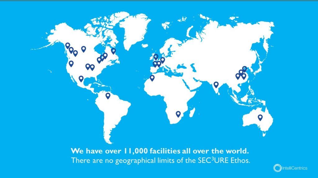
Planning to expand your business? Why not include a map pinpointing all your existing locations relative to your new expansion.
Planning to show how diseases spread throughout the world and relative hotspots of infections? Consider adding a map with varying degrees of color to highlight infection densities.
Maps don’t need to be international either depicting every country – they can be used for small businesses showcasing a localized region.
Lastly, maps help put things into perspective. Tying back to presentation psychology, people are more likely to express emotions or feel connected to something the closer they are to it, physically. By using a map, you can put your message into perspective for your audience.
7 – Infographic Charts & Graphs
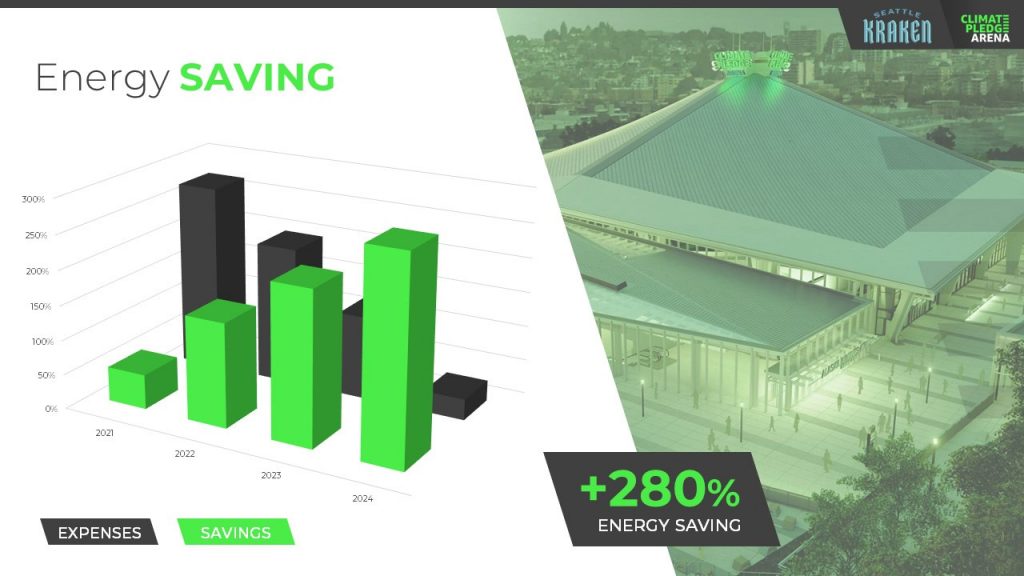
Rather than simply putting a few numbers up on a slide deck and calling it a day, try inputting these numbers in a chart or graph.
You have to consider your audience and not everyone learns or absorbs information by simply reading. They need to visualize comparisons and differences. Charts and graphs are one great way to do this.
Let’s take a look at the example above. It could’ve been easy enough to show there was a 280% increase in energy saving, but we were missing a big chunk of the story which was expenses were declining. You also don’t see the scale of energy savings relative to expenses with just words.
Instead, opting to put numbers into a visual format, the audience members can easily understand the advantages and compare it to the change over time.
Remember – try and avoid very complex graphs. When you start to input complex graphs into a presentation, you’ll begin to lose the audience as they will be too busy focusing on understanding the graph.
If possible, leave the audience with resources they can look back to after the presentation such as a brochure or handout where they can take as much time as they need to digest more robust graphs.
8 – Infographic Diagrams
Unlike charts and graphs which primarily focus on data and numbers, a diagram focuses on the appearance, structure, flow or workings of something.
A diagram is a great presentation aid to use as it helps break complex ideas into step-by-step sections the audience can follow along with.
Not only does it provide clear steps, but it can help speak to key points of a product or timeline.
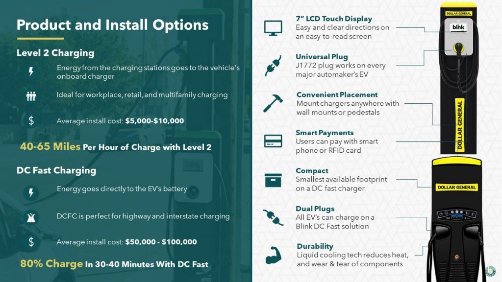
For example, this diagram goes over the structure of an EV charger.
Rather than just showing an image of the charger with bullet points off to the side, a diagram provides clear connection lines from the point being made and where it’s located on the final product.
Diagrams also help illustrate flow. Whether it be the customer journey, your product development or your company’s growth, diagrams are great ways to show consistent progression in a logical, step-by-step pattern.
9 – Brochures & Presentation Handouts
One way to really connect with your audience and almost guarantee they’ll leave the presentation remembering something is with a brochure or handout.
A brochure or handout is a physical printout which could be a combination of images, written text and diagrams.
Oftentimes, brochures and handouts are used to elaborate on information already being presented but in further detail. Depending on the scope of your presentation, you may want to opt to have a brochure or presentation handout.
If the nature of your presentation requires thorough research, data and insight such as business or healthcare, a handout can allow your audience to review the information at their own pace at a later time.
A brochure or handout also allows audience members to jot down information.
This is important if you’re trying to encourage audience participation.
By enabling the audience to jot down their own notes and have time near the end of your presentation for them to collaborate and speak to points throughout your presentation, you’ll be engaging in a discourse with your audience.
10 – Demonstration or Live Performance

The last presentation aid we recommend is also one of the hardest to pull off – a demonstration or live performance.
A demonstration or live performance is when you’re presenting the truth and validity of something. For example, you might do a demonstration of how your product performs. Or, instead of playing music, you could have a live performance.
One of the most well-known presenters to do demonstrations or live performances is Steve Jobs. At the unveiling of any new Apple product, Steve Jobs was there on stage with the product in-hand ready to demonstrate its state of the art capabilities.
Demonstration or live performances are one of the best presentation aids to use as they often go hand in hand with public relations. Whether the performance goes well or bad, you can almost be sure there will be press coverage of it afterwards.
A great example of a demonstration which went south was Tesla’s Cybertruck and their armored windows . What was supposed to be strong, armored glass came to a shattering end when a Tesla employee threw a steel ball at not just one window, but both the front and rear window leaving both of them shattered. The hope was for the steel ball to ricochet off the window to demonstrate their durability, but instead they failed.
Although this might seem like a failure, the coverage it got after the presentation was a complete publicity success.
Advantages & Disadvantages Of Using Presentation Aids
As with everything in life, there are always two sides of the coin – positives and negatives.
The same goes for using presentation aids.
Rather than experimenting yourself and learning the hard way of advantages and disadvantages, we’ve put together this short yet informative section to help guide your decision making.
Presentation aids are great complementary tools you should use in every presentation. They allow you to connect with audience members in new and unique ways.
One of the advantages of using presentation aids is to appeal to different audiences.
Everyone has a different attention span. Everyone also learns and absorbs information differently. By disseminating your key message using new and unique methods, you’re able to appeal to a larger audience.
Secondly, presentation aids allow the lifespan of your presentation to be extended.
Imagine your presentation was only you speaking. The moment you’re done talking, the presentation is over and it begins to fade from people’s memory. With the help of presentation aids, you avoid this outcome and extend how long your presentation is remembered for.
For example, if you used a slide deck to accompany your presentation, the slide deck can be made available to audience members after the presentation to reference.
Lastly, presentation aids help reduce the attention that’s put on you and allow you to take breaks while presenting.
If you’re a beginner, it can be intimidating to be the center of attention. With the added use of presentation aids, you can break up your presentation to allow the aids to do the work. If you have a video, once you begin to play it, the audience’s attention will be redirected to the video. This will allow you time to pause, recollect your thoughts, take a drink of water if needed and continue on with the presentation afterwards.
Disadvantages
Presentation aids are not the miracle solution.
If you don’t have a solid foundation on which your presentation is built upon, it doesn’t matter how many or which presentation aids you decide to use. You need to ensure your presentation is properly structured from the beginning.
Presenters can also get carried away with using too many presentation aids.
When you don’t take the time to reflect on the presentation aids you are using and just begin spitballing every presentation aid into your presentation just because you know of these tools, doesn’t mean you should. They begin to become a distraction and takeaway from the messaging you’re trying to get across.
Conclusion – Should You Use Presentation Aids?
The short and sweet answer is yes. You should absolutely use presentation aids.
Unless your plan is to only be a storyteller letting the audience create an image in their mind, then you should consider using at least one of the presentation aid types mentioned above.
Not only will presentation aids help your audience learn and retain the information better, it may actually help you!
Presentation aids require you to contribute more work to the final product. It requires you to carefully think of the story you’re trying to convey to your audience and which best method to do so. By taking this extra bit of time to sit down and reflect on your presentation and actually produce well-crafted aids, you’ll be setting yourself up as a thought-leader on the topic.
If You’re looking for a Pitch Deck Design Agency , we can help. Just click the button below to start your journey!

Author: Ryan
Related posts.

FREE PROFESSIONAL RESOURCES DELIVERED TO YOUR INBOX.
Subscribe for free tips, resources, templates, ideas and more from our professional team of presentation designers.

- PRESENTATION SKILLS
- Working With Visual Aids
Search SkillsYouNeed:
Presentation Skills:
- A - Z List of Presentation Skills
- Top Tips for Effective Presentations
- General Presentation Skills
- What is a Presentation?
- Preparing for a Presentation
- Organising the Material
- Writing Your Presentation
- Deciding the Presentation Method
- Managing your Presentation Notes
Working with Visual Aids
- Presenting Data
- Managing the Event
- Coping with Presentation Nerves
- Dealing with Questions
- How to Build Presentations Like a Consultant
- 7 Qualities of Good Speakers That Can Help You Be More Successful
- Self-Presentation in Presentations
- Specific Presentation Events
- Remote Meetings and Presentations
- Giving a Speech
- Presentations in Interviews
- Presenting to Large Groups and Conferences
- Giving Lectures and Seminars
- Managing a Press Conference
- Attending Public Consultation Meetings
- Managing a Public Consultation Meeting
- Crisis Communications
- Elsewhere on Skills You Need:
- Communication Skills
- Facilitation Skills
- Teams, Groups and Meetings
- Effective Speaking
- Question Types
Subscribe to our FREE newsletter and start improving your life in just 5 minutes a day.
You'll get our 5 free 'One Minute Life Skills' and our weekly newsletter.
We'll never share your email address and you can unsubscribe at any time.
Visual aids are an important part of presentations. They can help to keep your audience engaged, make your point for you—there is a reason why people say that a picture tells a thousand words—and remind you what you want to say.
However, you can also take them too far.
If good use of visual aids can make a presentation, poor use can ruin it. Who, after all, has not be subject to ‘death by PowerPoint’, in one of its many forms? This page explains more about how to use visual aids effectively in presentations and helps you to avoid being remembered for all the wrong reasons.
What Are Visual Aids?
Visual aids are exactly what they sound like: a visual support to you standing up and speaking.
They are commonly something like slides setting out your main points, or a video. They can also take the form of a handout, either of your slides, or a summary of your presentation, the use of a flip chart, or even something interesting that you have brought along to show your audience and make a point.
If visual aids are used well they will enhance a presentation by adding impact and strengthening audience involvement. They can also be a helpful to reminder to you of what you wanted to say.
You should only use visual aids if they are necessary to maintain interest and assist comprehension in your presentation.
Do not use visual aids just because you can, or to demonstrate your technological competence. Doing so may make it harder to get your messages across clearly and concisely.
For each visual aid or slide, ask yourself why you are using it. If there is no real purpose, don’t include it.
Thinking Ahead—Planning Your Visual Aids
Most visual aids will need advance preparation. You will need to know how to operate the equipment effectively.
Check beforehand what facilities are available so that you can plan your presentation accordingly.
Also check whether you need to send your presentation in advance to be loaded up, or whether you can bring it on a memory stick or similar.
You can find more about preparing a presentation in our dedicated page on the subject.
Presentation software
It is now common to use presentation software such as PowerPoint.
Indeed, few presenters would dare to attend an event without a PowerPoint file. However, it is still possible to manage without. Some of the very best lecturers and speakers do not use PowerPoint. At most, they might draw on a flip chart or whiteboard. What they have to say, and the style in which they say it, is compelling enough to hold their audience.
For most of the rest of us, PowerPoint is likely to be the way forward, however.
Top tips for using PowerPoint
Keep it simple. Use no more than three to five bullet points per slide and keep your bullet points to a line of text, if possible. Your slides should be a guide to what you are going to say, not a verbatim account.
Don’t use visual effects unless they actually add to your presentation. PowerPoint has some very nice options for adding and subtracting text, but they can be very distracting. Stay away unless you really know what you’re doing.
Keep it short. A half-hour presentation can usually be summarised into six to ten slides at most.
Don’t use the notes function. PowerPoint has a ‘notes’ function that allows you to write notes under the slides for your benefit. Don’t. You will try to read them off the screen, and stop talking to your audience. Instead, use cue cards held in your hands and focus on your audience.
Other common visual aids include:
- Whiteboards and interactive whiteboards
- Flip charts
Whiteboards and Interactive Whiteboards
Whiteboards are good for developing an explanation, diagrams and simple headings.
They can also be used for recording interaction with, and comments from, the audience during brainstorming sessions .
Remember that writing on a whiteboard takes time and that you will have to turn your back to the audience to do so. If using a whiteboard, you should ensure that your handwriting is legible, aligned horizontally, and is sufficiently large to be seen by all the audience. Also ensure that you use non-permanent pens (sometimes referred to as dry-wipe pens) rather than permanent markers so that your writing can be erased later.
Bear in mind that the white background of a whiteboard can cause contrast problems for people with impaired vision.
Interactive whiteboards can be used for PowerPoint presentations, and also to show videos, as well as to write on and record interactions with the audience. They are, effectively, projector screen/whiteboard combinations, with attitude. If you plan to use an interactive whiteboard, you should make sure you know how it works, and practice using it, before your presentation. It is NOT a good idea to make first use of one in a major presentation.
Flip Charts
A flip chart is a low cost, low tech solution to recording interactive meetings and brainstorming sessions.
At many venues, however, they have been replaced by interactive whiteboards.
A flip chart can be prepared in advance and is portable, it requires no power source and no technical expertise. Flip charts are ideal for collecting ideas and responses from the audience and are good for spontaneous summaries. However, if the audience is large, a flip chart will be too small to be seen by everyone.
Top tips for the effective use of a flip chart:
Arrive early and position the flip chart so that you can get to it easily when you need it.
Position the flip chart so that you can stand next to it and write while still at least half-facing your audience. Do not turn your back on your audience.
Make sure you have several marker pens that work.
Only use blue or black marker pens. It will be difficult for those at the back of the room to see any other colours. You can use red pens to accentuate blue or black.
Make your letters at least 2-3 inches tall so that everybody can see what you have written.
Draw lines in pencil on blank pages before your presentation, to help you keep your writing legible and straight.
If you are using a flip chart as an alternative to PowerPoint:
- Plan out your pages as you are writing the outline for your presentation;
- Write notes to yourself, in pencil, on the flip chart to remind you of the points you want to make. Your audience will not see the pencil notes.
If you have something that you want to present and then accentuate during the presentation or discussion, write out the flip chart page beforehand so that you can just flip the page to it—or just use a PowerPoint slide.
If you need to refer to something that you wrote on a page at a later point in your presentation, rip off the page and fix it to the wall.
Videos are particularly good for training purposes. Short videos can also be embedded into a PowerPoint presentation to make a point, or provide an example. This is becoming increasingly popular with the advent of YouTube, because far more videos are available. Smartphones have also made recording your own videos much easier.
However, as with any visual aid, make sure that you are using video for a purpose, not just because you can.
Handouts summarising or including the main points of a presentation are an excellent addition, but must be relevant.
Presentation software packages such as PowerPoint can automatically generate handouts from your presentation slides. You can also prepare a one-page summary of your presentation, perhaps as a diagram, if that seems more appropriate. This may be particularly useful if you are asked to do a presentation as part of an interview .
If you do provide handouts, it is worth thinking carefully about when to distribute them.
Giving out handouts at the start of a talk will take time and the audience may start to read these rather than listen to what the speaker is saying. However, if your presentation contains complex graphs or charts, the audience will appreciate receiving the handout before the presentation starts since they may find it easier to view these on paper than on the projection screen. The audience may also appreciate being able to make their own notes on the printed handout during the presentation.
Consider the best time and method to distribute any handouts, including either placing them on seats prior to the start or giving them out at the end of your presentation. You may also consider emailing copies of handouts to participants after the event. If your talk includes questions or discussion this will give to time to summarise this and communicate it back to the attendees.
A final take-away
There is no question that visual aids, used well, will enhance your presentation. They add a more visual element to the auditory aspect of you speaking. They therefore help to engage your audience on more levels, and also keep them interested.
The key to avoiding ‘death by PowerPoint’ is to focus on the purpose of each slide or visual aid, and ask yourself:
How does this add to what I am saying?
‘Adding’ may of course include ‘providing a summary’, but if your slide adds nothing to your spoken words, then do not include it.
Continue to: Managing the Presentation Event Presenting Data
See also: Preparing for a Presentation Organising the Presentation Material How You Can Improve Your Video Editing Skills Typography – It’s All About the Message in Your Slides
HOUSTON JULY 25-26 PUBLIC SPEAKING CLASS IS ALMOST FULL! RESERVE YOUR SPOT NOW
- Public Speaking Classes
- Corporate Presentation Training
- Online Public Speaking Course
- Northeast Region
- Midwest Region
- Southeast Region
- Central Region
- Western Region
- Presentation Skills
- 101 Public Speaking Tips
- Fear of Public Speaking
Visual Aid Examples for Both In-Person and Virtual Presentations

Contrarily, if you are starting your presentation design here, well, you may want to organize your thoughts first. Then, come back.
In this session, I’m going to give you a few visual aid examples. The examples include those for both in-person meetings where everyone is in the same room and virtual delivery. These mediums are actually fairly different. So, if you are using the same types of visual aids for both, this session may help you connect better with your given audience.
Visual Aid Examples for In-Person Meetings and training Sessions.
Let’s start with a few visual aid examples for in-person meetings.
PowerPoint and Digital Visual Aids.
Often today, presenters think of PowerPoint as their only visual. It is still a very important part of the presentation, so I will spend more time on this medium in the next couple of weeks.
PowerPoint has been around since the 1990s. Until recently, though, the software hadn’t changed a whole lot in that 20+ years. Prior to laptop computers, presenters used to have an ancient visual medium called the “slide projector.” It was similar to an old-timey film projector. However, this version was filled with a series of tiny photographs printed on tiny clear squares called slides.
Years later, the “overhead projector” was invented. This allowed the presenter to place paper-sized transparency onto the projector to present. Now presenters could interchange photos and/or bullet-pointed text. In addition, the presenter could write on the transparency.
So when PowerPoint came around, it was a digital version of both the slide projector and overhead projector. Presenters would digitally create “slides” with bullet points and images as examples of visual aids.
All of that changed when Prezi came on the scene. For a few years, the online software Prezi began to exert itself into the visual aid market. The concept was simple. Make the visual aid… well… visual. It uses images and a Zoom function. So instead of slides and bullet points, Prezi used a canvas and images to create visuals for the presentation. Then the software Zoomed in on the image while the presenter provided the “text.”
PowerPoint finally caught on. It now has a Zoom function which is pretty cool. Below are a few examples of what this Zoom function can do.
DOWNLOAD THE EXAMPLE POWERPOINT SLIDESHOW
Boards and posters..

For example, I had a client who was preparing a sales presentation. They were competing to win a contract with a school district. In the past, they had worked with hundreds of other districts. So, they decided to create hundreds of posters mounted on boards. In fact, they made one for each district that they had previously worked for. When they started the presentation, they set up all of the boards in a U-shape around the walls of the presentation area.
As each presenter spoke, he or she would pull one of the boards from the stack that corresponded to the story. Throughout the speech, they told about six success stories about these former clients. Since there were hundreds of other posters that weren’t used, the audience naturally assumed (correctly) that there were hundreds of other success stories as well. It was a fantastic way to dramatize their experience.
Samples, Models, and Demonstrations as Visual Aid Examples.
If you are presenting about a product, then a sample can be a great visual aid. Models can be a great alternative if you are explaining a concept that hasn’t yet been made. And finally, if you are explaining a service, a demonstration might be more illustrative.
- A Sample : If you ever watch the TV show Shart Tank, you will see inventors use samples as visual aids quite often. If you are presenting something physical, then giving your audience something they can see, touch, and feel adds value.
- A Model : Architects, marketers, and software engineers use this visual aid a lot. If you are proposing a solution and that solution is costly to produce, a model might be a good alternative. This will help the audience create a visual image of what you are suggesting without incurring a huge expense.
- A Demonstration : As a trainer, I use this one a lot. For example, if I am teaching a class on how to design presentations, I will often demonstrate the process myself. Or, if I’m teaching how to answer hostile questions, I may have the group ask me tough questions to demonstrate.
Your Handouts Are Also a Valuable Visual Aid for Your Audience.

Canva is one of my favorite tools for creating images and handouts. You can import your corporate colors and logos. Then, you can skim through hundreds of design templates to make your handouts look really professional. Don’t worry about finding a design that matches your colors. You can alter the colors of even a fully-completed document in seconds.
If you like PowerPoint, you can also create some pretty nice handouts there as well. The advantage is that you can more easily match the style of your slideshow if you are using one.
The point is, though, that if you have a bunch of content and a short time to present, don’t try to cram all the data into your presentation. Go through your speech strategically and determine what is most critical for the audience. Then use a handout as a mechanism to deliver the additional content to the audience members. This way, if the listener wants to know more, then he or she has access. If they don’t, then they will like the presentation better.
For additional reading on this subject, Take a look at How to Create the Perfect Presentation Handout. This post has additional ways to organize and create great handouts.
A Good Story or Example Is Often the Best Type of Visual Aid.
Sometimes, a visual aid isn’t visual at all. It can also be auditory. Just like when I mentioned that a demonstration of a service is a “visual aid,” sometimes a vivid description works better than an actual image. For example, a good story engages a different part of the brain than a photograph. Stories can also add emotion to your presentation delivery.
The truth is that stories are very powerful visual aids. The audience has to pay attention to create the vision in their own head. Watch how Will Smith captivates the audience with this simple story and creates an emotional impact at the same time.
Often, speakers will think things like, “Well my experiences just aren’t that interesting.” Will Smith just spent two minutes telling us how he built a brick wall. That is not a very interesting thing to talk about. However, he makes it interesting because he paints a picture for us about what he was feeling. We are experiencing the event as if we were there ourselves. You can do the same thing in your presentations.
For additional reading on this subject, Take a look at 5 Steps to Great Storytelling. This post has additional ways to creat and deliver great stories.
Visual Aid Examples for Virtual Meetings.
Your powerpoint slides should have more images and action than a typical slideshow..
People tend to have a shorter attention span on virtual meetings. Because of this, I tend to use more images and change them more frequently. This causes the audience to be engaged more.
For instance, when I am presenting in person, my slide might have three key bullet points and a single image. However, if I deliver a similar presentation through a Zoom meeting or webinar, I will likely use three images — one for each piece of text. In addition, I will often hide my bullets or text until the image appears.
Some of you may be wondering, “Why not use multiple images in the in-person meeting as well?” Well, you could do that. However, when you are in the same room with your audience, you can use your voice, gestures, and movement to keep the audience engaged. These tools are way more powerful than the visual aids, so if you are in the same room, use your gestures and voice.
No need to overdo it, by the way. The key is to add some movement every one or two minutes. If you watch a good YouTube video, the producer will use slight zooms in and out and change video angles. They do this to keep the viewer engaged.
If you are using a single webcam for your online meetings, though, you lose a lot of your tools. So adding additional images and visual aids can make up for some of this loss.
Videos or Animations without Sound Can Make Very Interactive Visual Aids.
PowerPoint and Prezi both have great animations that you can use as one of these “eye-catching” movements. So, instead of changing or adding images, you can make the images bigger as you reference them. Or, you can move them slightly or “shake” them up as you reference them. Prezi’s original “zoom” function is great for this.
However, recently, Prezi has created an entirely new platform called Prezi Video that is pretty cool. Basically, the slideshow or visuals are integrated into the speaker’s screen. So instead of sharing your screen and showing a slideshow, the visual aids appear to the side of the speaker.
In addition to Prezi, there are a number of video animation apps that either draw your images or animate them. The one that I use is Video Scribe . I use it because it was the first one that I found years ago. However, there are a number of these apps such as Doodley and Powtoon. There are a lot of these apps, though.
The way that you can use these is to add the image to your cartoon creator. Then, have the creator draw or animate the image. You can make the drawing process last as long as you want. However, five to 10 seconds usually works fine. So instead of adding a bunch of additional images, you can make the images more interesting using some of these apps.
Live Website Visits.
Don’t forget that since you are meeting online, you can always access additional information online as well. For example, when I’m meeting with a potential client, I will often answer questions for them by going https://www.fearlesspresentations.com . Instead of just quoting an expert who agrees with me, I might go to that expert’s website.
By the way, when I do this, I will have the websites open in my browser already. This way, I can just share my screen. A little trick for doing this is to click the browser tab and open it in a new window. That way, when you look at Share My Screen, that single webpage is available to share. (This makes the sharing a little cleaner and professional looking.)
Another tip here is to share videos with additional information or sometimes funny videos during session breaks. When I teach virtual or remote presentation classes, I will give the class a 10-minute break every hour or so. Sometimes, I will open up old Saturday Night Live clips that correspond to the previous or next lesson. For instance, if I am teaching about enthusiasm, I will show the old Chris Farley clip where he is pretending to be a motivational speaker.
Collaborative Shared Documents Such as Google Docs.
Spontaneity is a nice surprise in a virtual meeting. Sometimes, it is better to move away from the pre-created visual aids and use something more instant. For instance, when my team is meeting to assign instructors for upcoming sessions, we use Google Calendar. The corporate calendar is a combination of all of the instructors’ individual calendars. So, when I share my screen showing this collaborative calendar, it is unique every time.
It shows the whole group which of them are free during the time we are filling. If there are multiple instructors available, we can discuss the assignments to make the distribution more fair.
We also have reports that are created on multiple spreadsheets. As the team members insert their individual numbers, the data appears on the cumulative spreadsheet.
While this type of visual aid isn’t as fun and exciting as some of the others, it can add to collaboration very effectively.
Breakout Room Discussions Are Examples of Verbal Visual Aids.
Just as with stories and examples in the in-person meetings, discussions among the participants can replace the need for some visuals. Zoom has the ability to break the participants into breakout rooms. Participants are more likely to communicate in smaller groups. So, if you break your meeting into smaller teams and assign each new team to tackle a problem, you will get better results. Then, after a few minutes, close down the breakout rooms. Finally, have a spokesperson from each group give a summary.
This little technique fulfills the same need as I mentioned when I suggested you add more images. Instead of the entire group listening to one person for the entire meeting, they change their focus more quickly. Having multiple people present makes meetings more interactive.
If You Want More Visual Aid Examples, Let Us Know.
If you need help creating presentations or making your presentations better, invest in our virtual training. You get access to world-class public speaking coaches for hours at a time. They customize the content to your specific needs. It is a very economical way to develop presentation skills!

Podcasts | video
View More Posts By Category: Free Public Speaking Tips | leadership tips | Online Courses | Past Fearless Presentations ® Classes | Podcasts | presentation skills | Uncategorized
Presentation Training Institute
A division of bold new directions training, how to use visual aids effectively.
Visual aids can be a great tool for enhancing your presentation. They can increase the audience’s understanding of your topic, reinforce and explain points, and make more of an impact than spoken word alone. When you engage both the eyes and ears of your audience members, you help to improve their understanding and build retention. When used effectively, visual aids can create a more engaging and powerful experience for listeners.Â
What are Visual Aids?
Visual aids consist of any items that are used in a visual manner including graphs, charts, photographs, video clips, or slideshows. They can be useful for a number of reasons:
- Summarizing information
- Reducing the amount of spoken words
- Clarification and examples
- Emphasize your points
- To make something easier to understand
- To create more of an impact
- To make your message more memorable
Tips for Using Visual Aids
1. plan your presentation before choosing visual aids..
Know the purpose and objectives of your presentation. What do you want your audience to learn from your presentation? Then, figure out what visual aids you might need to help support those objectives and reach your main goal.Â
2. Choose visual aids that are relevant.
Ensure that the visual aids you choose are relevant to your topic. You don’t want to overload your audience with information and visuals that are not necessary, as this can lead to confusion.Â
3. Consider your audience.
Just as you want to tailor your message to meet the needs of your specific audience, the same is true for your visuals. For example, it might not be effective to use a lot of charts and graphs if the purpose of your presentation is to entertain the audience. If the visuals don’t align with the rest of your presentation, it’s best to leave them out.
4. Your visuals should be clear and concise.Â
Visual aids must always be clear, concise, and of high quality. They should be visible and easy to read from all areas in the room. You also want to keep the style consistent, such as using the same font, color scheme, backgrounds, etc. Finally, you want to avoid too much text. Your audience should not be trying to read slides while you are speaking. Â
5. One message per visual
In order for your visuals to be effective, you want to make sure there is only one message per visual aid. If you are using slides for example, you should have no more than one key point per slide.
6. Vary your visuals.
If you are going to incorporate visuals, try to vary the types of visuals in your presentation. For example, don’t use only graphs or too many photographs. Using the same visuals over and over becomes redundant and boring and it defeats the purpose of using visuals at all.Â
7. Don’t hide behind your visuals.Â
Your visuals are simply there to support what you are saying. Remember that you are still the presenter! You are not there to simply read a slideshow to the audience. Rather, your visuals are there to support and clarify your main talking points.
Presentation Guru
10 tips for… creating great visual aids.

We’ve boiled down all of our advice about visual aids into ten golden rules – follow these and you’ll always have your audience’s attention for the right reason. You don’t have to follow all of them, just remember that anything you put up will distract your audience from you and what you’re saying. So put up much less, use the visuals for emphasis, and not for narrative. You are the message.
This article is part of the series ’ 10 Tips for… ’.
1) Do the slides last
Create your slides only after you’ve completed your presentation plan and storyboard or you’ll have an overlong, text driven, linear presentation that will lead to dull, text driven slides.
2) Edit ruthlessly
If you’re working from an existing PowerPoint presentation, use that as your storyboard and add story structure, edit ruthlessly and remove visual, verbal and text clutter .
3) Use minimal words
Use pictures and diagrams before words, and use words as little as possible. Use a short word instead of a long word wherever you can. Use only nouns, verbs and key phrases on your slides.
4) Remember the Rule of Three
Do your best to stick to 3 words per bullet and 3 bullet-points per slide. Anything that takes the crowd away from you for more than 3 seconds is probably too complicated and needs to be broken down, or animated with ‘builds’.
5) Explain jargon
Explain jargon, TLA’s (Three Letter Acronyms) and technical terms as you use them.
6) Use muted colours
Use muted colours with no unnecessarily complex graphics or animations that can be seen in any light conditions. And always test the slides in the room before you start just to make sure that your gorgeous pastels can actually be seen by the people in the worst seats.
7) Follow a strict slide format
Follow a strict slide format: every page is laid out exactly the same, making the whole presentation look very consistent.
8) Give each slide a single message
Make sure that each slide has a single message, which is written out in the chart title and clearly supported by the words in the chart body. Better to have more slides, on screen for less time, than a small number of complicated confusion.
9) Use occasional theoretical models
Use occasional theoretical models & frameworks to structure information: time lines, force field analysis, evaluation of pros and cons, strengths and weaknesses. Again, diagrams to emphasise, not words to read. Show not tell.
10) Look for inspiration all around
Follow the example set by newspapers and TV bulletins. Notice how they tell a story with graphics and text. They are the professionals, learn from them for free every evening at 6pm!
This article is part of the series ’ 10 Tips for… ’. Watch out for our next article where we will be looking at freshening your delivery.
If you liked this, you might also like
Even the Shortest Story Needs Structure
Visual Learning Revisited – A Simple Truth Revealed
The Wondrous World of Colour in Presentations
The 5 Dos and Don’ts of Presentation Design
Master the Slide Master
Lots of other great articles on creating visual aids
- Latest Posts
+Jim Harvey
Latest posts by jim harvey ( see all ).
- How to get over ‘Impostor Syndrome’ when you’re presenting - 6th January 2024
- Powerpoint Zoom Summary for interactive presentations – everything you need to know - 19th November 2023
- Sharpen your presentation skills while you work – 3 great audiobooks for FREE - 29th October 2023
- Death by PowerPoint? Why not try The Better Deck Deck? - 31st October 2021
- The Presentation Guru Presentation Skills Questionnaire – How Do YOU Rate? - 13th October 2021
Your email address will not be published. Required fields are marked *
Follow The Guru

Join our Mailing List
Join our mailing list to get monthly updates and your FREE copy of A Guide for Everyday Business Presentations

The Only PowerPoint Templates You’ll Ever Need
Anyone who has a story to tell follows the same three-act story structure to...

Microsoft 365 Life Hacks > Presentations > 5 reasons to use visual aids for speeches and presentations
5 reasons to use visual aids for speeches and presentations
A whopping 65 percent of humans are visual learners . This makes sense, considering the brain processes visual information about 60,000 times faster than text.
It also explains why it’s so important for speakers to incorporate compelling visual aids into their presentations . Impactful visuals help us communicate our ideas and messaging more effectively—no matter what type of audience we are trying to reach.

Here are 5 facts that drill home the importance of visual aids when it comes to delivering a memorable presentation or speech.

Grow a business
Use free apps and tools from microsoft for your small business and side gig.
1. Presentation visuals grab an audience’s attention—and keep it
Human beings are naturally curious creatures but we have a short attention span—and it’s gotten worse in our current era of information overload and non-stop scrolling. When listening to a speech or presentation, audience interest peaks around the 10-minute mark and then drops precipitously depending on the content and communication style of the speaker. (A Ben Stein soundalike drolling on about duality quantum algorithms? Godspeed.) That’s why so many experts insist on capping lectures at 15 to 20 minutes or mixing up the format with 20-minute blocks. Interesting visual aids can help you do that.
They spark interest when the brain is feeling fatigued, making it easier to receive and process complex information. Think of each new visual or animation as little shots of adrenaline—capturing the waning attention of an audience and re-energizing the room. This can be especially effective when embedding picture polls, or visuals that require audience members to pull out their phones and interact with the content you’ve presented.
2. Presentation visuals make complex ideas easier to understand
Not everyone computes information at the same speed. Infographics make data-heavy presentations more digestible—breaking statistics and other figures or timelines into bite-sized chunks. They’re also more persuasive. According to a study conducted at the Wharton School of Business, 67 percent of audience members were more convinced by the content of a verbal presentation with accompanying visuals versus 50 percent with a verbal-only presentation.
3. Presentation visuals build emotional bridges with the audience
They say a picture is worth a thousand words—it’s cliché but true. Images make viewers feel things that words cannot and give presenters a way to connect with their audience on a more visceral level. (Yes, even if your audience is a bunch of humorless academics.) Instead of listing off dull facts about global warming, pop in a few slides depicting recent floods or forest fires to drive home your point. Powerful imagery, including 3D effects and visually appealing templates , resonate with audiences and makes them care more deeply about what you’re saying.
4. Presentation visuals help audiences retain information
Researchers have found that people who are asked to recall information after a three-day period retained just 10 percent of what they heard during an oral presentation, 35 percent from a visual presentation, and 65 percent from an oral presentation with visuals. You’ve worked too hard preparing your address to have the audience walk away remembering only a tiny fraction of what you said. Embracing visuals will improve the odds by six times.
5. Presentation visuals keep your speech on track
Peppering your presentation with visual aids will help you organize your talking points, avoid off-topic rambling, and even jog your memory if you get hit with a bout of stage fright.
But remember: While thoughtful visuals will make a speech or presentation much stronger, they won’t save you if you show up unprepared. The purpose of a visual aid is to engage the audience, boost their understanding of your content, ignite an emotional response, and help you convey important messaging—but it is never a substitute for preparation .
Get started with Microsoft 365
It’s the Office you know, plus the tools to help you work better together, so you can get more done—anytime, anywhere.
Topics in this article
More articles like this one.

How to introduce yourself in a presentation
Gain your audience’s attention at the onset of a presentation. Craft an impressionable introduction to establish tone, presentation topic, and more.

How to add citations to your presentation
Conduct research and appropriately credit work for your presentation. Understand the importance of citing sources and how to add them to your presentation.

How to work on a group presentation
Group presentations can go smoothly with these essential tips on how to deliver a compelling one.

How to create a sales presentation
Engage your audience and get them interested in your product with this guide to creating a sales presentation.
Everything you need to achieve more in less time
Get powerful productivity and security apps with Microsoft 365

Explore Other Categories

VisualStory®
- Duarte DataStory®
- Presentation Principles™
Slide:ology®
Slide Design
- Speaker Coaching
- Presenting Virtually™
- Illuminate™
- Adaptive Listening™
- Team training
- Learning journeys
- Brand and product storytelling
- Keynotes and events
- Sales enablement
- Communication systems
- Accelerator Lab™
- Our culture
- Our leaders
- Case studies
- Media mentions
- Guides and tools
- Learner support
3 secrets to choosing and designing unforgettable visual aids

Phoebe Perelman
We get asked a lot of questions about how to design impactful visuals. So, naturally, we held a webinar to answer some of those questions and offer our top tips and tricks for “designing slides and visual aids that pop”. In case you missed it, I’ve summarized some of the highest-level takeaways that our Senior Director of Strategic Learning, Michael Duarte, and Art Director, Chariti Canny, discussed live. To catch up on all the details (which I highly recommend), the full webinar recording lives here.

What are visual aids?
First thing’s first: what is a visual aid? By definition, visual aids are visual materials that help people understand and remember information from an oral presentation or lesson.
In other words, visual aids reinforce what we’re hearing and help our brains better process that verbal information.
There’s an entire field devoted to the science behind teaching and learning, predicated on the best practices for presenting information. Psychology Professor at UC Santa Barbara, Richard Mayer, conducted a study about this very topic. He gave two groups of people the same diagram explaining how water cycles work. One group received the diagram accompanied by a narration of the diagram. The other group received the diagram with a transcript of the narrative – but no audio.
The result? The group that saw the diagram and heard the narration did significantly better in follow-up testing. Why? Because our brains can only process so much information before going into cognitive overload mode.
Studies like Mayer’s have found that when communicating an idea you want people to understand and remember, striking a balance between audio and visual is key.
But not all visuals are created equal. Let’s discuss the different types of visual aids and how to use them to your advantage.
Here are some visual aid examples
We’ve been exposed to visual aids from a young age. Think back to eighth grade math class. It’s unlikely your teacher stood at a podium and relied solely on verbal communication to explain the Pythagorean Theorem. She probably used a chalkboard or whiteboard to draw a right triangle and the a2 + b2 = c2 formula. Am I right? That is a visual aid. Visual aids are regularly used in the classroom because they’re essential to education. And business presentations are a form of education too, which is why getting your visual aids right is so important.
Other visual aids include:
- Product demos
- And even props
And of course, our favorite (and one of the most commonly used in the business setting): presentation slides. Let’s see how visual aids can be used in action.
Visual aid presentation examples
Examples of visual aids in presentations come in many different forms. Take a look at a few examples we’ve compiled below.
1. Bill Gates and his TED talk
One great example of a visual aid is a Ted Talk that Bill Gates did. Bill Gates used a prop that really popped during a Ted Talk… See the clip below.
2. Michael Pollan and a cheeseburger
When Michael Pollan presented on sustainability and food systems, he utilized another powerful and unconventional visual aid (in a way that was a bit less extreme than Gates). To help people understand how much oil is used to make a single fast-food cheeseburger, Pollan placed said cheeseburger next to the amount of oil it took to produce it.
If he had just stood up there and said: “a cheeseburger takes 26 ounces of oil to produce” — the audience may not have really recognized how much oil that was. But by using a visual aid, Michael not only made his message clear — he made it memorable .
Common component(s) of visual aids
Less often than live mosquitoes and vats of oil, we see presentation slides utilized as visual aids. Some common components of those visual aids include:
Graphs and data
If you’re referencing metrics, forecasts, or statistical trends, it makes sense to show them! But some graphs are clearer than others. Data visualization is an art and a science … and that’s a topic for another course entirely.

Flowcharts and frameworks
If you’re outlining a process, system, or structure, flowcharts and frameworks are commonly used and widely understood.
Images are one of the most compelling ways to illustrate emotion and capture an audience’s attention. But there are many considerations that must be made first. Where did the image come from? Is it high quality? How will it look on a laptop screen versus a big screen? Will the audience connect with it?
Quotes and statements
We’re big fans of big quotes and statement slides that well … make a statement! These visuals are a simple way to hit a main point home.
In our 35+ years of presentation development and communications consulting, we’ve found that all of these components can be overdone, and ultimately, do more harm than good. Cluttered collages and overly detailed diagrams will not do your message justice. And that is why we wanted to share our foundational best practices in the first place.

What are best practices for visual aids in a presentation?
For the sake of everyone, everywhere, who has ever sat through a confusing or dull presentation, we’ve devoted our careers to helping professionals communicate with clarity and influence. And we can’t do that without covering the visual communication basics.
In our webinar, we offered detailed examples of how to put the following three tips into practice. Here’s the CliffsNotes version.
1. To use visual aids effectively a speaker should …
Amplify the signal and reduce the noise. Your main message is your signal – it’s what you want the audience to focus on. To ensure your audience receives the signal, you’ve got to remove any interference. Interference is the noise – in this case, the visual noise. This can include:
- The overly detailed bullet points
- The unnecessary ornamentation
- The distracting overuse of color
Take a look at how much stuff you have on your slide. Is the main message clear? Or is your slide crammed with content? Duarte uses what we call the Glance Test™ to determine if a slide emits a signal or just makes noise. Download it and see it in action for yourself!
2. Visual aids summarize main ideas and key points
Stick to one idea per slide. Tip number two will help you abide by tip number one. When we stick to one idea per slide, we’re much more likely to amplify our signal and clearly convey what we need to say. It can be tempting to display every well-thought-out detail or try to encompass five loosely related messages on one slide. But showing (or speaking to) too much content on one slide overwhelms and disengages your audience. So, it’s up to you to determine what slide content is necessary to support your script and what isn’t.
This editing and refining is one of the most important parts of the slide development process. Ask yourself: “How many messages and details do I have on this slide?” If you realize there’s more than one message, move it to the next slide. And if your slides are crowded with details that don’t directly support or add clarity to your visual, cut them from the slide completely.
That doesn’t mean you can’t speak to the details, but you don’t need everything from your script on your slides. After all, a visual aid supports your spoken content — it doesn’t need to stand on its own.
Itching for an example? See how Michael takes a critical look at simplifying crowded slides in our webinar: Designing slides and visual aids that pop.
3. When using visual aids in a speech you should …
Choose the best layout. Once you’ve quieted the visual noise and broken up your slides so that they each focus on one main idea, it’s time to consider layouts. Yes, layouts, plural. You can’t rely on the same layout for every slide. If you do, one slide will blur into the next and the next, and before you know it … you’ve lost your audience. Just like infusing contrast in your narrative keeps the audience engaged, contrasting layouts do too.
Not to mention that different slide layouts illustrate vastly different things. This is where we refer to our main idea and consider what layout will best support it. For example, if you’re introducing a new influencer outreach approach, you may want to use a flowchart to illustrate the process. If you’re breaking down a new organizational initiative, you may want to use a horizontal timeline to display important milestones. And if you’re highlighting a customer success story, a quote slide makes more sense than a chart containing broad customer data.
Want a slide layout starter pack? Look no further than our Slidedocs® templates.
How to make a good visual aid
Now that we’ve covered our top three tips for developing visual aids that pop, here are a few final notes to keep in mind.

Visual aids are most effective when they are …
Aligned with the content.
You would think this goes without saying … but we’ve found that nothing really does. So be sure that your presentation talk track aligns with the visual message being shown on the slide. You’d be surprised how many times I’ve reviewed a presentation only to realize that there is a serious mismatch between the verbal message and the visual one.
Digestible and accessible
Some of the most effective slides are the simplest slides. If it takes your audience more than 10 seconds to understand what they’re looking at, your visual aid is not doing its job. When in doubt, do a Glance Test™. Additionally, slides should be easily comprehensible for all audience members. That means making sure text is large enough, fonts are legible, and colors are accessible. Consider utilizing screen readers, incorporating closed captions, and adding alt text to images for the most accessible presentation possible. There are various accessibility checklists out there and PowerPoint even has a built-in accessibility checker.
Audience-centric
Our golden rule is to approach every presentation from an audience-centric point of view, and this applies to visuals too. For example, if you’re speaking to a sales team at a partner company in Europe, it would be more impactful to include a visual of an influential European leader they know and love, versus an American who they may not recognize or relate to. Paying attention to the little, customizable details goes a long way.
To make great presentation visual aids, you can:
Start by watching the full webinar where Michael and Chariti review examples and answer specific questions.
If you want to go a step further and get some hands-on slide design practice, sign up for our Slide:ology® course where you’ll learn to:
- Think, speak, and work like a designer
- Identify the characteristics of a great slide in your own or others’ presentations
- Apply expert design theory when sketching your slide layouts
- Use S.P.A.C.E.™ methodology to overcome common slide design challenges
Or if you want to focus on what you do best and hire out the rest, you can contact our agency experts who have helped some of the most prominent Fortune 500 brands craft show-stopping visuals for high-stakes events (like DreamForce and VMware Explore, just to name a few.)

Check out these related courses
Adaptive Listening™
Build trust and traction
Uncover a better way to listen that goes beyond active listening and paying attention. Learn about the way you prefer to listen, and adapt to meet the needs of others.
Structure and storyboard a talk
Analyze your audience and organize your ideas into a story structure that will move them. Transform content into visual concepts and build a storyboard for your presentation.
Illuminate™
Drive strategic change
Craft an effective communication strategy that sparks and sustains change with empathetic speeches, stories, ceremonies, and symbols that motivate and inspire teams.
Craft a persuasive talk
Learn how the world’s greatest speakers use story to persuade. Develop a story structure that powerfully expresses your ideas, applying the principles of empathy, contrast, and variety.
Presentation Principles™
Learn presentation basics
Follow a step-by-step method to write compelling stories, amplify ideas visually, and present with confidence while learning at your own pace.
Turn ideas into visuals
Use visual thinking and design principles to transform information into effective and memorable graphics for presentations.
Build effective slides
Create attractive slide decks using presentation software, even if you’re not a designer. Our training, tips, and tricks will help you work smarter, faster, and more efficiently.
Create “skimmable” documents
Build helpful pre-reads and impactful leave-behinds with presentation software to support knowledge sharing and decision-making.
Check out these related resources

3 communication lessons from Jim Schlossnagle’s press conference
We’ve all cringed at a bad media interview or PR debacle, and there are communication lessons to be learned from them all. Learn how to not have a PR crisis on your hands when you work with a communication firm.

What sets a top presentation design agency apart from the rest?
The presentation design agencies do more than just “clean up your slides.” Learn the difference between hiring a presentation designer, a basic presentation design company, and a premium presentation design agency.

Empathetic communication: The key to unlocking productivity and results
Discover proven strategies to revitalize your workforce, explore our new HR Evolution Continuum and Storytelling Culture Pathway guides, diagnose organizational challenges, and learn practical steps to boost engagement and productivity.

Sales presentations: Elevate your pitch to drive success
Learn from the experts in sales pitch decks what should go into every sales presentation so it meets success.

How to craft and nail your upcoming executive presentation
Presenting to senior executives shouldn’t be daunting. But you do need to pick the best medium for your interaction, and sometimes it’s a slide deck, and sometimes it’s a pre-read. Learn how to pick the right one and find success today.

4 ways to prepare for a hostile audience
Have a tough crowd you need to present to? Learn 4 ways to prepare for a hostile audience to help you still see success and buy-in.
Visual Aids in Speeches: When to use them and when to not?
So much of the content we consume is visual. It is no wonder it can enhance the impact of your speech as well.
They can be a great tool for the audience to follow your speeches more clearly. Especially if your speech is demonstrative, adding visual aids will only benefit your overall presentation.
When you are giving a public speech, you want the audience to ideally listen to the message you are trying to convey.
However, there are many types of visual aids that can add a refreshing aid to your main message.
Table of Contents
What are visual aids?
Attractiveness, appropriateness, preparing your visual aids, during the presentation, other helpful tips for visual aids:, credibility, distraction, design problems, wrapping up,.
Visual aids can include a wide variety of items such as handouts, slides, videos, posters, models, and more.
The purpose of these visual aids is to reinforce your main message. There are many reasons why you might consider adding visual aids to your presentation. Some of them can be as follows:
- Present clear examples.
- Provide a concise summary.
- Emphasize your points.
- Add credibility through references and facts.
- Give clear demonstrations.
- Help the audience understand better.
- Reduce the number of spoken words. For instance: showing a visual graph than boring your audience with data.
- Create a stronger impact. For instance: if your presentation is on the environmental risks of plastic usage, you may show images of the negative effects of plastics on marine life and pollution rather than simply describing this. Try to envision what you want your audience to feel – do you want them to empathize, feel sad, happy, or angry? Plan accordingly.
- Reiterate and make your points memorable.
- Engage the audience and maintain their interest.
Things to keep in mind when using visual aids
While visual aids are certainly a great addition to your speech, you still want to make sure that they do not distract from your main message.
It is very easy to go overboard with visual aids. This is why we have below a convenient checklist of things to keep in mind when using visual aids:

You need to ensure that the visual aids you pick are relevant to your speech. You want your visual aids to add to your message.
Often you see speakers hand out flyers or sheets during their presentations. This is very distracting and ensures that you are wasting valuable stage time as well.
The best time to provide these handouts is after your speech so they can have a brief overview of your speech. You can also provide them before your speech provided that they have enough time to skim through and then pay attention to your speech.
When using slides, font size is an important factor. The same is the case with charts, whiteboards, posters, and so on.
You have to be considerate about the audience that is listening in from the back of the room.
There is no point in incorporating visual aids if everyone is straining to see them. Once you decide to use these additional materials, make sure it is visible and legible.
Variation refers to when you are looking to use multiple types of visual aids. Typically, we recommend you stick to one variety as multiple may be difficult to manage.
However, if you feel that it is supportive of your speech, you can definitely go for it. Just make sure that the variation adds further intrigue.
Try not to throw too much data at them, such as charts, graphs, and more. If your speech is data-centric, try to make it visually appealing by experimenting with the variety of visual aids at your disposal.
When it comes to visual aids, pay attention to quality. If you’re not particularly adept at the software needed for your presentation, try to get help from someone who is.
Cluttered or unorganized visual aids can harm your speech more than not using them entirely. You want to make sure that anything you display does not take away from your credibility.
Make sure that your visual aids match your message. For instance: you typically wouldn’t use charts and data for a humorous speech.
Never use visual aids just for the sake of using them and make sure that it is appropriate to the message of your speech.
Types of visual aids
There are a variety of visual aids. From slides to posters and models, you need to decide which will suit your presentation as well as your audience.

PowerPoint or Google Slides are a fairly common visual aid used in presentations. Nowadays, with all the widely available themes, both premium and free, it has become easy to create professional-looking slides within minutes. This is a great medium and can be quite versatile if you know what you’re doing. If you are an Apple IOS user , you can try pages or Google slides.
From simple bullet points to picture slides, PowerPoint is a surefire to take your public speaking to the next level.
With simple modifications and reorganization, you can take your visual content to the next level. You can experiment with colors and pictures.
There is a good reason why PowerPoint has stood the test of time as an effective visual aid. They’re easy to make and visible to a wide audience.
If incorporated well, it can work great with your presented speech. However, it is easy to go wrong with this. Ensure you don’t go overboard with the colors and keep the slides professional.
- Use a plain and simple background.
- Stick to one or two fonts and font sizes.
- Avoid large blocks of text and use bullet points to summarise key points.
- Avoid using multi-colored texts that can be difficult to read.
- Try to limit the number of important points you add to one screen.
- Use a larger font size so that the whole room can follow.
- If there is a lot of detail, you might want to provide handouts so that the information is easy to understand.
- Use your slides only to enhance your presentation and be prepared for technical glitches.
- Don’t try to add too many images or animations without a purpose so as to avoid any unnecessary distractions.
- There is always a risk for technical glitches. As such, come prepared with handouts or be prepared to go without the visual aids if needed.
Whiteboards
Whiteboards are an excellent visual aid for a speech. These are best fitted for when you need to explain complex processes.
It is also useful when the audience needs to follow along to a cycle or if your speech includes complex phrases.
Whiteboards can be a great tool in audience participation. You can jot down any suggestions made by the audience.
They can also display key points of information throughout the meeting to keep your message centered.
- If you’re going to be changing the information repeatedly, make sure that the audience has had the time to properly understand the message before erasing.
- Make sure you write in big block letters that are easily visible and legible.
- Try not to have your back facing the audience for too long.
- Practice well beforehand as you want to avoid any hand tremors as you write in front of the audience.
When addressing a larger audience, you might want to make sure that the audience can easily access visual aids.
In these cases, it is best to go for handouts. These are handy summaries that contain the key points from your speech.
It will make it easy for your listeners to follow. When it comes to slides or whiteboard information, there is always a chance that the audience might not be keeping up.
However, if they have their personal handout, they can glance at this information and keep track of the main message. This is also much more effective than having the audience have to take notes.
- Usually, handouts are given at the end of your presentation so that the audience has a handy reminder of your key message.
- Try not to interrupt the flow of your speech by distributing them during your speech.
- If you are handing these out at the beginning of your speech, try not to overload the paper with too much information. You might end up overwhelming the audience, and they might not end up paying attention to your speech.
- Make sure your handout includes the graphs, charts, or any other visual data that you may have in your speech. This will help them grasp the impact much more easily.
Flip charts are quite an old-school visual aid. However, they are the best option when you want to present at a budget but don’t have the tech needed on hand.
Flip charts act as a great supplement to your spoken information. The drawback is that these often limit you to smaller audiences.
The information needs to be easily visible, which is more likely for smaller groups. This does make it perfect for team meetings and brainstorming ideas.
You can have your key points easily displayed or include charts and graphs as you go. Instead of having a consistent topic displayed like a whiteboard or having to turn your back to the audience as you erase and rewrite, you can simply flip the pages and carry on.
- Make sure you check the order of the charts beforehand and have extra sheets on hand should you need them.
- Try not to stuff too much information into one chart. Limit your key points so that your information is easy to follow.
- Separate different inks for different information. For instance, use red ink to highlight anything important so that the information does not get lost in the mix.
- Use large letters that are easy to read.
- Before you begin your speech, check with the audience whether or not they can clearly see the charts.
- Practice beforehand so that your speech is well in tune with your speech before you go in front of the audience.
- When summarizing, flip back through the main charts so the audience can recollect more easily.
Posters are a great visual aid, especially when you are trying to promote an event or occasion.
They are portable, budget-friendly, and will not require any technology on board. These are usually more suited for informal events but can also be used to jazz up any formal presentation.
Unlike the other options, posters can typically be as complex and detailed as you want them to be or as the budget allows for it to be.
- Incorporate attractive colors.
- Use block letters and experiment with fonts.
- Try to stick to one message per poster.
- Posters are more suitable to smaller audiences due to.
- For a larger audience, visibility can be a big problem, so unless you have multiple posters on hand, we’d recommend against it.
Products or Objects
Products or objects can be an excellent way to give the audience a visual demonstration. This can include small-scale versions of your products or detailed models.
You can have multiple objects depending on the audience size. These can add a lot more interaction as the audience can feel more immersed in your presentation. Products are the best for when you need to demonstrate an experiment.
- If the audience is small, you can pass the object around, but remember to plan these gaps into your speech time so that they don’t miss out on key points.
- If the audience is large, you might need multiple objects or allot a larger time slot so that the audience can follow your presentation properly.
- Spend some time explaining the object and your purpose for demonstrating it.
- Do not display the audience until it’s time for the demonstration, as it might be distracting for the audience.
- For demonstrative presentations, try to move slowly so that it is easy to follow. Repeat the key steps of the experiment and make sure you check with the audience to see if they are on track.
What are the things you need to keep in mind once you decide to incorporate visual aids into the presentation?
There is a lot of preparation that goes into a successful visual aids demonstration. Here are a few tips on how you can prepare to ensure that nothing goes wrong on your big day:
- Before picking your visual aid medium, think about whether or not it adequately supports your message. Are you clear on what the audience’s focus should be on?
- Check the order of the slides or charts beforehand. Make sure that your speech and visual aids are in tune so that it is easy for the audience to follow.
- Any form of visual aids you pick needs to look clean and professional.
- Make sure you use clear images or fonts.
- Keep the theme, colors, and fonts consistent as you can risk looking cluttered otherwise.
- Try to use visual representations of data such as graphs and charts over tabular data.
- Never include blocks of text as it might confuse the audience on whether to read or follow your vocal speech.
- Use bullet points for your main messages.
- Do not overwhelm the audience with more than one key message at once.
- It is easy to go overboard with visual aids. Make sure they are only used to enhance your message and do not take over your presentation.
- Always be prepared to give the speech without your visual aids in case of any technical problems. Your presentation should never depend on your visual aids.
- Whenever you have moving components in your presentation, you should practice well and minimize any chances of mishaps on the day of the demonstration.
- Try to practice in front of smaller audiences so that you can catch any mistakes that you may have missed.
So you’ve prepared your visual aids, there are still a couple of things you need to keep in mind during the presentation. These things are important in order to ensure that the audience receives the full impact of the visual aids that you have incorporated.
- There’s no point in using visual aids that aren’t visible. Make sure the audience, both in the front and back, can clearly see the information presented.
- Don’t turn your back to the audience unless absolutely unnecessary.
- Make sure you practice well so that you are not reading off your visual aids.
- Explain the object properly so that the audience can understand what to pay attention to.
- Visual aids can be quite distracting to the audience, so make sure to only display it when necessary. Once you are done using the aid, remove it so that the focus of the audience returns back to you.
Using a visual aid comes with quite a lot of advantages. However, it can be easy to miss little things that might end up ruining your presentation. Here are some additional tips to help guide you:
- Try to avoid flashy colors or switch between too many colors as it might be distracting for the listeners. For example, shades of blue or yellow might be way too loud for an official presentation.
- Static images tend to bore the audience, and they might lose interest, so make sure you switch the slides and charts around with your speech.
- Keep your visual aids clean and professional. Try not to use animations, stickers, or WordArt unless appropriate for your audience.
- Try to stick to a single font or at most two fonts to maintain consistency in your presentation.
- Use different font sizes or bold lettering to effectively present your data.
Should you use visual aids in your speech?
You’ve learned how to use visual aids, but you might still be wondering whether it is, in fact, a good addition to your speech itself.
Ask yourself: What could I show (or demonstrate) that would enhance my presentation? Remember, It is better to go for a few simple and well-prepared props than to go overboard and overwhelm the audience. It’s completely okay if you decide that props are not for you and modify your topic accordingly.
Think about it.
If you were sitting in the audience, would you like to only hear about a holiday in Russia? Or would it be better to see pictures? Wouldn’t that be a more immersive experience?
What about if the speaker included souvenirs and sweets?
Do the same with your topic at hand. Does your topic require you to present data that can be presented better? Would a colorful poster boost initiative from your audience members?
If yes, then it’s time to get yourself some visual aids.
If you’re still confused then take a brief look at the pros and cons of using visual aids in your speech:
Pros of using visual aids:
Here are the main advantages of incorporating visual aids in your presentation:
Using only one medium can get repetitive and boring. Besides, there is only so much transition that you can introduce.
With visual aids, you can explain concepts or events much more efficiently.
Rather than explain the steps and risk losing the audience’s focus, you can simply use bullet points to keep them on track.
Similarly, using pictures makes the audience feel as though they are a part of this experience itself.
Especially when you are trying to evoke a feeling in your audience, images of the devastating impacts of deforestation on wildlife will be much more effective in convincing the listeners to take a stand for climate change than sheer numbers. Emotion is a powerful tool, and clarity is a step closer to mastering it.
For a public speech, being a gifted orator definitely takes you a long way. However, credibility is earned through facts. You are more likely to sway the audience in your favor if you come armed with references.
Even when it comes to statistics, a visual representation will add a lot more credibility to your presentation. The audience will find it easier to connect and will be paying a lot more attention to your words.
Cons of using visual aids:
Here are the main disadvantages of incorporating visual aids in your presentation:
It is easy to go overboard with visual aids. The wrong color combination or illegible fonts are common mistakes that might risk you losing your credibility in front of the audience.
Many speakers are not well versed or lack the practice required. As a result, there can be a lot of fumbling, which also adds to the distraction.
Most people do not double-check their presented information. Apparent mistakes can have the audience doubting you. Therefore, if you’re not entirely sure that the visual aids will add to your presentation, then it is better to go without you.
You need to make sure that the visual aids you use match the audience you will be addressing.
There can be a lot of design problems while doing so. For instance: if you’re giving a persuasive speech, it is vital that you design your slides or posters to look as inviting as possible.
Similarly, no matter how good you think your images are, there is a risk of putting too much information onto your slides.
Many speakers do not spend enough time learning exactly how to use visual aids, and it ends up doing more harm than good.
And there you go, folks! Visual aids are an excellent addition to your public speech. They can add not just clarity and credibility but also emotion and connection to your message.
For a more extended presentation, these can help to keep the audience’s attention going. Mastering visual aids can add that effortless charm to your public speech.
However, it is essential to know when to use them and when to avoid them. Similarly, if you do decide to add these visual aids, then it’s better to come prepared and practice until they become a natural part of your presentation.
We hope our tips and tricks help you in delivering a rocking performance. All the best!
Up-Level Your Presentation in Minutes with Visual Aids

Many people tend to struggle with presentations. Part of this problem stems from the widespread fear of public speaking . However, that doesn't provide the full picture, as even people who are fairly confident speaking to a room full of people can still struggle with presentations. Problems concerning presentations are often caused by the way people go about creating them. While the information you're presenting is important, you'll also have to take how you deliver that information into consideration. Think about it, if you were just planning to relay a wall of text to get your message across, then wouldn't an email have sufficed? So how do you improve presentations? Well, as the title suggests, if you want to make an effective presentation, visual aids are a huge part of it. This article will be talking about what visual aids are, why they're important, and how they can make your presentations better.
What is visual aid in a presentation
Before we go on and discuss why visual aids are important and how to make an effective presentation, let's first talk about what visual aids are. To put it simply, visual aids are images that summarize, supplement, and simplify information. These can range from graphs and tables to videos and photos that are added to your presentation. And while this may sound simplistic, nothing could be further from the truth, as creating visuals to support and explain information has turned into an entire profession in itself. In fact, skills in graphic design are highly sought after as the demand for graphic designers is estimated to grow by 13% this year. Indeed, visual communication continues to be a top priority for companies streamlining their operations, both to the public and internally. The demand for people who can create and deliver such presentations is only expected to increase— but the field is ever-changing. Students taking up digital media degrees today will find themselves training to become specialists who understand both technology and design. With businesses adapting their strategies to the digital landscape, it’s no longer enough for budding professionals to only know the inner workings of their dedicated software. This applies to both internal and external communications and should be evident in the visual presentations that are delivered by this new breed of professionals.
Why visual aids are important in presentations
It's time to answer the all-important question: why are visual aids essential in presentations? While it's easy to assume that the reasoning behind this is purely aesthetic, it goes deeper than that. You'll encounter different kinds of learners in the workplace: visual, auditory, and kinesthetic. This means that people take to certain stimuli differently. Some people will learn best when listening, while some people learn through visuals. Around 65% of the population are visual learners, so from a statistical standpoint, adding visual aids allows you to cast a wider net when it comes to helping people absorb and internalize the topic of your presentation. Another reason why you'd want to add visuals to your presentations is that it helps prevent them from being too wordy. “A picture is worth a thousand words” is a cliché, but that doesn't make it any less true. Visuals can help you summarize complicated information by turning it into an infographic or a simple graph.
How to make a presentation more effective with visual aids
So how does one make an effective visual presentation? When deciding on your visual presentation ideas, the key is to keep things balanced. More images and visual aids will not automatically make your visual presentation more effective. So rather than stuffing as many infographics as you can into your presentation, look for parts that need to be simplified. Go through your presentation and try to keep an eye out for particularly wordy sections. Once you've spotted these, see if they can be summarized with the help of visual aids. Doing so will make your presentation feel a lot less cumbersome for your audience, which will go a long way into helping them take in and understand the information.
Beautiful.ai understands the importance of visual aids, which is why we offer a free image library with hundreds of thousands of quality images, icons, and logos within the product. Simply search for an image directly from your slide, without ever having to leave the presentation. If you can’t find exactly what you’re looking for, or have a specific brand image to include, it’s easy to import and upload your own assets with the click of a button. Plus, with our new Dropbox integration , now anyone can access their shared Dropbox assets and seamlessly incorporate them into slide templates with Beautiful.ai to create stunning on-brand presentations. If you're looking for more tips on how to give and make effective presentations, check out our article on seven time-saving tips when creating a presentation!

Patricia Dawson
Patricia Dawson is a Los Angeles-based graphic designer and freelance consultant. She is passionate about creating new and fruitful connections with her clients and between companies. When she's not in a meeting, you'll likely find her jogging in the local park with her dog, Bailey.
Recommended Articles
Presenting in front of class: how a solid outline and format can overcome nervousness, being the voice of the customer: 10 kinds of product marketing presentations and best practices, what is presentation software, what is onboarding and how to do it effectively for your customers and employees.
We use essential cookies to make Venngage work. By clicking “Accept All Cookies”, you agree to the storing of cookies on your device to enhance site navigation, analyze site usage, and assist in our marketing efforts.
Manage Cookies
Cookies and similar technologies collect certain information about how you’re using our website. Some of them are essential, and without them you wouldn’t be able to use Venngage. But others are optional, and you get to choose whether we use them or not.
Strictly Necessary Cookies
These cookies are always on, as they’re essential for making Venngage work, and making it safe. Without these cookies, services you’ve asked for can’t be provided.
Show cookie providers
- Google Login
Functionality Cookies
These cookies help us provide enhanced functionality and personalisation, and remember your settings. They may be set by us or by third party providers.
Performance Cookies
These cookies help us analyze how many people are using Venngage, where they come from and how they're using it. If you opt out of these cookies, we can’t get feedback to make Venngage better for you and all our users.
- Google Analytics
Targeting Cookies
These cookies are set by our advertising partners to track your activity and show you relevant Venngage ads on other sites as you browse the internet.
- Google Tag Manager
- Infographics
- Daily Infographics
- Popular Templates
- Accessibility
- Graphic Design
- Graphs and Charts
- Data Visualization
- Human Resources
- Beginner Guides
Blog Data Visualization 10 Types of Visual Aids in Teaching with Examples
10 Types of Visual Aids in Teaching with Examples
Written by: Sara McGuire Sep 28, 2018

Visual aids are any tools that use sight to communicate information. They can be anything from a simple picture to an elaborate animation.
In the realm of teaching, visual aids become powerful allies. Creating education visual aids takes abstract ideas and makes them concrete, aiding students in understanding and retaining information.
Visual aids for learning can also expand beyond the realm of just classroom posters and presentations. You can also visually enhance documents like student progress reports, lesson plans, and research reports.
Here are 10 types of visual aids for learning that will engage students and help you plan and deliver lessons more effectively. I’ve also included some education templates design tips to help you get started.
Click to jump ahead:
- Educational infographics to simplify complex information
- Creative presentations to keep students engaged with a lesson
- Educational charts to make data accessible
- Student assessment reports with an approachable design
- Research reports to make data and insights engaging
- School newsletters to get students, parents and teachers excited about events
- Lesson plans to help you stay organized and to inspire other educators
- Educational posters to inspire and remind students
- Classroom checklists to keep students, teachers and parents on track
- Education calendars to keep students, parents and teacher informed \
1. Educational infographics to simplify complex information
Infographics are a perfect classroom tool because they can make complex information easier to understand.
There are many different types of infographics you can create, depending on the information you want to visualize. For example, you could make an infographic to summarize a new topic , to show a timeline of events, to visualize statistics , to explain a process –and more.
For example, this educational infographic uses a combination of charts, icons and creative text to show statistics about teens and social media. Visuals aids like these can be helpful for students who have trouble wrapping their heads around big numbers.

The cool thing about infographics is that there’s so many approaches you can take to create one. And the design doesn’t have to be complicated–just effective.
Related: How to Create a Successful Employee Training and Development Program Using Visuals
For example, this infographic uses a pattern graphic design of colorful circles to represent different vitamins. Associating each vitamin with a color can help students remember each one.

In data visualization, color plays a bigger role than just for decoration. Color can also be used as a tool to visualize information. Check out our guide to using colors to communicate effectively .
2. Creative presentations to keep students engaged with a lesson
We’ve all sat through boring presentations before. I’m going to go out on a limb and assume you don’t want to be the one delivering a boring presentation!
A creative presentation template can go a long way to keep your students from snoring in the middle of class. For starters, introduce bright colors and creative fonts into your slide design. You can also combine photos, charts and icons to illustrate concepts.
For example, this creative presentation uses a bold color palette that give each slide impact:

The combination of a script font with a more modern font helps makes for an interesting and unexpected design. Simple tricks like mixing and matching styles (as long as they’re complementary) can go a long way in your presentation design .
Related: Storyline: A Starter Guide to Creating Engaging Visual Training Courses
Presenting information in a creative and visually-stimulating way can help get students excited about a topic. This presentation template uses image frames to seamlessly incorporate different pictures of foods into each slide design:

We have a tutorial for using image frames in your design, which you can access here .
3. Educational charts to make data accessible
Simple charts are another great visual aid for an online learning platform . They can make data more approachable, and can also help reveal the stories behind data.
Look for opportunities to present information visually in your presentations, handouts, and reports, and find a chart that fits that type of information. For example, a classic pyramid chart is effective for visualizing a topic in different levels:

Charts are also handy tools for analyzing processes. There are plenty of opportunities for you to include engaging visuals in your staff presentations, personal research, and more.
For example, a common problem that many teachers face is negotiating budgets for their curriculums, programs, and resources. Well-designed visuals can help you make a good case for your budget requests.

Check out our guide for choosing the best charts for your data .
4. Student assessment reports with an approachable design
Since tracking students’ progress is an important part of a teacher’s job, why not make your student assessment reports more engaging with a creative design?
Younger students at the preschool or elementary school level can find assessments particularly stressful. A fun and playful design can help make a student progress report appear less intimidating.
For example, this progress report template uses a rainbow color palette, with star pictograms representing their grades:

You can also help students and parents understand their progress better by summarizing their progress in a chart. For example, this chart template uses a combination of a pie chart and some simple icons to highlight the main educational areas the student is being assessed on.

5. Research reports to make data and insights engaging
If you want to share some interesting research findings with your students, or you want students to share their findings with you, try using a visually engaging report template . A visual report will require you or your students to identify and emphasize the most important pieces of information.
For example, this research report template uses circle icons to emphasize the study’s main findings:

Presenting research visually can also help inspire students and staff members. For example, if you want to promote a student organization or a charity, visualizing some surprising statistics can make people stop and think about a cause.
This research poster highlights the achievements of an organization using a simple bar graph and some icons:

6. School newsletters to get students, parents and teachers excited about events
A classic school newsletter can help keep staff, students and parents on the same page. Why not add some school spirit to your newsletter design ? If you start with a newsletter template, it’s easy to customize the text and visuals for every week or month.
Simply swap out the icons with ones that reflect the theme of each particular newsletter. You can also use image frames to share pictures of events at your school.

Incorporate your school colors and fonts into your newsletter design. For example, this newsletter template uses the school’s colors of orange for the headers and blue for the sub-headers:

Our newsletter maker offers a ton of creative newsletter templates. Why not try it out?
7. Lesson plans to help you stay organized and to inspire other educators
As an educator, you no doubt understand the importance of being organized. Incorporating visuals into your lesson plan can make it easier for you to scan for information. It can also help inspire your creativity about a subject!
Since organization is key when it comes to lesson planning, you don’t have to go overboard with the design. Some simple design elements like icons, colorful headers, and a thematic footer can breathe life into a mundane lesson plan.
And if you want to share your lesson plans on a personal blog or with other teachers in your school, making your lesson plan engaging will make all the difference!

8. Educational posters to inspire and remind students
Educational posters are a classic teaching aid that can breathe life into a classroom. Hanging posters up on your classroom walls will not only invite color into the environment, they’ll also act as helpful resources for students.
For example, here’s an educational poster that you could pin up in your classroom. The three study tips on this poster are organized with a different colored background. This is a simple poster design trick to help the information stand out.

Meanwhile, this educational poster uses icons to visualize each different type of learner. A poster with this layout this can be useful for introducing students to new or foreign concepts (for example, words in a secondary language) because they can associate each word with a visual.

9. Classroom checklists to keep students, teachers and parents on track
A simple checklist can be a great tool to have in the classroom. From classroom duties to assignments for the semester, there are a lot of things that students need to keep track of.
Adding visual aids to your checklists can help make the points on the list easier to remember. For example, this simple checklist infographic uses icons and a different color for each point:

A visual checklist can also be useful for staff members, to help them remember tasks or best practices. For example, this checklist template offers tips to guide new teaching assistants:

10. Education calendars to keep students, parents and teacher informed
Both teachers and students have a lot to keep track of. Adding some design flare to your calendar will make it a fun visual aid you can hang up in your classroom, or include to parents in an email.
Look for ways to organize the information so nothing is missed. For example, the lefthand column in this calendar template identifies the focus of each week, using an image to illustrate the ideas. This makes it easy for students to glance at the calendar and have an idea of what’s going on.

Read More: 27+ Lesson Plan Examples for Effective Teaching
A few things to keep in mind when designing visual aids for learning:
- Make sure your information is organized and easy to understand–even if that means toning down the design.
- On that same note, keep designs relatively simple and keep text concise.
- Look for ways to visualize information using charts, pictograms, icons, and images.
- Customize templates for things like newsletters, reports, and calendars so you can easily reuse them.
- Export your teaching aids as high quality PNGs or PDFs so they will look good when you print them.
These are just a handful of the different types of visual aids for learning that you can use in the classroom. Are there any other visual aids that you like to use in your classroom? Share your tips in the comments!
- What Is Your Teacher Personality Type? [QUIZ + INFOGRAPHIC]
- 9 Ways Middle Schools Can Use Infographics in Classroom
Discover popular designs

Infographic maker

Brochure maker

White paper online

Newsletter creator

Flyer maker

Timeline maker

Letterhead maker

Mind map maker

Ebook maker
📞 Call Now: 800.403.6598 Contact Us - Get Started

No products in the cart.
5 Visual Aids That are Not Powerpoint
Effective use of visual aids.
Any presentation stands to benefit from well-placed, effective visual aids. By giving your audience something to look at, you can help them understand difficult concepts, reinforce key points, and keep them focused on your presentation.
While there is no concrete evidence supporting the claim that people remember what they see and do more than they remember the things they hear, the fact that there were an estimated 115.6 million television sets in the U.S. in 2013 (and millions of video-enabled computers, smartphones and tablets on top of that) is probably enough proof that people are drawn to things they can see.
For that reason, you need to make using effective visual aids a part of your presentations. The trouble is, for a lot of people, the first thing they think of when the term “visual aid” is thrown around is Powerpoint.
Powerpoint is Good, However…
Don’t get me wrong, Powerpoint has its merits. And sometimes it can even be the most appropriate visual aid. But this popular Microsoft presentation software is quite often used as a crutch that kills a presentation instead of enhancing it.
For that reason, we’ve come up with 5 examples of good visual aids you should consider using for your next presentation that are not Powerpoint. Some may not be practical, but I bet if you think creatively, each one of these types of visual aids can be cleverly used to keep your presentation interesting. And who knows? Maybe something your audience sees will be what they remember most about your presentation.
Posters and photographs— The name Kim Phuc may not ring a bell, but I’ll bet you’ve seen the photo of her running naked down the street in 1972 after an aerial napalm bombing during the Vietnam War. The Pulitzer Prize-winning photograph showed us the very real and horrific human suffering caused by war, and reminded us that it’s not just soldiers on the battlefield. How did you feel the first time (and every time) you saw it? A photo or a poster can be a great visual aid to invoke feelings from your audience.
Video— Let’s be honest: People love video. Aside from the more than 34 hours of TV the average American watches each week, studies have shown that at least 40 percent of adults between the ages of 18 and 24 watch videos more than 10 times per week. There’s a reason YouTube has more than one billions users— and why 300 hours of video are uploaded the popular social media channel every minute. Find or create a video that will appeal to you audience and you’ll have no problem keeping their attention.
Models— Three-dimensional models can be a very beneficial visual aid, particularly when you’re dealing with architecture. Sophisticated 3D software has largely replaced the use of miniature models by bigger companies, which is why bringing one to your next presentation would set you apart.
People— Having a live model is great if you need help with demonstrations. You can use an assistant to demonstrate how easily a product works, for example, or you can use them to model clothing or demonstrate a dance. To really grab your audience’s attention, pick a volunteer from the group . It’s a sure-fire way to get them worked up and take interest in what’s happening.
Choose Wisely
The type of visual aid you choose will of course depend on the topic of your presentation as well as your audience. If you are limited to text-based visual aids, consider alternatives to Powerpoint, such as whiteboards or infographics.
When you’re trying to choose which visual aid to use, think about the information you believe is the most valuable or important for the audience to know, and then try to think up creative way to present that information in the most visually appealing way. This is one of the great advantages of using visual aids.
For more great presentation tips, stop by our Resources section. We also cover visual aids in our presentation skills training workshops. What is your favorite alternative to PowerPoint? Share with our audience in the comment section below and if you enjoyed this post, sharing is caring!
Very good tips right here. I honestly never thought to use people in a live presentation but that makes so much sense. It gives people something to actually connect with that is true to life instead of a still picture or video. Going to share this with some friends. Excellent read thank you!
I wish the world would ban PowerPoint! I’ve yet to see a presentation with it that didn’t nearly put me to sleep!
Great alternatives to Powerpoint. I’m going to try a few of them for sure.
Great alternatives offered up here.
Everyone falls back on Powerpoint because it’s easy. This article gives some great ideas on how to be different.
Leave a Reply Cancel reply
Your email address will not be published. Required fields are marked *
Save my name, email, and website in this browser for the next time I comment.
Special Offer! Get 25% off
Your exclusive code is ready! Copy it now!
2024's Must-See Visual Presentation Examples to Power Up Your Deck
Anh Vu • 05 April, 2024 • 8 min read
Keep on reading because these visual presentation examples will blow your boring decks away! For many people, delivering a presentation is a daunting project, even before it turns to hybrid and virtual displays due to the pandemic. To avoid the Death By PowerPoint phenomenon, it is time to adopt new techniques to make your presentations more visual and impressive.
This article tries to encourage you to think outside of the slide by providing essential elements of a successful visual presentation, especially for the new presenter and those who want to save time, money, and effort for the upcoming presentation deadline.
Table of Contents
What is a visual presentation.
- Types of Visual Presentation Examples
How to Create a Visual Presentation
- What Makes a Good Presentation Visual?
Frequently Asked Questions
How ahaslides supports a good visual presentation.
As mentioned before, you need a presentation tool to make your presentation more visual and engaging. The art of leveraging visual elements is all intended visual aids make sense and kick off audiences' imagination, curiosity, and interest from the entire presentation.
The easiest way to create interaction between the presenter and the audience is by asking for rhetorical and thought-provoking quizzes and quick surveys during the presentation. AhaSlides , with a range of live polls , live Q&A , word clouds , interactive questions, image questions, creative fonts, and integration with streaming platforms can help you to make a good visual presentation in just a second.
- Types of Presentation
- College Presentation
- Creative Presentation Ideas
- AhaSlides Free Public Templates

Start in seconds.
Get free templates for your next interactive presentation. Sign up for free and take what you want from the template library!
| What are visual presentation examples? | Infographics, photographs, videos, diagrams, graphs, and charts. |
| Why do presenters use presentation aids? | Presentation aids allow the audience to understand clearly and easily the information. |
So, what are the visual presentation examples? When providing as much information as possible, many presenters think that text-heavy slides may help, but by contrast, they may lead to distraction. As we explore the characteristics of good presentations, illustrations and graphics play an important role in delivering compelling content and turning complex concepts more clearly, precisely, and instantly to understand. A visual presentation is the adoption of a range of visual aids on presentation to ensure information is easier to understand and memorize.
In addition, visual aids can also help to keep presenters on track, which can be used as a cue for reviving a train of thought. They build better interaction and communication between presenters and the audience, making them notice more deeply what you are saying.
Types of Visual Presentation Examples
Some possible visual presentations include infographics , charts, diagrams, posters, flipcharts, idea board , whiteboards, and video presentation examples.
An infographic is a collection of different graphic visual presentations to represent information, data, or knowledge intended more visually quickly and clearly to grab the audience's attention.
To illustrate quantitative data effectively, it is important to make use of graphs and charts. For both business use and research use, graphs and charts can show multiple and complex data in a way that is easy to understand and memory.
When it comes to presenting information systematically and logically, you can use diagrams. A diagram is a powerful tool for effective communication and brainstorming processes. It also is time-saving for people to read and collect information.
A poster, especially a research project poster, provides brief and concrete information about a research paper straightforwardly. The audiences can grab all important data knowledge and findings through posters.
A flipchart and whiteboard are the most basic presentation aids and work best to supplement lecture slides. Excellent whiteboard and flipchart composite of well-chosen words, and clear diagram will help to explain complex concepts.
A video presentation is not a new concept, it is a great way to spread ideas lively and quickly attract the audience's attention. The advantages of a video presentation lie in its animation and illustration concepts, fascinating sound effects, and user-friendliness.
In addition, we can add many types of visual aids in the presentations as long as they can give shapes and form words or thoughts into visual content. Most popular visual aids include graphs, statistics, charts, and diagrams that should be noted in your mind. These elements combined with verbal are a great way to engage the listeners’ imagination and also emphasize vital points more memorable.

It is simply to create more visual presentations than you think. With the development of technology and the internet, you can find visual presentation examples and templates for a second. PowerPoint is a good start, but there are a variety of quality alternatives, such as AhaSlides , Keynote, and Prezi.
When it comes to designing an effective visual presentation, you may identify some key steps beforehand:
Visual Presentation Examples - Focus on Your Topic
Firstly, you need to determine your purpose and understand your audience's needs. If you are going to present in a seminar with your audience of scientists, engineers, business owners… They are likely to care about data under simple charts and graphs, which explain the results or trends. Or if you are going to give a lecture for secondary students, your slides should be something fun and interesting, with more colourful pictures and interactive questions.
Visual Presentation Examples - Animation and Transition
When you want to add a bit of excitement to a slideshow and help to keep the listener more engaged, you use animation and transition. These functions help to shift the focus of audiences between elements on slides. When the transition style and setting are set right, it can help to give fluidity and professionalism to a slideshow.
Visual Presentation Examples - Devices for Interactivity
One of the approaches that improve communication between audiences and the use of visual aids is using technology assistance. You don’t want to take too much time to create well-designed visual aids while ensuring your presentation is impressive, so why not leverage a presentation app like AhaSlides ? It properly encourages participant engagement with interactive visual features and templates and is time-saving. With its help, you can design your presentation either formally or informally depending on your interest.
Visual Presentation Examples - Give an Eye-catching Title
Believe it or not, the title is essential to attracting audiences at first sight. Though don’t “read the book by its cover”, you still can put your thoughts into a unique title that conveys the topic while piquing the viewer’s interest.
Visual Presentation Examples - Play a Short Video
Creative video presentation ideas are always important. “Videos evoke emotional responses”, it will be a mistake if you don’t leverage short videos with sound to reel in and captivate the audience's attention. You can put the video at the beginning of the presentation as a brief introduction to your topic, or you can play it as a supplement to explain difficult concepts.
Visual Presentation Examples - Use a Prop or Creative Visual Aid to Inject Humour
It is challenging to keep your audience interested and engaged with your audience from the whole presentation. It is why to add a prop or creative visual aid to pull your audience's focus on what you say. Here are some ideas to cover it:
- Use neon colour and duotones
- Tell a personal story
- Show a shocking heading
- Use isometric illustrations
- Go vertical
Visual Presentation Examples - Rehearsal and Get Feedback
It is an important step to make your visual presentation really work out. You won’t know any unexpected mirrors may come out on D-day if you don’t make the rehearsal and get feedback from a reliable source. If they say that your visual image is in bad-quality, the data is overwhelming, or the pictures are misunderstood, you can have an alternative plan in advance.

What Makes a Good Visual Presentation?
Incorporate visual or audio media appropriately. Ensure you arrange and integrate suitable data presentation in your slides or videos. You can read the guidelines for visual aids applications in the following:
- Choose a readable text size about the slide room and text spacing in about 5-7 doubted-spaced.
- Use consistent colour for overall presentation, visual aids work better in white yellow and blue backgrounds.
- Take care of data presentation, and avoid oversimplification or too much detail.
- Keep the data shown minimum and highlight really important data points only.
- Choose font carefully, keep in mind that lowercase is easier to read than uppercase
- Don’t mix fonts.
- Printed text is easier to read than handwritten text.
- Use the visual to emphasize punctuation in your verbal presentation.
- Say no to poor-quality images or videos.
- Visual elements need to be strategic and relevant.
What well-designed visual aids should have?
To make an effective visual aid, you must follow principles of design, including contrast, alignment, repetition, and proximity.
Why is it important to keep visual aids simple?
Simple ads help to keep things clear and understandable, so the message can be communicated effectively.
What is the purpose of visual aids in the classroom?
To encourage the learning process and make it easier and more interesting so students would want to engage in lessons more.

Tips to Engage with Polls & Trivia
More from AhaSlides

Videography & Photography on demand
5 types of visuals you can use in your presentation Spice up your presentation slides with these great ideas!
Visuals to use in presentation.
It’s commonplace these days to have some kind of imagery in your presentation. After all, you have to be an excellent speaker to command your audience’s attention without something visual to anchor their interest.
Did you know that 90% of information transmitted to the brain is visual ? This means that visual aids are incredibly important if you want to deliver an engaging presentation. Not only do visual aids make your presentations interesting, but it makes the information more digestible for the audience.
There are plenty of visual aid benefits, which make using them in your presentation worthwhile; for example, good visual aids will:
- Make your presentation more engaging
- Make your presentation easier to understand
- Create a memorable presentation
- Increase your authority
However, not all visual aids are made the same! Visuals in a good presentation are very different to visuals in a bad presentation. So, how to make a good visual presentation? Effective visual presentations can be accomplished if you use the right visual aids.
To help you ace your next presentation, in this post we will be going through the top 5 types of visuals for a presentation. In addition to the visual presentation examples, we will provide some helpful visual presentation tips to make your presentation a memorable one.

Photography
Every visual aid PowerPoint example list will include photos, and for a good reason! When you are speaking about any topic, it takes a certain level of rhetorical skill to set the scene for the audience. You have to be specific in your descriptions to help your audience visualise what you are saying. This can be a challenge.
Even if you are a great orator, why not use the shortcut of a photo which shows exactly what you are talking about? Using a photo as a visual aid to your speech takes away the need for the audience to imagine what you are talking about, as they can instantly visualise it. This makes your speech far more comprehensive. For example, if you’re speaking about the environment, by showing images of pollution, people can not only hear about, but see the impact with their own eyes, which makes them far more likely to be moved by the presentation – and take the desired actions you are promoting.
Photos can be used as part of any presentation. If you are speaking about personal experiences, having photos of said experiences really give the audience a chance to connect with you on a more personal level. Photography can be very emotive, so it is a great way to help your audience feel something by showing them the right image.
If you’re giving a sales pitch, bombarding your potential buyers with information about your product or services can generate some interest – but showing photos of the product will make more of an impact . Again, they can see how good your product is with their own eyes – rather than having to take your word for it.
Videography
Videos are also very important presentation visuals. Videos are very beneficial to presenters as it gives you a chance to take a break and let your audience watch a video that explains your presentation topic. Other engaging visual assets include diagrams using flowchart symbols conveying relationships, hierarchies and workflows. The advent of YouTube has allowed many people to embed videos into their presentations, to back up what they are saying, add some interest or humour, or show someone else’s opinion and critique it.
Using someone else’s video is useful, but in some cases, it may be worthwhile to create a custom video. It has been proven that storytelling has a lasting effect on human memory . Telling a story in a video will be more memorable for your audience, and can create an emotional impact on them, too.
Your own video would also be useful in a demonstration speech, as a pre-recorded video demonstrating how to use your product or how to perform a task is far more convenient and clear than having to demonstrate it live. This is especially useful if you have to give multiple presentations, as you have a pre-prepared demo video ready to go. Videos are very visually interesting to audiences, and some good editing can make your video very attention-grabbing.
Infographics
Infographics are a great visual aid to help communicate complicated information. According to Forbes, infographics are a highly engaging method for presenting your content to your target audience. Infographics are increasingly being used as part of educational materials, presentations, and marketing strategies as the blend of imagery and data makes it easy for audiences to understand the facts and figures.
As we all know, statistics are incredibly important and effective – but infographics are even more comprehensive than bullet-pointed statistics on a PowerPoint slide. Using infographics is far more visually interesting and memorable, as well as comprehensive.
Data visualisations
Data visualisation is any kind of imagery that visually shows data; this includes graphs, charts, or diagrams. The purpose of using charts, graphs, and diagrams is the same as with infographics. Providing factual evidence is a highly important part of a presentation, but there are more interesting ways of doing it than just reciting the statistics or showing written reports on a screen.
Showing the information as a chart or graph will make it easier for your audience to understand, and remember, as well as simply looking much more attractive. Remember that 90% of information transmitted to the brain is visual and seeing data as a graph will help your audience to quickly process the information, rather than just hearing it. As storytelling makes information more memorable, telling a story about the data can also help your audience to remember it.

Iconography and illustrations
Iconography consists of symbols that convey concepts and ideas to your audience. Icons can be used as visual shorthand to indicate what you are saying. For instance, if you are speaking about a subject with a positive association you can show a tick mark, a green traffic light, or a ‘thumbs up’ on screen. Likewise, if you are discouraging something to your audience you can show a stop sign, a ‘thumbs down’, or a sad face.
Illustrations fall into this category of visual shorthand. You can use an illustration to show a situation visually to make it easier for the audience to understand. Sometimes you cannot find a relevant photo so using an illustration is a better alternative.
Illustrations as part of your presentation might mean a spider diagram to show ideas, or it could be illustrations that are part of your branding that contributes to the aesthetic of the presentation. Graphic design elements are important parts of a presentation, so make sure that illustrations, icons, logos, motion graphics, and fonts are also used to enhance the look and feel of your presentation.
Now that you know everything you need to know about visual presentations, you can blow your audience away with amazing visuals.
Splento are experts in visual content creation, get in touch today if anything is required
Contact Splento if you are in need of:
Event Photography and Videography
Professional Headshots
eCommerce Photography and Videography
The Future of AI in Photography and Videography Do you want to bring your photo and video production to a whole new level? AI is your perfect solution. Learn about the opportunities this innovation can bring
How to use pinterest for visual content marketing and seo learn how to use pinterest for visual content marketing and seo. boost your online presence and drive traffic to your website.

What are the 6 types of presentation aids?
Table of contents, what are presentation aids, what is the primary purpose of a presentation aid.

Tip: Use mainly visual aids and underline them with your voice and gesture
The 6 types of presentation aid examples.
- Visual aids (such as slides or PowerPoint)
- Auditory aids (such as taped recordings)
- Kinesthetic aids (such as objects or demonstrators)
- Graphic aids (such as charts or graphs)
- Verbal aids (such as the presenter\’s voice)
- Multimedia aids (such as computer-based presentations)
Visual Presentation Aids
Visual aids in PowerPoint are one of the most effective ways to impress your audience. You can use visual aids to explain complex ideas by using graphs, charts, pictures or videos.

Auditory Presentation Aids

Kinesthetic Presentation aids (such as objects or demonstrators)

Graphic Presentation aids

Verbal Presentation aids (such as the presenter’s voice)

Multimedia Presentation aids (such as computer-based presentations)

effective use of presentation aids
Using the right presentation software, how storytelling can connect all 6 of these presentation aids, here are some tips for creating a standout, impactful waterfall structure to impress your audience:, helpful hints and hidden presentation aids.
Implement an active voice. The subject did something, rather than something was done to them. E.g., “Wendy consulted with her agent” is an example of active voice, whereas “The agent was consulted by Wendy” is an example of passive voice.
Key Takeaways
Related Posts
Recent Posts
- Powerpoint Summarizer: Anything can be simplified
- Team Charter Template Powerpoint: How to Create a Team Charter
- This Or That Powerpoint: A Guide to Making Effective Presentations
- Powerpoint Scoreboard Template: A Comprehensive Guide
- Powerpoint Quote Template: A Comprehensive Guide
IMAGES
VIDEO
COMMENTS
Charts, Graphs, Diagrams, Maps: These are visual aids that are commonly used for data or facts. These are used to help a reader see a trend or a pattern, and they can be an excellent choice to go with a description of a situation. For example, if you show the amount of money spent on groceries for the past 30 days, a chart will show the pattern ...
Example: Bar Charts for Sales Data. Bar charts are an excellent way to compare different categories of data. For instance, in a business presentation, a bar chart can clearly show sales performance across various regions. This visual aid helps the audience quickly grasp which regions are performing well and which are lagging behind.
Even better, with virtual meetings now the go-to way to conduct a presentation, many video conferencing software contains virtual whiteboards. 7. Posters and boards. If you go to a scientific conference, posters are the primary way to present. When big and visually engaging, they can help introduce an idea.
2 - Visual Aids, Audio And Video Clips. At a minimum, you should have at least one of the following presentation aids - imagery, audio or video. Imagery can be more than just a photo. Imagery encompasses your slide deck, the color theory you use such as brand colors, how you embellish quotes and more.
Visual aids are an important part of presentations. They can help to keep your audience engaged, make your point for you—there is a reason why people say that a picture tells a thousand words—and remind you what you want to say. However, you can also take them too far. If good use of visual aids can make a presentation, poor use can ruin it.
Prior to laptop computers, presenters used to have an ancient visual medium called the "slide projector.". It was similar to an old-timey film projector. However, this version was filled with a series of tiny photographs printed on tiny clear squares called slides. Years later, the "overhead projector" was invented.
There are many types of visual presentations, but we will focus on seven of the most common ones here. Each type has its own strengths and weaknesses, so it's important to understand when each would be appropriate to use. 1. Slides. Slides are the most common type of visual aid. You can use slides to demonstrate your point and make it easier ...
Black and whites slides will look boring. Use color even if it is just for a heading for the slide. Make sure the visual aid you are using is visible from at least 8 feet away. If it is legible from approximately that distance, it will be legible to an entire room when it is projected using visual equipment.
4. Your visuals should be clear and concise.Â. Visual aids must always be clear, concise, and of high quality. They should be visible and easy to read from all areas in the room. You also want to keep the style consistent, such as using the same font, color scheme, backgrounds, etc. Finally, you want to avoid too much text.
8) Give each slide a single message. Make sure that each slide has a single message, which is written out in the chart title and clearly supported by the words in the chart body. Better to have more slides, on screen for less time, than a small number of complicated confusion.
Embracing visuals will improve the odds by six times. 5. Presentation visuals keep your speech on track. Peppering your presentation with visual aids will help you organize your talking points, avoid off-topic rambling, and even jog your memory if you get hit with a bout of stage fright. But remember: While thoughtful visuals will make a speech ...
Visual aid presentation examples. Examples of visual aids in presentations come in many different forms. Take a look at a few examples we've compiled below. 1. Bill Gates and his TED talk. One great example of a visual aid is a Ted Talk that Bill Gates did. Bill Gates used a prop that really popped during a Ted Talk…
Visual aids can include a wide variety of items such as handouts, slides, videos, posters, models, and more. The purpose of these visual aids is to reinforce your main message. There are many reasons why you might consider adding visual aids to your presentation. Some of them can be as follows: Present clear examples. Provide a concise summary.
You'll encounter different kinds of learners in the workplace: visual, auditory, and kinesthetic. This means that people take to certain stimuli differently. Some people will learn best when listening, while some people learn through visuals. Around 65% of the population are visual learners, so from a statistical standpoint, adding visual aids ...
This means that visual aids are incredibly important if you want to deliver an engaging presentation. Not only do visual aids make your presentations interesting, but it makes the information more digestible for the audience. There are plenty of visual aid benefits, which make using them in your presentation worthwhile; for example, good visual ...
Visual aids for learning can also expand beyond the realm of just classroom posters and presentations. You can also visually enhance documents like student progress reports, lesson plans, and research reports. Here are 10 types of visual aids for learning that will engage students and help you plan and deliver lessons more effectively.
Models— Three-dimensional models can be a very beneficial visual aid, particularly when you're dealing with architecture. Sophisticated 3D software has largely replaced the use of miniature models by bigger companies, which is why bringing one to your next presentation would set you apart. People— Having a live model is great if you need ...
Types of Visual Presentation Examples. Some possible visual presentations include infographics, charts, diagrams, posters, flipcharts, idea board, whiteboards, and video presentation examples. An infographic is a collection of different graphic visual presentations to represent information, data, or knowledge intended more visually quickly and ...
This means that visual aids are incredibly important if you want to deliver an engaging presentation. Not only do visual aids make your presentations interesting, but it makes the information more digestible for the audience. There are plenty of visual aid benefits, which make using them in your presentation worthwhile; for example, good visual ...
Tip #1: Labels matter. When assigning students a presentation in which visual aids are required, avoid calling it a "PowerPoint presentation.". Instead, assign them an oral presentation/speech, and, if the desire is to have them use presentation software of some kind, then make one requirement of the assignment to use a visual aid ...
There are several types of visual aids including slides, photographs, diagrams, objects, whiteboards, and videos. Each type has advantages such as adding sensory dimensions or being interactive, but also disadvantages like technical problems or distracting from the presenter. Overall, visual aids are important presentation tools to improve ...
There are three components: verbal aids, written aids, and visual aids. These aids are often combined, as in a video-based aid. According to Steven C. Brown, author of the book Effective Presentations, verbal aids are best when you want to inform, while written aids are best when you want to persuade, and visual aids are best when you want to engage people.