- Chapter Seven: Presenting Your Results
This chapter serves as the culmination of the previous chapters, in that it focuses on how to present the results of one's study, regardless of the choice made among the three methods. Writing in academics has a form and style that you will want to apply not only to report your own research, but also to enhance your skills at reading original research published in academic journals. Beyond the basic academic style of report writing, there are specific, often unwritten assumptions about how quantitative, qualitative, and critical/rhetorical studies should be organized and the information they should contain. This chapter discusses how to present your results in writing, how to write accessibly, how to visualize data, and how to present your results in person.
- Chapter One: Introduction
- Chapter Two: Understanding the distinctions among research methods
- Chapter Three: Ethical research, writing, and creative work
- Chapter Four: Quantitative Methods (Part 1)
- Chapter Four: Quantitative Methods (Part 2 - Doing Your Study)
- Chapter Four: Quantitative Methods (Part 3 - Making Sense of Your Study)
- Chapter Five: Qualitative Methods (Part 1)
- Chapter Five: Qualitative Data (Part 2)
- Chapter Six: Critical / Rhetorical Methods (Part 1)
- Chapter Six: Critical / Rhetorical Methods (Part 2)

Written Presentation of Results
Once you've gone through the process of doing communication research – using a quantitative, qualitative, or critical/rhetorical methodological approach – the final step is to communicate it.
The major style manuals (the APA Manual, the MLA Handbook, and Turabian) are very helpful in documenting the structure of writing a study, and are highly recommended for consultation. But, no matter what style manual you may use, there are some common elements to the structure of an academic communication research paper.
Title Page :
This is simple: Your Paper's Title, Your Name, Your Institutional Affiliation (e.g., University), and the Date, each on separate lines, centered on the page. Try to make your title both descriptive (i.e., it gives the reader an idea what the study is about) and interesting (i.e., it is catchy enough to get one's attention).
For example, the title, "The uncritical idealization of a compensated psychopath character in a popular book series," would not be an inaccurate title for a published study, but it is rather vague and exceedingly boring. That study's author fortunately chose the title, "A boyfriend to die for: Edward Cullen as compensated psychopath in Stephanie Meyer's Twilight ," which is more precisely descriptive, and much more interesting (Merskin, 2011). The use of the colon in academic titles can help authors accomplish both objectives: a catchy but relevant phrase, followed by a more clear explanation of the article's topic.
In some instances, you might be asked to write an abstract, which is a summary of your paper that can range in length from 75 to 250 words. If it is a published paper, it is useful to include key search terms in this brief description of the paper (the title may already have a few of these terms as well). Although this may be the last thing your write, make it one of the best things you write, because this may be the first thing your audience reads about the paper (and may be the only thing read if it is written badly). Summarize the problem/research question, your methodological approach, your results and conclusions, and the significance of the paper in the abstract.
Quantitative and qualitative studies will most typically use the rest of the section titles noted below. Critical/rhetorical studies will include many of the same steps, but will often have different headings. For example, a critical/rhetorical paper will have an introduction, definition of terms, and literature review, followed by an analysis (often divided into sections by areas of investigation) and ending with a conclusion/implications section. Because critical/rhetorical research is much more descriptive, the subheadings in such a paper are often times not generic subheads like "literature review," but instead descriptive subheadings that apply to the topic at hand, as seen in the schematic below. Because many journals expect the article to follow typical research paper headings of introduction, literature review, methods, results, and discussion, we discuss these sections briefly next.
Introduction:
As you read social scientific journals (see chapter 1 for examples), you will find that they tend to get into the research question quickly and succinctly. Journal articles from the humanities tradition tend to be more descriptive in the introduction. But, in either case, it is good to begin with some kind of brief anecdote that gets the reader engaged in your work and lets the reader understand why this is an interesting topic. From that point, state your research question, define the problem (see Chapter One) with an overview of what we do and don't know, and finally state what you will do, or what you want to find out. The introduction thus builds the case for your topic, and is the beginning of building your argument, as we noted in chapter 1.
By the end of the Introduction, the reader should know what your topic is, why it is a significant communication topic, and why it is necessary that you investigate it (e.g., it could be there is gap in literature, you will conduct valuable exploratory research, or you will provide a new model for solving some professional or social problem).
Literature Review:
The literature review summarizes and organizes the relevant books, articles, and other research in this area. It sets up both quantitative and qualitative studies, showing the need for the study. For critical/rhetorical research, the literature review often incorporates the description of the historical context and heuristic vocabulary, with key terms defined in this section of the paper. For more detail on writing a literature review, see Appendix 1.
The methods of your paper are the processes that govern your research, where the researcher explains what s/he did to solve the problem. As you have seen throughout this book, in communication studies, there are a number of different types of research methods. For example, in quantitative research, one might conduct surveys, experiments, or content analysis. In qualitative research, one might instead use interviews and observations. Critical/rhetorical studies methods are more about the interpretation of texts or the study of popular culture as communication. In creative communication research, the method may be an interpretive performance studies or filmmaking. Other methods used sometimes alone, or in combination with other methods, include legal research, historical research, and political economy research.
In quantitative and qualitative research papers, the methods will be most likely described according to the APA manual standards. At the very least, the methods will include a description of participants, data collection, and data analysis, with specific details on each of these elements. For example, in an experiment, the researcher will describe the number of participants, the materials used, the design of the experiment, the procedure of the experiment, and what statistics will be used to address the hypotheses/research questions.
Critical/rhetorical researchers rarely have a specific section called "methods," as opposed to quantitative and qualitative researchers, but rather demonstrate the method they use for analysis throughout the writing of their piece.
Helping your reader understand the methods you used for your study is important not only for your own study's credibility, but also for possible replication of your study by other researchers. A good guideline to keep in mind is transparency . You want to be as clear as possible in describing the decisions you made in designing your study, gathering and analyzing your data so that the reader can retrace your steps and understand how you came to the conclusions you formed. A research study can be very good, but if it is not clearly described so that others can see how the results were determined or obtained, then the quality of the study and its potential contributions are lost.
After you completed your study, your findings will be listed in the results section. Particularly in a quantitative study, the results section is for revisiting your hypotheses and reporting whether or not your results supported them, and the statistical significance of the results. Whether your study supported or contradicted your hypotheses, it's always helpful to fully report what your results were. The researcher usually organizes the results of his/her results section by research question or hypothesis, stating the results for each one, using statistics to show how the research question or hypothesis was answered in the study.
The qualitative results section also may be organized by research question, but usually is organized by themes which emerged from the data collected. The researcher provides rich details from her/his observations and interviews, with detailed quotations provided to illustrate the themes identified. Sometimes the results section is combined with the discussion section.
Critical/rhetorical researchers would include their analysis often with different subheadings in what would be considered a "results" section, yet not labeled specifically this way.
Discussion:
In the discussion section, the researcher gives an appraisal of the results. Here is where the researcher considers the results, particularly in light of the literature review, and explains what the findings mean. If the results confirmed or corresponded with the findings of other literature, then that should be stated. If the results didn't support the findings of previous studies, then the researcher should develop an explanation of why the study turned out this way. Sometimes, this section is called a "conclusion" by researchers.
References:
In this section, all of the literature cited in the text should have full references in alphabetical order. Appendices: Appendix material includes items like questionnaires used in the study, photographs, documents, etc. An alphabetical letter is assigned for each piece (e.g. Appendix A, Appendix B), with a second line of title describing what the appendix contains (e.g. Participant Informed Consent, or New York Times Speech Coverage). They should be organized consistently with the order in which they are referenced in the text of the paper. The page numbers for appendices are consecutive with the paper and reference list.
Tables/Figures:
Tables and figures are referenced in the text, but included at the end of the study and numbered consecutively. (Check with your professor; some like to have tables and figures inserted within the paper's main text.) Tables generally are data in a table format, whereas figures are diagrams (such as a pie chart) and drawings (such as a flow chart).
Accessible Writing
As you may have noticed, academic writing does have a language (e.g., words like heuristic vocabulary and hypotheses) and style (e.g., literature reviews) all its own. It is important to engage in that language and style, and understand how to use it to communicate effectively in an academic context . Yet, it is also important to remember that your analyses and findings should also be written to be accessible. Writers should avoid excessive jargon, or—even worse—deploying jargon to mask an incomplete understanding of a topic.
The scourge of excessive jargon in academic writing was the target of a famous hoax in 1996. A New York University physics professor submitted an article, " Transgressing the Boundaries: Toward a Transformative Hermeneutics of Quantum Gravity ," to a special issue of the academic journal Social Text devoted to science and postmodernism. The article was designed to point out how dense academic jargon can sometimes mask sloppy thinking. As the professor, Alan Sokal, had expected, the article was published. One sample sentence from the article reads:
It has thus become increasingly apparent that physical "reality", no less than social "reality", is at bottom a social and linguistic construct; that scientific "knowledge", far from being objective, reflects and encodes the dominant ideologies and power relations of the culture that produced it; that the truth claims of science are inherently theory-laden and self-referential; and consequently, that the discourse of the scientific community, for all its undeniable value, cannot assert a privileged epistemological status with respect to counter-hegemonic narratives emanating from dissident or marginalized communities. (Sokal, 1996. pp. 217-218)
According to the journal's editor, about six reviewers had read the article but didn't suspect that it was phony. A public debate ensued after Sokal revealed his hoax. Sokal said he worried that jargon and intellectual fads cause academics to lose contact with the real world and "undermine the prospect for progressive social critique" ( Scott, 1996 ). The APA Manual recommends to avoid using technical vocabulary where it is not needed or relevant or if the technical language is overused, thus becoming jargon. In short, the APA argues that "scientific jargon...grates on the reader, encumbers the communication of information, and wastes space" (American Psychological Association, 2010, p. 68).
Data Visualization
Images and words have long existed on the printed page of manuscripts, yet, until recently, relatively few researchers possessed the resources to effectively combine images combined with words (Tufte, 1990, 1983). Communication scholars are only now becoming aware of this dimension in research as computer technologies have made it possible for many people to produce and publish multimedia presentations.
Although visuals may seem to be anathema to the primacy of the written word in research, they are a legitimate way, and at times the best way, to present ideas. Visual scholar Lester Faigley et al. (2004) explains how data visualizations have become part of our daily lives:
Visualizations can shed light on research as well. London-based David McCandless specializes in visualizing interesting research questions, or in his words "the questions I wanted answering" (2009, p. 7). His images include a graph of the peak times of the year for breakups (based on Facebook status updates), a radiation dosage chart , and some experiments with the Google Ngram Viewer , which charts the appearance of keywords in millions of books over hundreds of years.
The public domain image below creatively maps U.S. Census data of the outflow of people from California to other states between 1995 and 2000.
Visualizing one's research is possible in multiple ways. A simple technology, for example, is to enter data into a spreadsheet such as Excel, and select Charts or SmartArt to generate graphics. A number of free web tools can also transform raw data into useful charts and graphs. Many Eyes , an open source data visualization tool (sponsored by IBM Research), says its goal "is to 'democratize' visualization and to enable a new social kind of data analysis" (IBM, 2011). Another tool, Soundslides , enables users to import images and audio to create a photographic slideshow, while the program handles all of the background code. Other tools, often open source and free, can help visual academic research into interactive maps; interactive, image-based timelines; interactive charts; and simple 2-D and 3-D animations. Adobe Creative Suite (which includes popular software like Photoshop) is available on most computers at universities, but open source alternatives exist as well. Gimp is comparable to Photoshop, and it is free and relatively easy to use.
One online performance studies journal, Liminalities , is an excellent example of how "research" can be more than just printed words. In each issue, traditional academic essays and book reviews are often supported photographs, while other parts of an issue can include video, audio, and multimedia contributions. The journal, founded in 2005, treats performance itself as a methodology, and accepts contribution in html, mp3, Quicktime, and Flash formats.
For communication researchers, there is also a vast array of visual digital archives available online. Many of these archives are located at colleges and universities around the world, where digital librarians are spearheading a massive effort to make information—print, audio, visual, and graphic—available to the public as part of a global information commons. For example, the University of Iowa has a considerable digital archive including historical photos documenting American railroads and a database of images related to geoscience. The University of Northern Iowa has a growing Special Collections Unit that includes digital images of every UNI Yearbook between 1905 and 1923 and audio files of UNI jazz band performances. Researchers at he University of Michigan developed OAIster , a rich database that has joined thousands of digital archives in one searchable interface. Indeed, virtually every academic library is now digitizing all types of media, not just texts, and making them available for public viewing and, when possible, for use in presenting research. In addition to academic collections, the Library of Congress and the National Archives offer an ever-expanding range of downloadable media; commercial, user-generated databases such as Flickr, Buzznet, YouTube and Google Video offer a rich resource of images that are often free of copyright constraints (see Chapter 3 about Creative Commons licenses) and nonprofit endeavors, such as the Internet Archive , contain a formidable collection of moving images, still photographs, audio files (including concert recordings), and open source software.
Presenting your Work in Person
As Communication students, it's expected that you are not only able to communicate your research project in written form but also in person.
Before you do any oral presentation, it's good to have a brief "pitch" ready for anyone who asks you about your research. The pitch is routine in Hollywood: a screenwriter has just a few minutes to present an idea to a producer. Although your pitch will be more sophisticated than, say, " Snakes on a Plane " (which unfortunately was made into a movie), you should in just a few lines be able to explain the gist of your research to anyone who asks. Developing this concise description, you will have some practice in distilling what might be a complicated topic into one others can quickly grasp.
Oral presentation
In most oral presentations of research, whether at the end of a semester, or at a research symposium or conference, you will likely have just 10 to 20 minutes. This is probably not enough time to read the entire paper aloud, which is not what you should do anyway if you want people to really listen (although, unfortunately some make this mistake). Instead, the point of the presentation should be to present your research in an interesting manner so the listeners will want to read the whole thing. In the presentation, spend the least amount of time on the literature review (a very brief summary will suffice) and the most on your own original contribution. In fact, you may tell your audience that you are only presenting on one portion of the paper, and that you would be happy to talk more about your research and findings in the question and answer session that typically follows. Consider your presentation the beginning of a dialogue between you and the audience. Your tone shouldn't be "I have found everything important there is to find, and I will cram as much as I can into this presentation," but instead "I found some things you will find interesting, but I realize there is more to find."
Turabian (2007) has a helpful chapter on presenting research. Most important, she emphasizes, is to remember that your audience members are listeners, not readers. Thus, recall the lessons on speech making in your college oral communication class. Give an introduction, tell them what the problem is, and map out what you will present to them. Organize your findings into a few points, and don't get bogged down in minutiae. (The minutiae are for readers to find if they wish, not for listeners to struggle through.) PowerPoint slides are acceptable, but don't read them. Instead, create an outline of a few main points, and practice your presentation.
Turabian suggests an introduction of not more than three minutes, which should include these elements:
- The research topic you will address (not more than a minute).
- Your research question (30 seconds or less)
- An answer to "so what?" – explaining the relevance of your research (30 seconds)
- Your claim, or argument (30 seconds or less)
- The map of your presentation structure (30 seconds or less)
As Turabian (2007) suggests, "Rehearse your introduction, not only to get it right, but to be able to look your audience in the eye as you give it. You can look down at notes later" (p. 125).
Poster presentation
In some symposiums and conferences, you may be asked to present at a "poster" session. Instead of presenting on a panel of 4-5 people to an audience, a poster presenter is with others in a large hall or room, and talks one-on-one with visitors who look at the visual poster display of the research. As in an oral presentation, a poster highlights just the main point of the paper. Then, if visitors have questions, the author can informally discuss her/his findings.
To attract attention, poster presentations need to be nicely designed, or in the words of an advertising professor who schedules poster sessions at conferences, "be big, bold, and brief" ( Broyles , 2011). Large type (at least 18 pt.), graphics, tables, and photos are recommended.
A poster presentation session at a conference, by David Eppstein (Own work) [CC-BY-SA-3.0 ( www.creativecommons.org/licenses/by-sa/3.0 )], via Wikimedia Commons]
The Association for Education in Journalism and Mass Communication (AEJMC) has a template for making an effective poster presentation . Many universities, copy shops, and Internet services also have large-scale printers, to print full-color research poster designs that can be rolled up and transported in a tube.
Judging Others' Research
After taking this course, you should have a basic knowledge of research methods. There will still be some things that may mystify you as a reader of other's research. For example, you may not be able to interpret the coefficients for statistical significance, or make sense of a complex structural equation. Some specialized vocabulary may still be difficult.
But, you should understand how to critically review research. For example, imagine you have been asked to do a blind (i.e., the author's identity is concealed) "peer review" of communication research for acceptance to a conference, or publication in an academic journal. For most conferences and journals , submissions are made online, where editors can manage the flow and assign reviews to papers. The evaluations reviewers make are based on the same things that we have covered in this book. For example, the conference for the AEJMC ask reviewers to consider (on a five-point scale, from Excellent to Poor) a number of familiar research dimensions, including the paper's clarity of purpose, literature review, clarity of research method, appropriateness of research method, evidence presented clearly, evidence supportive of conclusions, general writing and organization, and the significance of the contribution to the field.
Beyond academia, it is likely you will more frequently apply the lessons of research methods as a critical consumer of news, politics, and everyday life. Just because some expert cites a number or presents a conclusion doesn't mean it's automatically true. John Allen Paulos, in his book A Mathematician reads the newspaper , suggests some basic questions we can ask. "If statistics were presented, how were they obtained? How confident can we be of them? Were they derived from a random sample or from a collection of anecdotes? Does the correlation suggest a causal relationship, or is it merely a coincidence?" (1997, p. 201).
Through the study of research methods, we have begun to build a critical vocabulary and understanding to ask good questions when others present "knowledge." For example, if Candidate X won a straw poll in Iowa, does that mean she'll get her party's nomination? If Candidate Y wins an open primary in New Hampshire, does that mean he'll be the next president? If Candidate Z sheds a tear, does it matter what the context is, or whether that candidate is a man or a woman? What we learn in research methods about validity, reliability, sampling, variables, research participants, epistemology, grounded theory, and rhetoric, we can consider whether the "knowledge" that is presented in the news is a verifiable fact, a sound argument, or just conjecture.
American Psychological Association (2010). Publication manual of the American Psychological Association (6th ed.). Washington, DC: Author.
Broyles, S. (2011). "About poster sessions." AEJMC. http://www.aejmc.org/home/2013/01/about-poster-sessions/ .
Faigley, L., George, D., Palchik, A., Selfe, C. (2004). Picturing texts . New York: W.W. Norton & Company.
IBM (2011). Overview of Many Eyes. http://www.research.ibm.com/social/projects_manyeyes.shtml .
McCandless, D. (2009). The visual miscellaneum . New York: Collins Design.
Merskin, D. (2011). A boyfriend to die for: Edward Cullen as compensated psychopath in Stephanie Meyer's Twilight. Journal of Communication Inquiry 35: 157-178. doi:10.1177/0196859911402992
Paulos, J. A. (1997). A mathematician reads the newspaper . New York: Anchor.
Scott, J. (1996, May 18). Postmodern gravity deconstructed, slyly. New York Times , http://www.nytimes.com/books/98/11/15/specials/sokal-text.html .
Sokal, A. (1996). Transgressing the boundaries: towards a transformative hermeneutics of quantum gravity. Social Text 46/47, 217-252.
Tufte, E. R. (1990). Envisioning information . Cheshire, CT: Graphics Press.
Tufte, E. R. (1983). The visual display of quantitative information . Cheshire, CT: Graphics Press.
Turabian, Kate L. (2007). A manual for writers of research papers, theses, and dissertations: Chicago style guide for students and researchers (7th ed.). Chicago: University of Chicago Press.
- USC Libraries
- Research Guides
Organizing Your Social Sciences Research Paper
- 7. The Results
- Purpose of Guide
- Design Flaws to Avoid
- Independent and Dependent Variables
- Glossary of Research Terms
- Reading Research Effectively
- Narrowing a Topic Idea
- Broadening a Topic Idea
- Extending the Timeliness of a Topic Idea
- Academic Writing Style
- Applying Critical Thinking
- Choosing a Title
- Making an Outline
- Paragraph Development
- Research Process Video Series
- Executive Summary
- The C.A.R.S. Model
- Background Information
- The Research Problem/Question
- Theoretical Framework
- Citation Tracking
- Content Alert Services
- Evaluating Sources
- Primary Sources
- Secondary Sources
- Tiertiary Sources
- Scholarly vs. Popular Publications
- Qualitative Methods
- Quantitative Methods
- Insiderness
- Using Non-Textual Elements
- Limitations of the Study
- Common Grammar Mistakes
- Writing Concisely
- Avoiding Plagiarism
- Footnotes or Endnotes?
- Further Readings
- Generative AI and Writing
- USC Libraries Tutorials and Other Guides
- Bibliography
The results section is where you report the findings of your study based upon the methodology [or methodologies] you applied to gather information. The results section should state the findings of the research arranged in a logical sequence without bias or interpretation. A section describing results should be particularly detailed if your paper includes data generated from your own research.
Annesley, Thomas M. "Show Your Cards: The Results Section and the Poker Game." Clinical Chemistry 56 (July 2010): 1066-1070.
Importance of a Good Results Section
When formulating the results section, it's important to remember that the results of a study do not prove anything . Findings can only confirm or reject the hypothesis underpinning your study. However, the act of articulating the results helps you to understand the problem from within, to break it into pieces, and to view the research problem from various perspectives.
The page length of this section is set by the amount and types of data to be reported . Be concise. Use non-textual elements appropriately, such as figures and tables, to present findings more effectively. In deciding what data to describe in your results section, you must clearly distinguish information that would normally be included in a research paper from any raw data or other content that could be included as an appendix. In general, raw data that has not been summarized should not be included in the main text of your paper unless requested to do so by your professor.
Avoid providing data that is not critical to answering the research question . The background information you described in the introduction section should provide the reader with any additional context or explanation needed to understand the results. A good strategy is to always re-read the background section of your paper after you have written up your results to ensure that the reader has enough context to understand the results [and, later, how you interpreted the results in the discussion section of your paper that follows].
Bavdekar, Sandeep B. and Sneha Chandak. "Results: Unraveling the Findings." Journal of the Association of Physicians of India 63 (September 2015): 44-46; Brett, Paul. "A Genre Analysis of the Results Section of Sociology Articles." English for Specific Speakers 13 (1994): 47-59; Go to English for Specific Purposes on ScienceDirect;Burton, Neil et al. Doing Your Education Research Project . Los Angeles, CA: SAGE, 2008; Results. The Structure, Format, Content, and Style of a Journal-Style Scientific Paper. Department of Biology. Bates College; Kretchmer, Paul. Twelve Steps to Writing an Effective Results Section. San Francisco Edit; "Reporting Findings." In Making Sense of Social Research Malcolm Williams, editor. (London;: SAGE Publications, 2003) pp. 188-207.
Structure and Writing Style
I. Organization and Approach
For most research papers in the social and behavioral sciences, there are two possible ways of organizing the results . Both approaches are appropriate in how you report your findings, but use only one approach.
- Present a synopsis of the results followed by an explanation of key findings . This approach can be used to highlight important findings. For example, you may have noticed an unusual correlation between two variables during the analysis of your findings. It is appropriate to highlight this finding in the results section. However, speculating as to why this correlation exists and offering a hypothesis about what may be happening belongs in the discussion section of your paper.
- Present a result and then explain it, before presenting the next result then explaining it, and so on, then end with an overall synopsis . This is the preferred approach if you have multiple results of equal significance. It is more common in longer papers because it helps the reader to better understand each finding. In this model, it is helpful to provide a brief conclusion that ties each of the findings together and provides a narrative bridge to the discussion section of the your paper.
NOTE: Just as the literature review should be arranged under conceptual categories rather than systematically describing each source, you should also organize your findings under key themes related to addressing the research problem. This can be done under either format noted above [i.e., a thorough explanation of the key results or a sequential, thematic description and explanation of each finding].
II. Content
In general, the content of your results section should include the following:
- Introductory context for understanding the results by restating the research problem underpinning your study . This is useful in re-orientating the reader's focus back to the research problem after having read a review of the literature and your explanation of the methods used for gathering and analyzing information.
- Inclusion of non-textual elements, such as, figures, charts, photos, maps, tables, etc. to further illustrate key findings, if appropriate . Rather than relying entirely on descriptive text, consider how your findings can be presented visually. This is a helpful way of condensing a lot of data into one place that can then be referred to in the text. Consider referring to appendices if there is a lot of non-textual elements.
- A systematic description of your results, highlighting for the reader observations that are most relevant to the topic under investigation . Not all results that emerge from the methodology used to gather information may be related to answering the " So What? " question. Do not confuse observations with interpretations; observations in this context refers to highlighting important findings you discovered through a process of reviewing prior literature and gathering data.
- The page length of your results section is guided by the amount and types of data to be reported . However, focus on findings that are important and related to addressing the research problem. It is not uncommon to have unanticipated results that are not relevant to answering the research question. This is not to say that you don't acknowledge tangential findings and, in fact, can be referred to as areas for further research in the conclusion of your paper. However, spending time in the results section describing tangential findings clutters your overall results section and distracts the reader.
- A short paragraph that concludes the results section by synthesizing the key findings of the study . Highlight the most important findings you want readers to remember as they transition into the discussion section. This is particularly important if, for example, there are many results to report, the findings are complicated or unanticipated, or they are impactful or actionable in some way [i.e., able to be pursued in a feasible way applied to practice].
NOTE: Always use the past tense when referring to your study's findings. Reference to findings should always be described as having already happened because the method used to gather the information has been completed.
III. Problems to Avoid
When writing the results section, avoid doing the following :
- Discussing or interpreting your results . Save this for the discussion section of your paper, although where appropriate, you should compare or contrast specific results to those found in other studies [e.g., "Similar to the work of Smith [1990], one of the findings of this study is the strong correlation between motivation and academic achievement...."].
- Reporting background information or attempting to explain your findings. This should have been done in your introduction section, but don't panic! Often the results of a study point to the need for additional background information or to explain the topic further, so don't think you did something wrong. Writing up research is rarely a linear process. Always revise your introduction as needed.
- Ignoring negative results . A negative result generally refers to a finding that does not support the underlying assumptions of your study. Do not ignore them. Document these findings and then state in your discussion section why you believe a negative result emerged from your study. Note that negative results, and how you handle them, can give you an opportunity to write a more engaging discussion section, therefore, don't be hesitant to highlight them.
- Including raw data or intermediate calculations . Ask your professor if you need to include any raw data generated by your study, such as transcripts from interviews or data files. If raw data is to be included, place it in an appendix or set of appendices that are referred to in the text.
- Be as factual and concise as possible in reporting your findings . Do not use phrases that are vague or non-specific, such as, "appeared to be greater than other variables..." or "demonstrates promising trends that...." Subjective modifiers should be explained in the discussion section of the paper [i.e., why did one variable appear greater? Or, how does the finding demonstrate a promising trend?].
- Presenting the same data or repeating the same information more than once . If you want to highlight a particular finding, it is appropriate to do so in the results section. However, you should emphasize its significance in relation to addressing the research problem in the discussion section. Do not repeat it in your results section because you can do that in the conclusion of your paper.
- Confusing figures with tables . Be sure to properly label any non-textual elements in your paper. Don't call a chart an illustration or a figure a table. If you are not sure, go here .
Annesley, Thomas M. "Show Your Cards: The Results Section and the Poker Game." Clinical Chemistry 56 (July 2010): 1066-1070; Bavdekar, Sandeep B. and Sneha Chandak. "Results: Unraveling the Findings." Journal of the Association of Physicians of India 63 (September 2015): 44-46; Burton, Neil et al. Doing Your Education Research Project . Los Angeles, CA: SAGE, 2008; Caprette, David R. Writing Research Papers. Experimental Biosciences Resources. Rice University; Hancock, Dawson R. and Bob Algozzine. Doing Case Study Research: A Practical Guide for Beginning Researchers . 2nd ed. New York: Teachers College Press, 2011; Introduction to Nursing Research: Reporting Research Findings. Nursing Research: Open Access Nursing Research and Review Articles. (January 4, 2012); Kretchmer, Paul. Twelve Steps to Writing an Effective Results Section. San Francisco Edit ; Ng, K. H. and W. C. Peh. "Writing the Results." Singapore Medical Journal 49 (2008): 967-968; Reporting Research Findings. Wilder Research, in partnership with the Minnesota Department of Human Services. (February 2009); Results. The Structure, Format, Content, and Style of a Journal-Style Scientific Paper. Department of Biology. Bates College; Schafer, Mickey S. Writing the Results. Thesis Writing in the Sciences. Course Syllabus. University of Florida.
Writing Tip
Why Don't I Just Combine the Results Section with the Discussion Section?
It's not unusual to find articles in scholarly social science journals where the author(s) have combined a description of the findings with a discussion about their significance and implications. You could do this. However, if you are inexperienced writing research papers, consider creating two distinct sections for each section in your paper as a way to better organize your thoughts and, by extension, your paper. Think of the results section as the place where you report what your study found; think of the discussion section as the place where you interpret the information and answer the "So What?" question. As you become more skilled writing research papers, you can consider melding the results of your study with a discussion of its implications.
Driscoll, Dana Lynn and Aleksandra Kasztalska. Writing the Experimental Report: Methods, Results, and Discussion. The Writing Lab and The OWL. Purdue University.
- << Previous: Insiderness
- Next: Using Non-Textual Elements >>
- Last Updated: May 30, 2024 9:38 AM
- URL: https://libguides.usc.edu/writingguide
Research Guide
Chapter 7 presenting your findings.
Now that you have worked so hard in your project, how to ensure that you can communicate your findings in an effective and efficient way? In this section, I will introduce a few tips that could help you prepare your slides and preparing for your final presentation.
7.1 Sections of the Presentation
When preparing your slides, you need to ensure that you have a clear roadmap. You have a limited time to explain the context of your study, your results, and the main takeaways. Thus, you need to be organized and efficient when deciding what material will be included in the slides.
You need to ensure that your presentation contains the following sections:
- Motivation : Why did you choose your topic? What is the bigger question?
- Research question : Needs to be clear and concise. Include secondary questions, if available, but be clear about what is your research question.
- Literature Review : How does your paper fit in the overall literature? What are your contributions?
- Context : Give an overview of the issue and the population/countries that you analyzed
- Study Characteristics : This section is key, as it needs to include your model, identification strategy, and introduce your data (sources, summary statistics, etc.).
- Results : In this section, you need to answer your research question(s). Include tables that are readable.
- Additional analysis : Here, include any additional information that your public needs to know. For instance, did you try different specifications? did you find an obstacle (i.e. your data is very noisy, the sample is very small, something else) that may bias your results or create some issues in your analysis? Tell your audience! No research project is perfect, but you need to be clear about the imperfections of your project.
- Conclusion : Be repetitive! What was your research question? How did you answer it? What did you find? What is next in this topic?
7.2 How to prepare your slides
When preparing your slides, remember that humans have a limited capacity to pay attention. If you want to convey your convey your message in an effective way, you need to ensure that the message is simple and that you keep your audience attention. Here are some strategies that you may want to follow:
- Have a clear roadmap at the beginning of the presentation. Tell your audience what to expect.
- Number your slides. This will help you and your audience to know where you are in your analysis.
- Ensure that each slide has a purpose
- Ensure that each slide is connected to your key point.
- Make just one argument per slide
- State the objective of each slide in the headline
- Use bullet points. Do not include more than one sentence per bullet point.
- Choose a simple background.
- If you want to direct your audience attention to a specific point, make it more attractive (using a different font color)
- Each slide needs to have a similar structure (going from the general to the particular detauls).
- Use images/graphs when possible. Ensure that the axes for the graphs are clear.
- Use a large font for your tables. Keep them as simple as possible.
- If you can say it with an image, choose it over a table.
- Have an Appendix with slides that address potential questions.
7.3 How to prepare your presentation
One of the main constraints of having simple presentations is that you cannot rely on them and read them. Instead, you need to have extra notes and memorize them to explain things beyond what is on your slides. The following are some suggestions on how to ensure you communicate effectively during your presentation.
- Practice, practice, practice!
- Keep the right volume (practice will help you with that)
- Be journalistic about your presentation. Indicate what you want to say, then say it.
- Ensure that your audience knows where you are going
- Avoid passive voice.
- Be consistent with the terms you are using. You do not want to confuse your audience, even if using synonyms.
- Face your audience and keep an eye contact.
- Do not try reading your slides
- Ensure that your audience is focused on what you are presenting and there are no other distractions that you can control.
- Do not rush your presentation. Speak calmly and controlled.
- Be comprehensive when answering questions. Avoid yes/no answers. Instead, rephrase question (to ensure you are answering the right question), then give a short answer, then develop.
- If you lose track, do not panick. Go back a little bit or ask your audience for assistance.
- Again, practice is the secret.
You have worked so hard in your final project, and the presentation is your opportunity to share that work with the rest of the world. Use this opportunity to shine and enjoy it.
Since this is the first iteration of the Guide, I expect that there are going to be multiple typos and structure issues. Please feel free to let me know, and I will correct accordingly. ↩︎
Note that you would still need to refine some of the good questions even more. ↩︎
Presenting Results of Statistical Analysis
- First Online: 01 January 2013
Cite this chapter

- Scott M. Lynch 2
9444 Accesses
This chapter is intended to be a practical guide to help with the construction of tables and figures and with the general presentation of results of statistical analysis in a research paper. Constructing tables and figures well and writing a results section so that it appears to make a coherent point—and does not wander—is as important as constructing a solid research question and conducting analyses correctly to answer it. That is, if the reporting of the results does a poor job of telling a story that can answer the research question, it is ultimately pointless to have developed a good literature review and research question. For that matter, the statistical analyses may have been performed extremely well, but if the results are not displayed in a way that is easy to see and understand, the analyses have been a waste of time.
This is a preview of subscription content, log in via an institution to check access.
Access this chapter
- Available as PDF
- Read on any device
- Instant download
- Own it forever
- Available as EPUB and PDF
- Compact, lightweight edition
- Dispatched in 3 to 5 business days
- Free shipping worldwide - see info
- Durable hardcover edition
Tax calculation will be finalised at checkout
Purchases are for personal use only
Institutional subscriptions
Agin, D. (2006). Junk science: An overdue indictment of government, industry, and faith groups that twist science for their own gain . New York: Thomas Dunne Books.
Google Scholar
Babbie, E. (2004). The practice of social research (10th ed.). Belmont: Thomson Wadsworth.
Bonevac, D. (2003). Deduction: Introductory symbolic logic (2nd ed.). Malden: Blackwell.
Bunch, B. (1997). Mathematical fallacies and paradoxes . Mineola: Dover.
Campbell, S. K. (2004). Flaws and fallacies in statistical thinking . Mineoloa: Dover.
Campbell, D. T., & Stanley, J. C. (1963). Experimental and quasi-experimental designs for research . Chicago: Rand-McNally.
Cleveland, W. S. (1993). Visualizing data . Summit: Hobart Press.
Coyne, J. A. (2009). Why evolution is true . New York: Viking.
Davis, J. A. (1985). The logic of causal order (Sage University paper series on quantitative applications in the social sciences, series no. 07–55). Beverly Hills: Sage.
DeGroot, M. H., & Schervish, M. J. (2012). Probability and statistics (4th ed.). Boston: Addison-Wesley.
Dickens, W. T., & Flynn, J. R. (2006). Black Americans reduce the racial IQ gap: Evidence from standardization samples. Psychological Science, 16 (10), 913–920.
Article Google Scholar
Dillman, D. A., Smyth, J. D., & Christian, L. M. (2009). Internet, mail, and mixed-mode surveys: The tailored design method (3rd ed.). Hoboken: Wiley.
Duneier, M. (2012). Qualitative methods. In G. Ritzer (Ed.), The Wiley-Blackwell companion to sociology (1st ed., pp. 73–81). West Sussex: Blackwell.
Chapter Google Scholar
Durkheim, E. (1997). The division of labor in society (L. A. Coser, Trans.). New York: Free Press.
Firebaugh, G. (2008). Seven rules for social research . Princeton: Princeton University Press.
Fox, J. (2008). Applied regression analysis and generlized linear models (2nd ed.). Thousand Oaks: Sage.
Gujarati, D. N., & Porter, D. C. (2009). Basic econometrics (5th ed.). New York: McGraw-Hill.
Hawking, S. (1988). A brief history of time . New York: Bantam.
Hooke, R. (1983). How to tell the liars from the statisticians . New York: Marcel Dekker.
Huff, D. (1993). How to lie with statistics . New York: W.W. Norton.
Idler, E. L., & Benyamini, Y. (1997). Self-rated health and mortality: A review of twenty-seven community studies. Journal of Health and Social Behavior, 38 (1), 21–37.
Kuhn, T. S. (1962). The structure of scientific revolutions . Chicago: University of Chicago Press.
Lieberson, S. (1987). Making it count: The improvement of social research and theory . Berkeley: University of California Press.
Lohr, S. L. (1999). Sampling: Design and analysis . Pacific Grove: Duxbury Press.
MATH Google Scholar
Lynch, S. M. (2007). Introduction to applied Bayesian statistics and estimation for social scientists . New York: Springer.
Book MATH Google Scholar
Marx, K. (1988). Economic and philosophic manuscripts of 1844 (M. Milligan, Trans.). Amherst: Prometheus Books.
Merton, R. K. (1968). Social theory and social structure . New York: Free Press.
Mlodinow, L. (2008). The Drunkard’s walk: How randomness rules our lives . New York: Pantheon Books.
Morgan, S. L., & Winship, C. (2007). Counterfactuals and causal inference: Methods and principles for social research . New York: Cambridge University Press.
Book Google Scholar
Paulos, J. A. (2001). Innumeracy: Mathematical illiteracy and its consequences . New York: Hill & Wang.
Pigliucci, M. (2010). Nonsense on stilts: How to tell science from bunk . Chicago: The University of Chicago Press.
Popper, K. S. (1992). The logic of scientific discovery . New York: Routledge.
Preston, S. H., Heuveline, P., & Guillot, M. (2001). Demography: Meauring and modeling population processes . Oxford: Blackwell.
Scheaffer, R. L., Mendenhall, W., III, Ott, R. L., & Gerow, K. (2012). Elementary survey sampling (7th ed.). Boston: Brooks/Cole.
Smith, T. W., Marsden, P., Hout, M., & Kim, J. (2011). General social surveys 1972–2010 [machine-readable data file]/Principal Investigator, T.W. Smith; Co-Principal Investigator, P.V. Marsden; Co-Principal Investigator, M. Hout; Sponsored by National Science Foundation.–NORC ed.–Chicago: National Opinion Research Center [producer]; Storrs, CT: The Roper Center for Public Opinion Research, University of Connecticut [distributer].
von Hippel, P. T. (2005). Mean, median, and skew: Correcting a textbook rule. Journal of Statistics Education, 13 (2).
Western, B. (2009). Punishment and inequality in America . New York: Russell Sage Foundation.
Wilson, W. J. (1987). The truly disadvantaged: The inner city, the underclass, and public policy . Chicago: The University of Chicago Press.
Wimmer, A. (2013). Waves of war: Nationalism, state formation, and ethnic exclusion in the modern world . New York: Cambridge University Press.
Ziliak, S. T., & McCloskey, D. N. (2008). The cult of statistical significance: How the standard error costs us jobs, justice, and lives . Ann Arbor: University of Michigan Press.
Download references
Author information
Authors and affiliations.
Department of Sociology, Princeton University, Princeton, New Jersey, USA
Scott M. Lynch
You can also search for this author in PubMed Google Scholar
Rights and permissions
Reprints and permissions
Copyright information
© 2013 Springer Science+Business Media New York
About this chapter
Lynch, S.M. (2013). Presenting Results of Statistical Analysis. In: Using Statistics in Social Research. Springer, New York, NY. https://doi.org/10.1007/978-1-4614-8573-5_11
Download citation
DOI : https://doi.org/10.1007/978-1-4614-8573-5_11
Published : 09 August 2013
Publisher Name : Springer, New York, NY
Print ISBN : 978-1-4614-8572-8
Online ISBN : 978-1-4614-8573-5
eBook Packages : Mathematics and Statistics Mathematics and Statistics (R0)
Share this chapter
Anyone you share the following link with will be able to read this content:
Sorry, a shareable link is not currently available for this article.
Provided by the Springer Nature SharedIt content-sharing initiative
- Publish with us
Policies and ethics
- Find a journal
- Track your research
How To Write The Results/Findings Chapter
For quantitative studies (dissertations & theses).
By: Derek Jansen (MBA) | Expert Reviewed By: Kerryn Warren (PhD) | July 2021
So, you’ve completed your quantitative data analysis and it’s time to report on your findings. But where do you start? In this post, we’ll walk you through the results chapter (also called the findings or analysis chapter), step by step, so that you can craft this section of your dissertation or thesis with confidence. If you’re looking for information regarding the results chapter for qualitative studies, you can find that here .
Overview: Quantitative Results Chapter
- What exactly the results chapter is
- What you need to include in your chapter
- How to structure the chapter
- Tips and tricks for writing a top-notch chapter
- Free results chapter template
What exactly is the results chapter?
The results chapter (also referred to as the findings or analysis chapter) is one of the most important chapters of your dissertation or thesis because it shows the reader what you’ve found in terms of the quantitative data you’ve collected. It presents the data using a clear text narrative, supported by tables, graphs and charts. In doing so, it also highlights any potential issues (such as outliers or unusual findings) you’ve come across.
But how’s that different from the discussion chapter?
Well, in the results chapter, you only present your statistical findings. Only the numbers, so to speak – no more, no less. Contrasted to this, in the discussion chapter , you interpret your findings and link them to prior research (i.e. your literature review), as well as your research objectives and research questions . In other words, the results chapter presents and describes the data, while the discussion chapter interprets the data.
Let’s look at an example.
In your results chapter, you may have a plot that shows how respondents to a survey responded: the numbers of respondents per category, for instance. You may also state whether this supports a hypothesis by using a p-value from a statistical test. But it is only in the discussion chapter where you will say why this is relevant or how it compares with the literature or the broader picture. So, in your results chapter, make sure that you don’t present anything other than the hard facts – this is not the place for subjectivity.
It’s worth mentioning that some universities prefer you to combine the results and discussion chapters. Even so, it is good practice to separate the results and discussion elements within the chapter, as this ensures your findings are fully described. Typically, though, the results and discussion chapters are split up in quantitative studies. If you’re unsure, chat with your research supervisor or chair to find out what their preference is.

What should you include in the results chapter?
Following your analysis, it’s likely you’ll have far more data than are necessary to include in your chapter. In all likelihood, you’ll have a mountain of SPSS or R output data, and it’s your job to decide what’s most relevant. You’ll need to cut through the noise and focus on the data that matters.
This doesn’t mean that those analyses were a waste of time – on the contrary, those analyses ensure that you have a good understanding of your dataset and how to interpret it. However, that doesn’t mean your reader or examiner needs to see the 165 histograms you created! Relevance is key.
How do I decide what’s relevant?
At this point, it can be difficult to strike a balance between what is and isn’t important. But the most important thing is to ensure your results reflect and align with the purpose of your study . So, you need to revisit your research aims, objectives and research questions and use these as a litmus test for relevance. Make sure that you refer back to these constantly when writing up your chapter so that you stay on track.

As a general guide, your results chapter will typically include the following:
- Some demographic data about your sample
- Reliability tests (if you used measurement scales)
- Descriptive statistics
- Inferential statistics (if your research objectives and questions require these)
- Hypothesis tests (again, if your research objectives and questions require these)
We’ll discuss each of these points in more detail in the next section.
Importantly, your results chapter needs to lay the foundation for your discussion chapter . This means that, in your results chapter, you need to include all the data that you will use as the basis for your interpretation in the discussion chapter.
For example, if you plan to highlight the strong relationship between Variable X and Variable Y in your discussion chapter, you need to present the respective analysis in your results chapter – perhaps a correlation or regression analysis.
Need a helping hand?
How do I write the results chapter?
There are multiple steps involved in writing up the results chapter for your quantitative research. The exact number of steps applicable to you will vary from study to study and will depend on the nature of the research aims, objectives and research questions . However, we’ll outline the generic steps below.
Step 1 – Revisit your research questions
The first step in writing your results chapter is to revisit your research objectives and research questions . These will be (or at least, should be!) the driving force behind your results and discussion chapters, so you need to review them and then ask yourself which statistical analyses and tests (from your mountain of data) would specifically help you address these . For each research objective and research question, list the specific piece (or pieces) of analysis that address it.
At this stage, it’s also useful to think about the key points that you want to raise in your discussion chapter and note these down so that you have a clear reminder of which data points and analyses you want to highlight in the results chapter. Again, list your points and then list the specific piece of analysis that addresses each point.
Next, you should draw up a rough outline of how you plan to structure your chapter . Which analyses and statistical tests will you present and in what order? We’ll discuss the “standard structure” in more detail later, but it’s worth mentioning now that it’s always useful to draw up a rough outline before you start writing (this advice applies to any chapter).
Step 2 – Craft an overview introduction
As with all chapters in your dissertation or thesis, you should start your quantitative results chapter by providing a brief overview of what you’ll do in the chapter and why . For example, you’d explain that you will start by presenting demographic data to understand the representativeness of the sample, before moving onto X, Y and Z.
This section shouldn’t be lengthy – a paragraph or two maximum. Also, it’s a good idea to weave the research questions into this section so that there’s a golden thread that runs through the document.

Step 3 – Present the sample demographic data
The first set of data that you’ll present is an overview of the sample demographics – in other words, the demographics of your respondents.
For example:
- What age range are they?
- How is gender distributed?
- How is ethnicity distributed?
- What areas do the participants live in?
The purpose of this is to assess how representative the sample is of the broader population. This is important for the sake of the generalisability of the results. If your sample is not representative of the population, you will not be able to generalise your findings. This is not necessarily the end of the world, but it is a limitation you’ll need to acknowledge.
Of course, to make this representativeness assessment, you’ll need to have a clear view of the demographics of the population. So, make sure that you design your survey to capture the correct demographic information that you will compare your sample to.
But what if I’m not interested in generalisability?
Well, even if your purpose is not necessarily to extrapolate your findings to the broader population, understanding your sample will allow you to interpret your findings appropriately, considering who responded. In other words, it will help you contextualise your findings . For example, if 80% of your sample was aged over 65, this may be a significant contextual factor to consider when interpreting the data. Therefore, it’s important to understand and present the demographic data.
Step 4 – Review composite measures and the data “shape”.
Before you undertake any statistical analysis, you’ll need to do some checks to ensure that your data are suitable for the analysis methods and techniques you plan to use. If you try to analyse data that doesn’t meet the assumptions of a specific statistical technique, your results will be largely meaningless. Therefore, you may need to show that the methods and techniques you’ll use are “allowed”.
Most commonly, there are two areas you need to pay attention to:
#1: Composite measures
The first is when you have multiple scale-based measures that combine to capture one construct – this is called a composite measure . For example, you may have four Likert scale-based measures that (should) all measure the same thing, but in different ways. In other words, in a survey, these four scales should all receive similar ratings. This is called “ internal consistency ”.
Internal consistency is not guaranteed though (especially if you developed the measures yourself), so you need to assess the reliability of each composite measure using a test. Typically, Cronbach’s Alpha is a common test used to assess internal consistency – i.e., to show that the items you’re combining are more or less saying the same thing. A high alpha score means that your measure is internally consistent. A low alpha score means you may need to consider scrapping one or more of the measures.
#2: Data shape
The second matter that you should address early on in your results chapter is data shape. In other words, you need to assess whether the data in your set are symmetrical (i.e. normally distributed) or not, as this will directly impact what type of analyses you can use. For many common inferential tests such as T-tests or ANOVAs (we’ll discuss these a bit later), your data needs to be normally distributed. If it’s not, you’ll need to adjust your strategy and use alternative tests.
To assess the shape of the data, you’ll usually assess a variety of descriptive statistics (such as the mean, median and skewness), which is what we’ll look at next.

Step 5 – Present the descriptive statistics
Now that you’ve laid the foundation by discussing the representativeness of your sample, as well as the reliability of your measures and the shape of your data, you can get started with the actual statistical analysis. The first step is to present the descriptive statistics for your variables.
For scaled data, this usually includes statistics such as:
- The mean – this is simply the mathematical average of a range of numbers.
- The median – this is the midpoint in a range of numbers when the numbers are arranged in order.
- The mode – this is the most commonly repeated number in the data set.
- Standard deviation – this metric indicates how dispersed a range of numbers is. In other words, how close all the numbers are to the mean (the average).
- Skewness – this indicates how symmetrical a range of numbers is. In other words, do they tend to cluster into a smooth bell curve shape in the middle of the graph (this is called a normal or parametric distribution), or do they lean to the left or right (this is called a non-normal or non-parametric distribution).
- Kurtosis – this metric indicates whether the data are heavily or lightly-tailed, relative to the normal distribution. In other words, how peaked or flat the distribution is.
A large table that indicates all the above for multiple variables can be a very effective way to present your data economically. You can also use colour coding to help make the data more easily digestible.
For categorical data, where you show the percentage of people who chose or fit into a category, for instance, you can either just plain describe the percentages or numbers of people who responded to something or use graphs and charts (such as bar graphs and pie charts) to present your data in this section of the chapter.
When using figures, make sure that you label them simply and clearly , so that your reader can easily understand them. There’s nothing more frustrating than a graph that’s missing axis labels! Keep in mind that although you’ll be presenting charts and graphs, your text content needs to present a clear narrative that can stand on its own. In other words, don’t rely purely on your figures and tables to convey your key points: highlight the crucial trends and values in the text. Figures and tables should complement the writing, not carry it .
Depending on your research aims, objectives and research questions, you may stop your analysis at this point (i.e. descriptive statistics). However, if your study requires inferential statistics, then it’s time to deep dive into those .

Step 6 – Present the inferential statistics
Inferential statistics are used to make generalisations about a population , whereas descriptive statistics focus purely on the sample . Inferential statistical techniques, broadly speaking, can be broken down into two groups .
First, there are those that compare measurements between groups , such as t-tests (which measure differences between two groups) and ANOVAs (which measure differences between multiple groups). Second, there are techniques that assess the relationships between variables , such as correlation analysis and regression analysis. Within each of these, some tests can be used for normally distributed (parametric) data and some tests are designed specifically for use on non-parametric data.
There are a seemingly endless number of tests that you can use to crunch your data, so it’s easy to run down a rabbit hole and end up with piles of test data. Ultimately, the most important thing is to make sure that you adopt the tests and techniques that allow you to achieve your research objectives and answer your research questions .
In this section of the results chapter, you should try to make use of figures and visual components as effectively as possible. For example, if you present a correlation table, use colour coding to highlight the significance of the correlation values, or scatterplots to visually demonstrate what the trend is. The easier you make it for your reader to digest your findings, the more effectively you’ll be able to make your arguments in the next chapter.

Step 7 – Test your hypotheses
If your study requires it, the next stage is hypothesis testing. A hypothesis is a statement , often indicating a difference between groups or relationship between variables, that can be supported or rejected by a statistical test. However, not all studies will involve hypotheses (again, it depends on the research objectives), so don’t feel like you “must” present and test hypotheses just because you’re undertaking quantitative research.
The basic process for hypothesis testing is as follows:
- Specify your null hypothesis (for example, “The chemical psilocybin has no effect on time perception).
- Specify your alternative hypothesis (e.g., “The chemical psilocybin has an effect on time perception)
- Set your significance level (this is usually 0.05)
- Calculate your statistics and find your p-value (e.g., p=0.01)
- Draw your conclusions (e.g., “The chemical psilocybin does have an effect on time perception”)
Finally, if the aim of your study is to develop and test a conceptual framework , this is the time to present it, following the testing of your hypotheses. While you don’t need to develop or discuss these findings further in the results chapter, indicating whether the tests (and their p-values) support or reject the hypotheses is crucial.
Step 8 – Provide a chapter summary
To wrap up your results chapter and transition to the discussion chapter, you should provide a brief summary of the key findings . “Brief” is the keyword here – much like the chapter introduction, this shouldn’t be lengthy – a paragraph or two maximum. Highlight the findings most relevant to your research objectives and research questions, and wrap it up.
Some final thoughts, tips and tricks
Now that you’ve got the essentials down, here are a few tips and tricks to make your quantitative results chapter shine:
- When writing your results chapter, report your findings in the past tense . You’re talking about what you’ve found in your data, not what you are currently looking for or trying to find.
- Structure your results chapter systematically and sequentially . If you had two experiments where findings from the one generated inputs into the other, report on them in order.
- Make your own tables and graphs rather than copying and pasting them from statistical analysis programmes like SPSS. Check out the DataIsBeautiful reddit for some inspiration.
- Once you’re done writing, review your work to make sure that you have provided enough information to answer your research questions , but also that you didn’t include superfluous information.
If you’ve got any questions about writing up the quantitative results chapter, please leave a comment below. If you’d like 1-on-1 assistance with your quantitative analysis and discussion, check out our hands-on coaching service , or book a free consultation with a friendly coach.

Psst... there’s more!
This post was based on one of our popular Research Bootcamps . If you're working on a research project, you'll definitely want to check this out ...
You Might Also Like:
")
Thank you. I will try my best to write my results.

Awesome content 👏🏾

this was great explaination
Submit a Comment Cancel reply
Your email address will not be published. Required fields are marked *
Save my name, email, and website in this browser for the next time I comment.
- Print Friendly
- Skip to main content
- Skip to primary sidebar
- Skip to footer
- QuestionPro

- Solutions Industries Gaming Automotive Sports and events Education Government Travel & Hospitality Financial Services Healthcare Cannabis Technology Use Case NPS+ Communities Audience Contactless surveys Mobile LivePolls Member Experience GDPR Positive People Science 360 Feedback Surveys
- Resources Blog eBooks Survey Templates Case Studies Training Help center
Home Uncategorized
The 6-Steps to Persuasively Presenting Your Results

I know, reporting research results is supposed to be cut and dried. No emotion, no opinion, just the facts. That might be true for academia and basic research, but in the world of business it’s all about using the results to help us make “good” decisions. Here is a great way to synthesize and summarize your results in a way that will help your audience easily process what the results mean and then make a sound decision based on those results.
How to Present Your Results and Get Recommendations Implemented
“Our competitors have already launched Wickety Widget to stellar results, but they are missing out on a key customer segment. Can we interest 1000 soccer moms to buy our Wacky Wodget in the next quarter and take that segment for ourselves?”
- Tell a story. It’s not news anymore that we base many decisions more on an emotional basis than on a logical basis. Since your data is the logic – give your audience and emotional hat to hang your data on. Tell them the story behind the objective of your research. How did this burning issue develop? What observations or opportunities did you identify that prompted the research. What benefits did you think were possible…if only…? Telling a good story will lend context to the data and help your audience formulate an opinion and make decisions. Use your data as supporting evidence to the key points of the story. In other words, instead of using your data and charts to drive the story, use the story to drive the data and the charts.
- Give the Answer in the Chart Title. Charts generally confuse people — especially table charts. That’s why it’s brilliant strategy to give your chart title as a conclusion to what the chart means. For example “85% of our target market prefers the purple flying elephant logo.” This way, when they see the chart, they won’t have to do their own analysis, they will simply confirm what you’ve already told them and this is what will stay in their memory.
Don’t just present the data, take this golden opportunity to think of creative solutions, recommendations and implementation strategies. Look for creative ways to create mock-ups and other physical representations of solutions. Actually seeing a solution gets people excited and relieves them of the responsibility to think of something. You look like a hero and your recommendation just took another step toward becoming reality.
- Give them a payoff. Tell your audience why this idea is good for them. How will they benefit from implementing these recommendations.
- Tell them how to take action. Come prepared with an action you want them to take. Do they need to approve a budget? Have the paperwork there and ready for their signature. Do they need to get together for another meeting? Have access to a calendar and schedule that date. You’ll never have the audience this excited again, so take advantage of it.
This outline will take a little longer to prepare than your standard Power Point presentation, but it will only take about ten minutes to deliver and will get your audience saying “YES” to your recommendations.
Try it and let us know how it worked.
About the Author: Ivana Taylor is CEO of Third Force, a strategic firm that helps small businesses get and keep their ideal customer. She’s the co-author of the book “Excel for Marketing Managers” and proprietor of DIYMarketers, a site for in-house marketers. Her blog is Strategy Stew. You can reach her directly at [email protected] .
MORE LIKE THIS

Raked Weighting: A Key Tool for Accurate Survey Results
May 31, 2024

Top 8 Data Trends to Understand the Future of Data
May 30, 2024

Top 12 Interactive Presentation Software to Engage Your User
May 29, 2024

Trend Report: Guide for Market Dynamics & Strategic Analysis
Other categories.
- Academic Research
- Artificial Intelligence
- Assessments
- Brand Awareness
- Case Studies
- Communities
- Consumer Insights
- Customer effort score
- Customer Engagement
- Customer Experience
- Customer Loyalty
- Customer Research
- Customer Satisfaction
- Employee Benefits
- Employee Engagement
- Employee Retention
- Friday Five
- General Data Protection Regulation
- Insights Hub
- Life@QuestionPro
- Market Research
- Mobile diaries
- Mobile Surveys
- New Features
- Online Communities
- Question Types
- Questionnaire
- QuestionPro Products
- Release Notes
- Research Tools and Apps
- Revenue at Risk
- Survey Templates
- Training Tips
- Uncategorized
- Video Learning Series
- What’s Coming Up
- Workforce Intelligence
Want to create or adapt books like this? Learn more about how Pressbooks supports open publishing practices.
Qualitative Data Analysis
23 Presenting the Results of Qualitative Analysis
Mikaila Mariel Lemonik Arthur
Qualitative research is not finished just because you have determined the main findings or conclusions of your study. Indeed, disseminating the results is an essential part of the research process. By sharing your results with others, whether in written form as scholarly paper or an applied report or in some alternative format like an oral presentation, an infographic, or a video, you ensure that your findings become part of the ongoing conversation of scholarship in your field, forming part of the foundation for future researchers. This chapter provides an introduction to writing about qualitative research findings. It will outline how writing continues to contribute to the analysis process, what concerns researchers should keep in mind as they draft their presentations of findings, and how best to organize qualitative research writing
As you move through the research process, it is essential to keep yourself organized. Organizing your data, memos, and notes aids both the analytical and the writing processes. Whether you use electronic or physical, real-world filing and organizational systems, these systems help make sense of the mountains of data you have and assure you focus your attention on the themes and ideas you have determined are important (Warren and Karner 2015). Be sure that you have kept detailed notes on all of the decisions you have made and procedures you have followed in carrying out research design, data collection, and analysis, as these will guide your ultimate write-up.
First and foremost, researchers should keep in mind that writing is in fact a form of thinking. Writing is an excellent way to discover ideas and arguments and to further develop an analysis. As you write, more ideas will occur to you, things that were previously confusing will start to make sense, and arguments will take a clear shape rather than being amorphous and poorly-organized. However, writing-as-thinking cannot be the final version that you share with others. Good-quality writing does not display the workings of your thought process. It is reorganized and revised (more on that later) to present the data and arguments important in a particular piece. And revision is totally normal! No one expects the first draft of a piece of writing to be ready for prime time. So write rough drafts and memos and notes to yourself and use them to think, and then revise them until the piece is the way you want it to be for sharing.
Bergin (2018) lays out a set of key concerns for appropriate writing about research. First, present your results accurately, without exaggerating or misrepresenting. It is very easy to overstate your findings by accident if you are enthusiastic about what you have found, so it is important to take care and use appropriate cautions about the limitations of the research. You also need to work to ensure that you communicate your findings in a way people can understand, using clear and appropriate language that is adjusted to the level of those you are communicating with. And you must be clear and transparent about the methodological strategies employed in the research. Remember, the goal is, as much as possible, to describe your research in a way that would permit others to replicate the study. There are a variety of other concerns and decision points that qualitative researchers must keep in mind, including the extent to which to include quantification in their presentation of results, ethics, considerations of audience and voice, and how to bring the richness of qualitative data to life.
Quantification, as you have learned, refers to the process of turning data into numbers. It can indeed be very useful to count and tabulate quantitative data drawn from qualitative research. For instance, if you were doing a study of dual-earner households and wanted to know how many had an equal division of household labor and how many did not, you might want to count those numbers up and include them as part of the final write-up. However, researchers need to take care when they are writing about quantified qualitative data. Qualitative data is not as generalizable as quantitative data, so quantification can be very misleading. Thus, qualitative researchers should strive to use raw numbers instead of the percentages that are more appropriate for quantitative research. Writing, for instance, “15 of the 20 people I interviewed prefer pancakes to waffles” is a simple description of the data; writing “75% of people prefer pancakes” suggests a generalizable claim that is not likely supported by the data. Note that mixing numbers with qualitative data is really a type of mixed-methods approach. Mixed-methods approaches are good, but sometimes they seduce researchers into focusing on the persuasive power of numbers and tables rather than capitalizing on the inherent richness of their qualitative data.
A variety of issues of scholarly ethics and research integrity are raised by the writing process. Some of these are unique to qualitative research, while others are more universal concerns for all academic and professional writing. For example, it is essential to avoid plagiarism and misuse of sources. All quotations that appear in a text must be properly cited, whether with in-text and bibliographic citations to the source or with an attribution to the research participant (or the participant’s pseudonym or description in order to protect confidentiality) who said those words. Where writers will paraphrase a text or a participant’s words, they need to make sure that the paraphrase they develop accurately reflects the meaning of the original words. Thus, some scholars suggest that participants should have the opportunity to read (or to have read to them, if they cannot read the text themselves) all sections of the text in which they, their words, or their ideas are presented to ensure accuracy and enable participants to maintain control over their lives.
Audience and Voice
When writing, researchers must consider their audience(s) and the effects they want their writing to have on these audiences. The designated audience will dictate the voice used in the writing, or the individual style and personality of a piece of text. Keep in mind that the potential audience for qualitative research is often much more diverse than that for quantitative research because of the accessibility of the data and the extent to which the writing can be accessible and interesting. Yet individual pieces of writing are typically pitched to a more specific subset of the audience.
Let us consider one potential research study, an ethnography involving participant-observation of the same children both when they are at daycare facility and when they are at home with their families to try to understand how daycare might impact behavior and social development. The findings of this study might be of interest to a wide variety of potential audiences: academic peers, whether at your own academic institution, in your broader discipline, or multidisciplinary; people responsible for creating laws and policies; practitioners who run or teach at day care centers; and the general public, including both people who are interested in child development more generally and those who are themselves parents making decisions about child care for their own children. And the way you write for each of these audiences will be somewhat different. Take a moment and think through what some of these differences might look like.
If you are writing to academic audiences, using specialized academic language and working within the typical constraints of scholarly genres, as will be discussed below, can be an important part of convincing others that your work is legitimate and should be taken seriously. Your writing will be formal. Even if you are writing for students and faculty you already know—your classmates, for instance—you are often asked to imitate the style of academic writing that is used in publications, as this is part of learning to become part of the scholarly conversation. When speaking to academic audiences outside your discipline, you may need to be more careful about jargon and specialized language, as disciplines do not always share the same key terms. For instance, in sociology, scholars use the term diffusion to refer to the way new ideas or practices spread from organization to organization. In the field of international relations, scholars often used the term cascade to refer to the way ideas or practices spread from nation to nation. These terms are describing what is fundamentally the same concept, but they are different terms—and a scholar from one field might have no idea what a scholar from a different field is talking about! Therefore, while the formality and academic structure of the text would stay the same, a writer with a multidisciplinary audience might need to pay more attention to defining their terms in the body of the text.
It is not only other academic scholars who expect to see formal writing. Policymakers tend to expect formality when ideas are presented to them, as well. However, the content and style of the writing will be different. Much less academic jargon should be used, and the most important findings and policy implications should be emphasized right from the start rather than initially focusing on prior literature and theoretical models as you might for an academic audience. Long discussions of research methods should also be minimized. Similarly, when you write for practitioners, the findings and implications for practice should be highlighted. The reading level of the text will vary depending on the typical background of the practitioners to whom you are writing—you can make very different assumptions about the general knowledge and reading abilities of a group of hospital medical directors with MDs than you can about a group of case workers who have a post-high-school certificate. Consider the primary language of your audience as well. The fact that someone can get by in spoken English does not mean they have the vocabulary or English reading skills to digest a complex report. But the fact that someone’s vocabulary is limited says little about their intellectual abilities, so try your best to convey the important complexity of the ideas and findings from your research without dumbing them down—even if you must limit your vocabulary usage.
When writing for the general public, you will want to move even further towards emphasizing key findings and policy implications, but you also want to draw on the most interesting aspects of your data. General readers will read sociological texts that are rich with ethnographic or other kinds of detail—it is almost like reality television on a page! And this is a contrast to busy policymakers and practitioners, who probably want to learn the main findings as quickly as possible so they can go about their busy lives. But also keep in mind that there is a wide variation in reading levels. Journalists at publications pegged to the general public are often advised to write at about a tenth-grade reading level, which would leave most of the specialized terminology we develop in our research fields out of reach. If you want to be accessible to even more people, your vocabulary must be even more limited. The excellent exercise of trying to write using the 1,000 most common English words, available at the Up-Goer Five website ( https://www.splasho.com/upgoer5/ ) does a good job of illustrating this challenge (Sanderson n.d.).
Another element of voice is whether to write in the first person. While many students are instructed to avoid the use of the first person in academic writing, this advice needs to be taken with a grain of salt. There are indeed many contexts in which the first person is best avoided, at least as long as writers can find ways to build strong, comprehensible sentences without its use, including most quantitative research writing. However, if the alternative to using the first person is crafting a sentence like “it is proposed that the researcher will conduct interviews,” it is preferable to write “I propose to conduct interviews.” In qualitative research, in fact, the use of the first person is far more common. This is because the researcher is central to the research project. Qualitative researchers can themselves be understood as research instruments, and thus eliminating the use of the first person in writing is in a sense eliminating information about the conduct of the researchers themselves.
But the question really extends beyond the issue of first-person or third-person. Qualitative researchers have choices about how and whether to foreground themselves in their writing, not just in terms of using the first person, but also in terms of whether to emphasize their own subjectivity and reflexivity, their impressions and ideas, and their role in the setting. In contrast, conventional quantitative research in the positivist tradition really tries to eliminate the author from the study—which indeed is exactly why typical quantitative research avoids the use of the first person. Keep in mind that emphasizing researchers’ roles and reflexivity and using the first person does not mean crafting articles that provide overwhelming detail about the author’s thoughts and practices. Readers do not need to hear, and should not be told, which database you used to search for journal articles, how many hours you spent transcribing, or whether the research process was stressful—save these things for the memos you write to yourself. Rather, readers need to hear how you interacted with research participants, how your standpoint may have shaped the findings, and what analytical procedures you carried out.
Making Data Come Alive
One of the most important parts of writing about qualitative research is presenting the data in a way that makes its richness and value accessible to readers. As the discussion of analysis in the prior chapter suggests, there are a variety of ways to do this. Researchers may select key quotes or images to illustrate points, write up specific case studies that exemplify their argument, or develop vignettes (little stories) that illustrate ideas and themes, all drawing directly on the research data. Researchers can also write more lengthy summaries, narratives, and thick descriptions.
Nearly all qualitative work includes quotes from research participants or documents to some extent, though ethnographic work may focus more on thick description than on relaying participants’ own words. When quotes are presented, they must be explained and interpreted—they cannot stand on their own. This is one of the ways in which qualitative research can be distinguished from journalism. Journalism presents what happened, but social science needs to present the “why,” and the why is best explained by the researcher.
So how do authors go about integrating quotes into their written work? Julie Posselt (2017), a sociologist who studies graduate education, provides a set of instructions. First of all, authors need to remain focused on the core questions of their research, and avoid getting distracted by quotes that are interesting or attention-grabbing but not so relevant to the research question. Selecting the right quotes, those that illustrate the ideas and arguments of the paper, is an important part of the writing process. Second, not all quotes should be the same length (just like not all sentences or paragraphs in a paper should be the same length). Include some quotes that are just phrases, others that are a sentence or so, and others that are longer. We call longer quotes, generally those more than about three lines long, block quotes , and they are typically indented on both sides to set them off from the surrounding text. For all quotes, be sure to summarize what the quote should be telling or showing the reader, connect this quote to other quotes that are similar or different, and provide transitions in the discussion to move from quote to quote and from topic to topic. Especially for longer quotes, it is helpful to do some of this writing before the quote to preview what is coming and other writing after the quote to make clear what readers should have come to understand. Remember, it is always the author’s job to interpret the data. Presenting excerpts of the data, like quotes, in a form the reader can access does not minimize the importance of this job. Be sure that you are explaining the meaning of the data you present.
A few more notes about writing with quotes: avoid patchwriting, whether in your literature review or the section of your paper in which quotes from respondents are presented. Patchwriting is a writing practice wherein the author lightly paraphrases original texts but stays so close to those texts that there is little the author has added. Sometimes, this even takes the form of presenting a series of quotes, properly documented, with nothing much in the way of text generated by the author. A patchwriting approach does not build the scholarly conversation forward, as it does not represent any kind of new contribution on the part of the author. It is of course fine to paraphrase quotes, as long as the meaning is not changed. But if you use direct quotes, do not edit the text of the quotes unless how you edit them does not change the meaning and you have made clear through the use of ellipses (…) and brackets ([])what kinds of edits have been made. For example, consider this exchange from Matthew Desmond’s (2012:1317) research on evictions:
The thing was, I wasn’t never gonna let Crystal come and stay with me from the get go. I just told her that to throw her off. And she wasn’t fittin’ to come stay with me with no money…No. Nope. You might as well stay in that shelter.
A paraphrase of this exchange might read “She said that she was going to let Crystal stay with her if Crystal did not have any money.” Paraphrases like that are fine. What is not fine is rewording the statement but treating it like a quote, for instance writing:
The thing was, I was not going to let Crystal come and stay with me from beginning. I just told her that to throw her off. And it was not proper for her to come stay with me without any money…No. Nope. You might as well stay in that shelter.
But as you can see, the change in language and style removes some of the distinct meaning of the original quote. Instead, writers should leave as much of the original language as possible. If some text in the middle of the quote needs to be removed, as in this example, ellipses are used to show that this has occurred. And if a word needs to be added to clarify, it is placed in square brackets to show that it was not part of the original quote.
Data can also be presented through the use of data displays like tables, charts, graphs, diagrams, and infographics created for publication or presentation, as well as through the use of visual material collected during the research process. Note that if visuals are used, the author must have the legal right to use them. Photographs or diagrams created by the author themselves—or by research participants who have signed consent forms for their work to be used, are fine. But photographs, and sometimes even excerpts from archival documents, may be owned by others from whom researchers must get permission in order to use them.
A large percentage of qualitative research does not include any data displays or visualizations. Therefore, researchers should carefully consider whether the use of data displays will help the reader understand the data. One of the most common types of data displays used by qualitative researchers are simple tables. These might include tables summarizing key data about cases included in the study; tables laying out the characteristics of different taxonomic elements or types developed as part of the analysis; tables counting the incidence of various elements; and 2×2 tables (two columns and two rows) illuminating a theory. Basic network or process diagrams are also commonly included. If data displays are used, it is essential that researchers include context and analysis alongside data displays rather than letting them stand by themselves, and it is preferable to continue to present excerpts and examples from the data rather than just relying on summaries in the tables.
If you will be using graphs, infographics, or other data visualizations, it is important that you attend to making them useful and accurate (Bergin 2018). Think about the viewer or user as your audience and ensure the data visualizations will be comprehensible. You may need to include more detail or labels than you might think. Ensure that data visualizations are laid out and labeled clearly and that you make visual choices that enhance viewers’ ability to understand the points you intend to communicate using the visual in question. Finally, given the ease with which it is possible to design visuals that are deceptive or misleading, it is essential to make ethical and responsible choices in the construction of visualization so that viewers will interpret them in accurate ways.
The Genre of Research Writing
As discussed above, the style and format in which results are presented depends on the audience they are intended for. These differences in styles and format are part of the genre of writing. Genre is a term referring to the rules of a specific form of creative or productive work. Thus, the academic journal article—and student papers based on this form—is one genre. A report or policy paper is another. The discussion below will focus on the academic journal article, but note that reports and policy papers follow somewhat different formats. They might begin with an executive summary of one or a few pages, include minimal background, focus on key findings, and conclude with policy implications, shifting methods and details about the data to an appendix. But both academic journal articles and policy papers share some things in common, for instance the necessity for clear writing, a well-organized structure, and the use of headings.
So what factors make up the genre of the academic journal article in sociology? While there is some flexibility, particularly for ethnographic work, academic journal articles tend to follow a fairly standard format. They begin with a “title page” that includes the article title (often witty and involving scholarly inside jokes, but more importantly clearly describing the content of the article); the authors’ names and institutional affiliations, an abstract , and sometimes keywords designed to help others find the article in databases. An abstract is a short summary of the article that appears both at the very beginning of the article and in search databases. Abstracts are designed to aid readers by giving them the opportunity to learn enough about an article that they can determine whether it is worth their time to read the complete text. They are written about the article, and thus not in the first person, and clearly summarize the research question, methodological approach, main findings, and often the implications of the research.
After the abstract comes an “introduction” of a page or two that details the research question, why it matters, and what approach the paper will take. This is followed by a literature review of about a quarter to a third the length of the entire paper. The literature review is often divided, with headings, into topical subsections, and is designed to provide a clear, thorough overview of the prior research literature on which a paper has built—including prior literature the new paper contradicts. At the end of the literature review it should be made clear what researchers know about the research topic and question, what they do not know, and what this new paper aims to do to address what is not known.
The next major section of the paper is the section that describes research design, data collection, and data analysis, often referred to as “research methods” or “methodology.” This section is an essential part of any written or oral presentation of your research. Here, you tell your readers or listeners “how you collected and interpreted your data” (Taylor, Bogdan, and DeVault 2016:215). Taylor, Bogdan, and DeVault suggest that the discussion of your research methods include the following:
- The particular approach to data collection used in the study;
- Any theoretical perspective(s) that shaped your data collection and analytical approach;
- When the study occurred, over how long, and where (concealing identifiable details as needed);
- A description of the setting and participants, including sampling and selection criteria (if an interview-based study, the number of participants should be clearly stated);
- The researcher’s perspective in carrying out the study, including relevant elements of their identity and standpoint, as well as their role (if any) in research settings; and
- The approach to analyzing the data.
After the methods section comes a section, variously titled but often called “data,” that takes readers through the analysis. This section is where the thick description narrative; the quotes, broken up by theme or topic, with their interpretation; the discussions of case studies; most data displays (other than perhaps those outlining a theoretical model or summarizing descriptive data about cases); and other similar material appears. The idea of the data section is to give readers the ability to see the data for themselves and to understand how this data supports the ultimate conclusions. Note that all tables and figures included in formal publications should be titled and numbered.
At the end of the paper come one or two summary sections, often called “discussion” and/or “conclusion.” If there is a separate discussion section, it will focus on exploring the overall themes and findings of the paper. The conclusion clearly and succinctly summarizes the findings and conclusions of the paper, the limitations of the research and analysis, any suggestions for future research building on the paper or addressing these limitations, and implications, be they for scholarship and theory or policy and practice.
After the end of the textual material in the paper comes the bibliography, typically called “works cited” or “references.” The references should appear in a consistent citation style—in sociology, we often use the American Sociological Association format (American Sociological Association 2019), but other formats may be used depending on where the piece will eventually be published. Care should be taken to ensure that in-text citations also reflect the chosen citation style. In some papers, there may be an appendix containing supplemental information such as a list of interview questions or an additional data visualization.
Note that when researchers give presentations to scholarly audiences, the presentations typically follow a format similar to that of scholarly papers, though given time limitations they are compressed. Abstracts and works cited are often not part of the presentation, though in-text citations are still used. The literature review presented will be shortened to only focus on the most important aspects of the prior literature, and only key examples from the discussion of data will be included. For long or complex papers, sometimes only one of several findings is the focus of the presentation. Of course, presentations for other audiences may be constructed differently, with greater attention to interesting elements of the data and findings as well as implications and less to the literature review and methods.
Concluding Your Work
After you have written a complete draft of the paper, be sure you take the time to revise and edit your work. There are several important strategies for revision. First, put your work away for a little while. Even waiting a day to revise is better than nothing, but it is best, if possible, to take much more time away from the text. This helps you forget what your writing looks like and makes it easier to find errors, mistakes, and omissions. Second, show your work to others. Ask them to read your work and critique it, pointing out places where the argument is weak, where you may have overlooked alternative explanations, where the writing could be improved, and what else you need to work on. Finally, read your work out loud to yourself (or, if you really need an audience, try reading to some stuffed animals). Reading out loud helps you catch wrong words, tricky sentences, and many other issues. But as important as revision is, try to avoid perfectionism in writing (Warren and Karner 2015). Writing can always be improved, no matter how much time you spend on it. Those improvements, however, have diminishing returns, and at some point the writing process needs to conclude so the writing can be shared with the world.
Of course, the main goal of writing up the results of a research project is to share with others. Thus, researchers should be considering how they intend to disseminate their results. What conferences might be appropriate? Where can the paper be submitted? Note that if you are an undergraduate student, there are a wide variety of journals that accept and publish research conducted by undergraduates. Some publish across disciplines, while others are specific to disciplines. Other work, such as reports, may be best disseminated by publication online on relevant organizational websites.
After a project is completed, be sure to take some time to organize your research materials and archive them for longer-term storage. Some Institutional Review Board (IRB) protocols require that original data, such as interview recordings, transcripts, and field notes, be preserved for a specific number of years in a protected (locked for paper or password-protected for digital) form and then destroyed, so be sure that your plans adhere to the IRB requirements. Be sure you keep any materials that might be relevant for future related research or for answering questions people may ask later about your project.
And then what? Well, then it is time to move on to your next research project. Research is a long-term endeavor, not a one-time-only activity. We build our skills and our expertise as we continue to pursue research. So keep at it.
- Find a short article that uses qualitative methods. The sociological magazine Contexts is a good place to find such pieces. Write an abstract of the article.
- Choose a sociological journal article on a topic you are interested in that uses some form of qualitative methods and is at least 20 pages long. Rewrite the article as a five-page research summary accessible to non-scholarly audiences.
- Choose a concept or idea you have learned in this course and write an explanation of it using the Up-Goer Five Text Editor ( https://www.splasho.com/upgoer5/ ), a website that restricts your writing to the 1,000 most common English words. What was this experience like? What did it teach you about communicating with people who have a more limited English-language vocabulary—and what did it teach you about the utility of having access to complex academic language?
- Select five or more sociological journal articles that all use the same basic type of qualitative methods (interviewing, ethnography, documents, or visual sociology). Using what you have learned about coding, code the methods sections of each article, and use your coding to figure out what is common in how such articles discuss their research design, data collection, and analysis methods.
- Return to an exercise you completed earlier in this course and revise your work. What did you change? How did revising impact the final product?
- Find a quote from the transcript of an interview, a social media post, or elsewhere that has not yet been interpreted or explained. Write a paragraph that includes the quote along with an explanation of its sociological meaning or significance.
The style or personality of a piece of writing, including such elements as tone, word choice, syntax, and rhythm.
A quotation, usually one of some length, which is set off from the main text by being indented on both sides rather than being placed in quotation marks.
A classification of written or artistic work based on form, content, and style.
A short summary of a text written from the perspective of a reader rather than from the perspective of an author.
Social Data Analysis Copyright © 2021 by Mikaila Mariel Lemonik Arthur is licensed under a Creative Commons Attribution-NonCommercial-ShareAlike 4.0 International License , except where otherwise noted.

An official website of the United States government
The .gov means it’s official. Federal government websites often end in .gov or .mil. Before sharing sensitive information, make sure you’re on a federal government site.
The site is secure. The https:// ensures that you are connecting to the official website and that any information you provide is encrypted and transmitted securely.
- Publications
- Account settings
Preview improvements coming to the PMC website in October 2024. Learn More or Try it out now .
- Advanced Search
- Journal List
- Korean J Anesthesiol
- v.74(2); 2021 Apr
The principles of presenting statistical results: Table
Sang gyu kwak.
1 Department of Medical Statistics, Daegu Catholic University School of Medicine, Daegu, Korea
2 Department of Anesthesiology and Pain Medicine, Chung-Ang University College of Medicine, Seoul, Korea
Jong Hae Kim
3 Department of Anesthesiology and Pain Medicine, Daegu Catholic University School of Medicine, Daegu, Korea
Tae Kyun Kim
4 Department of Anesthesiology and Pain Medicine, Yangsan Hospital, Pusan National University School of Medicine, Busan, Korea
Dong Kyu Lee
5 Department of Anesthesiology and Pain Medicine, Guro Hospital, Korea University School of Medicine, Seoul, Korea
Sangseok Lee
6 Department of Anesthesiology and Pain Medicine, Sanggye Paik Hospital, Inje University College of Medicine, Seoul, Korea
Jae Hong Park
7 Department of Anesthesiology and Pain Medicine, Haeundae Paik Hospital, Inje University College of Medicine, Busan, Korea
Francis Sahngun Nahm
8 Department of Anesthesiology and Pain Medicine, Seoul National University Bundang Hospital, Seongnam, Korea
9 Department of Anesthesiology and Pain Medicine, Dongguk University Ilsan Hospital, Goyang, Korea
General medical journals such as the Korean Journal of Anesthesiology (KJA) receive numerous manuscripts every year. However, reviewers have noticed that the tables presented in various manuscripts have great diversity in their appearance, resulting in difficulties in the review and publication process. It might be due to the lack of clear written instructions regarding reporting of statistical results for authors. Therefore, the present article aims to briefly outline reporting methods for several table types, which are commonly used to present statistical results. We hope this article will serve as a guideline for reviewers as well as for authors, who wish to submit a manuscript to the KJA.
Introduction
It has been encouraging to see the growing number of outstanding article submissions and publications in the Korean Journal of Anesthesiology (KJA) over the years. Unfortunately, however, the diversity of result presentation format, alongside the number of manuscripts, has resulted in confusion not only in the review and publication process but also in delivering appropriate information to the readers. Presenting results derived using similar statistical methods in a prescribed tabular format recommended by the journal will not only simplify the review and publication process but also help with readers’ understanding of the published content.
General methods of presenting easy-to-read results can be found in the previous article [ 1 ]. In this article, we present specific examples of the appropriate application of the Instruction for Authors of KJA 1) to the tabular results for various analysis methods commonly used in research.
Common statistical tests and tables
Various types of tables are used to clearly present various forms of research results. Even if presented independently, tables must contain the essential elements needed to convey the necessary information. For instance, the title must contain sufficient description of the content, while the body and footnotes of the table must describe in detail the statistical method and results of the analysis.
The following are the examples of typical tabular results commonly submitted to this journal. The data used in the examples were generated randomly, unless otherwise indicated, and do not reflect results of a specific study, i.e., the presented results have no clinical significance.
Common guidelines
Statistic provided in all the tables follow the guidelines on the representation of significant figures and statistics in the Instructions for authors provided by the KJA. There must be no blank spaces in the table and estimate, sample size (n), and the statistical method used must be appropriately included when presenting results using statistical analysis. Quantitative data can be expressed as a representative value and its distribution, such as ‘mean ± standard deviation’ or ‘median (first quartile, third quartile). Qualitative data can be expressed as ‘frequency (percent, %)’, et al. For statistical analyses involving variable transformation that changes the shape of the distribution (i.e., log transformation), statistic reflective of the original value should be used. An inverse statistic may also be expressed if needed. Description of the transformation method and transformed values must accompany variable transformation. For more information on data transformation, refer to Lee's article [ 2 ].
Based on the statistic derived from the sample data of the study, the population parameters are estimated. It is recommended to display a confidence interval (i.e., 95% CI) that is an interval estimator along with point estimators such as mean, median, proportion, coefficient, et al. The previously derived estimates are described together with the hypothesis test results. P value must be described in three decimal places, and a test statistic should be presented in detail so that statistical inference can be made. Presenting the effect size, if possible, can aid the interpretation of statistical results.
An explanation of the abbreviations must be included in the footnote even if an explanation is provided in the text so that the table can be interpreted independently. The unit of measure of each variable must be accurately described, and the number of samples should be presented in the title or alongside the variable.
One sample comparison
In one sample comparisons, the data of the experimental sample are compared to a specific reference value. The example in Table 1 is a comparison between the arterial pressures of the experimental sample with the reference value of 60 mmHg. Based on the distribution of experimental data, a parametric or non-parametric method of statistical analysis was applied, along with the difference between the reference value and that of the experimental sample and its 95% CI.
Example of One Sample Comparison with Reference Value
Values are presented as mean ± SD or median (Q1, Q3). MBP: mean blood pressure.
* One-sample t-test,
† Two-sided P value < 0.05,
‡ Wilcoxon’s signed rank test. These values, including P values, are presented according to the Instructions for Authors of Korean Journal of Anesthesiology for notation below the decimal point.
In the case of categorical data, proportions, etc. can be compared. One sample proportion test can be performed to compare the response rate with the reference value, and when the response rate is close to 0% or 100%, an exact binomial test is sometimes performed. The comparison results are described in Table 2 along with the 95% CI of the response rate.
Example of One Sample Test of Proportions
PONV: postoperative nausea and vomiting,
* One sample proportion test with continuity correction,
† Exact binomial test,
‡ Two-sided P value < 0.05. These values, including P values, are presented according to the Instructions for Authors of Korean Journal of Anesthesiology for notation below the decimal point.
Comparison of two independent samples
Table 3 presents the results of comparing the mean arterial pressure and heart rate after endotracheal intubation when two types of endotracheal intubation devices were used. A parametric or non-parametric method of statistical analysis is applied depending on the distribution of the experimental data. The statistical method used is described in the table along with a representative value suitable for the distribution. To facilitate the interpretation of the results, the difference between the two groups is presented and the corresponding P value is presented to three decimal places.
Example of Independent Two Sample Comparison
* Independent two sample t-test,
† Mann-Whitney U test. These values, including P values, are presented according to the Instructions for Authors of Korean Journal of Anesthesiology for notation below the decimal point.
Comparison of matched pairs
Table 4 presents data from a study measuring mean blood pressure before and after the administration of a drug. The table presents results of administering the drug in a sample of hypertensive patients and a sample of patients with a body mass index over 30 kg/m 2 . The number of patients in each sample has been presented and the mean or median blood pressure was used as the representative value according to the distribution of measurements. A paired t-test was used to perform a paired comparison using the difference in pre- and post-treatment values for each patient. The statistically estimated differences are presented alongside the its 95% CI. The statistical method and P value is also clearly presented.
Example of Dependent Two Samples Comparison
Values are presented as mean ± SD or median (Q1, Q3). BMI: body mass index, MBP: mean blood pressure.
* Paired t-test,
Comparison of three or more independent samples
Results from a study on pain control following a Cesarean section are presented in Table 5 [ 3 ]. The administered dose of morphine and time taken until the first dose was compared between a control group that received normal saline, a group that received intrathecal morphine and a group that received a quadratus lumborum block. Morphine requirement with a normal distribution was expressed as ‘mean ± standard deviation’, while the time taken until the first dose was expressed as a ‘median (Q1, Q3)’ value as it did not satisfy the normal distribution assumption. An accurate P value, up to 3 decimal places, and the number of samples in each group are presented, while a detailed description of the statistical method including the multiple comparison method for post hoc analysis is provided.
Example of Three Independent Samples Comparison
Values are presented as mean ± SD or median (Q1, Q3). ITM: intrathecal morphine, QLB: quadratus lumborum block. P values indicate the statistical inference result of overall comparisons.
* One-way analysis of variance with Tukey’s method,
‡ Kruskal-Wallis H test with Dunn’s procedure. These values, including P values, are presented according to the Instructions for Authors of Korean Journal of Anesthesiology for notation below the decimal point. Excerpt from Salama ER [ 3 ] results showing representative values and P value as examples of comparison of three independent samples.
Categorical data comparison
Table 6 presents results of an investigation analyzing the occurrence of successful endotracheal intubation, sore throat 1 hour following tracheal extubation, and post-surgical vocal cord paralysis in two groups treated with an existing versus newly developed endotracheal tube. Results were reported as the frequency of occurrence and relative frequency and the statistical method and P value are clearly presented.
Example of Categorical Data Comparison
Values are presented as frequency (%).
* Chi-squared test,
‡ Fisher’s exact test. These values, including P values, are presented according to the Instructions for Authors of Korean Journal of Anesthesiology for notation below the decimal point.
Logistic regression analysis
The dependent variable is a nominal scale. This analysis method is widely used when selecting a meaningful variable among various explanatory variables and results are presented in terms of odds ratio, etc. Parts of results of a study published in the KJA is presented in Table 7 [ 4 ]. The study analyzed the risk factors of post-anesthesia emergence agitation in the recovery room. Variables with three or more components were converted into insignificant dummy variables to estimate the odds ratio. The table presents the odds ratio of referenced components and those converted into dummy variables alongside the 95% CI. A detailed description of the statistical methods used to select variables in the logistic regression analysis is also included.
Risk Factors of Emergence Agitation in the PACU (n = 158) [ 4 ]
The odds ratio of Marital status is estimated with non-weighted dummified variables. IO: intraoperative, ND: neurologic disorders, PACU: post-anesthesia care unit,
* Backward binary stepwise logistic regression,
† Two-sided P value < 0.05. These values, including P values, are presented according to the Instructions for Authors of Korean Journal of Anesthesiology for notation below the decimal point.
This article examined the principles of presenting the statistical results in clinical studies as a table. We hope to see manuscript submissions with standardized tables reflective of the provided framework. Such standardized format will help facilitate the submission and review process for both authors and reviewers.
1) https://ekja.org/authors/authors.php
Conflicts of Interest
All authors are Statistical Round Board Members in KJA.
Author Contributions
Sang Gyu Kwak (Conceptualization; Supervision; Writing – original draft; Writing – review & editing)
Hyun Kang (Validation; Writing – review & editing)
Jong Hae Kim (Validation; Writing – review & editing)
Tae Kyun Kim (Validation; Writing – review & editing)
EunJin Ahn (Validation; Writing – review & editing)
Dong Kyu Lee (Validation; Writing – original draft; Writing – review & editing)
Sangseok Lee (Project administration; Validation; Writing – review & editing)
Jae Hong Park (Validation; Writing – review & editing)
Francis Sahngun Nahm (Validation; Writing – review & editing)
Junyong In (Conceptualization; Supervision; Writing – original draft; Writing – review & editing)
Disclaimer: It looks like you're using an old version of Internet Explorer. For the best experience, please update your browser.
- Participating in a survey
- Creative commons
- Accessibility
- Staff login
- Student Program
- Sign Up for Free

How to Create a Survey
How to turn survey results into a great presentation
Turning survey results into presentation, choose the best data to share, tell a story, adhere to common design rules, create an additional report.
You’ve launched your survey . The results are in. Now it’s time to make sense of them.
Creating a survey results presentation is one of the best ways to analyze your results and present them to stakeholders in a format that makes them clear and understandable.
It’s not as simple as copying and pasting everything into a PowerPoint presentation, though. Here’s how you can create an awesome survey results presentation.

Why you should turn survey results into a presentation
Not everyone is going to be willing to sift through all your survey responses and tease out the relevant findings. That’s why you need to succinctly summarize those findings and make them digestible for everyone. A survey results presentation is the perfect tool.
How to create a survey results presentation: Best practices
Before you rush to turn your responses into a presentation, take the time to acquaint yourself with the following best practices.
Not every insight you collect from your survey is going to be relevant to your target audience. So start by narrowing down your dataset to include only information that’s useful. Think about what you want your audience to take away from your presentation, and then choose your data accordingly.
If you really want to capture your audience’s attention, tell a story with your presentation. Rather than just show them the raw data, explain what the findings mean and why your audience should care.
Using subjective feedback from surveys can work well. While it’s helpful to show data that proves your point, using specific examples can make your presentations much more powerful, writes corporate trainer Dana Brownlee .
There are several design best practices you should follow, writes Shonna Waters, Ph.D. , vice president of strategic alliances and partnerships at professional coaching platform BetterUp. That includes using a minimalistic background, placing only your major points on each slide, and avoiding blocks of copy. “Keep the presentation stimulating and appealing without overwhelming your audience with bright colors or too much font,” Waters advises.
Not all of your survey findings will be suitable to include in your presentation, but they may still be essential for stakeholders. “If you’re presenting data to senior executives or business clients, you might want to prepare a full report on your findings,” writes Swetha Amaresan , senior marketing coordinator at Nickelodeon International. “You wouldn’t refer to this document during a presentation, but you might hand this to your audience to read through on their own time.”

Turn survey results into a presentation with Jotform Report Builder
If you’re worried about keeping track of all the best practices above, let Jotform’s Report Builder do the hard work for you. Jotform Report Builder automatically turns your Jotform survey responses into beautiful, professional reports.

Create the perfect report with a range of charts and tables. You can drag and drop design elements to suit your tastes. Don’t worry about having to update your presentation once it’s designed — presentations are updated automatically with each new form submission.
Just so you know
Automatically turn your survey responses into professional presentations with Jotform Report Builder .
How Jotform can make surveys easy
Whether you want to create a survey or turn your existing survey into a report, Jotform is the ideal tool. With over 800 free survey templates , it’s easy to get started.
You can tailor the survey to your needs, choosing the format that works best for you. That could be a classic survey where all questions are listed on a single page, or you may opt for Jotform Cards, where you ask one question per page.
If you want to dig deeper, you can use conditional logic to create an interactive survey that changes depending on each user’s response. Conditional logic improves the quality of answers from respondents while also improving the completion rate.
With Jotform, you never have to worry about privacy or security. All Jotform form data is protected with a 256-bit SSL connection and is compliant with the General Data Protection Regulation and the California Consumer Privacy Act. You can even add an optional feature that helps with HIPAA compliance if you’re creating a healthcare survey.
Thank you for helping improve the Jotform Blog. 🎉
RECOMMENDED ARTICLES

15 of the best Refiner.io alternatives in 2024

9 examples of ranking survey questions

50 mental health survey questions to ask employees

How to automate survey follow-up emails

SurveyLegend alternatives in 2024

Pre-sales surveys: How to focus on your best leads

12 employee-of-the-month survey questions you should ask

7 important user experience survey questions you should ask

How to add a “poor to excellent” scale to your surveys

Cybersecurity questionnaires: How to assess online threats

4 survey design tips to get more accurate results

The leadership survey questions every company should ask

10 of the best StrawPoll alternatives

Top 6 advantages of open-ended questions
")
How to write a survey introduction (plus examples)

Multiple-choice survey questions: Examples and tips

SurveyMonkey vs SurveySparrow

Closed-ended questions: Definition and examples
")
How to calculate the Net Promoter Score® (NPS®)

Top diversity and inclusion questions to ask employees

Announcing Jotform’s free Student Survey Program

14 political survey questions to gauge public opinion

29 best customer experience survey questions

How to write a survey reminder email

Top podcast survey questions to ask guests and listeners

Survey questions 101: Examples and tips

The best newsletter survey questions to ask

30 insightful hotel survey questions

Peakon alternatives in 2024

Top 3 SurveySparrow alternatives in 2024

What are the best website survey questions?

How to increase survey response rate

Ordinal Scale Questions: Definition and Examples

5 ways to improve your online surveys

The 28 best post-purchase survey questions to ask your customers
?")
What is a good Net Promoter Score® (NPS®)?

Survey vs questionnaire: Which one should you use for your next project?

How to get the most out of Peakon surveys
 survey questions")
20 essential human resources (HR) survey questions

How to conduct an online survey

Top 9 Qualaroo alternatives in 2024

CRM survey benefits, best practices, and example questions

How to do a poll in Slack

4 tips for creating effective quantitative surveys

How to create a survey in Google Forms

What are ambiguous survey questions, and how do you avoid asking them?

21 website usability survey questions to ask your user

How to send a survey to your email list on AWeber

How to make Google Forms anonymous

A Guide to Creating the Perfect Survey Form

What is a survey?

16 best survey tools worth checking out

8 types of poll questions to engage your online audience
")
SurveyMonkey vs Alchemer (Formerly SurveyGizmo)

5 tips for creating great qualitative surveys

22 excellent customer service survey questions

Parent survey questions: What to ask and why

How to ask someone to take a survey via email

Survicate vs SurveyMonkey: Comparing online survey platforms

How to write a research question

Best training survey questions to evaluate effectiveness

How to improve survey accuracy

Using survey logic to elicit better survey responses

Social media survey questions: Examples and best practices

How to embed a survey in an email

What is a good survey response rate?

The 4 survey data collection software you should start using today

Top 15 employee pulse survey tools

25 post-training survey questions to ask employees

How to create an anonymous survey for employees

Ethnicity survey questions: Benefits and examples

How to write good survey questions

How many questions to include in an online survey

How to send surveys: 7 survey distribution methods

The 6 best customer satisfaction survey tools

How to write unbiased survey questions

How to add a popup survey on your website

How is public opinion measured with surveys?

11 top survey incentive ideas

6 best survey tools for research

How to conduct a pricing survey: Questions to ask

Survey data collection: 5 best practices

How to create an employee pulse survey

What is the smiley face rating scale?

How to create a survey on Facebook

Qualtrics vs SurveyMonkey: Which should you choose?

6 EmailMeForm alternatives to build powerful surveys in 2024

How to close a survey on SurveyMonkey

Qualitative vs quantitative questions: What you need to know

20 pre-training survey questions for a professional development course

How to use a survey dashboard effectively

6 effective ways to find survey participants

Survey report examples with informative visuals

Top 14 demographic survey questions to ask

5 types of questionnaires

4 types of survey questions to engage your audience

8 leading Survicate alternatives for customer feedback in 2024

How to create a survey in Microsoft Word

14 best SurveyMonkey alternatives in 2024
Send Comment :
Home Blog Business How to Create an Appealing Report Presentation (Guide + Templates)
How to Create an Appealing Report Presentation (Guide + Templates)

Sharing data, insights, and recommendations extracted from detailed analysis is a practice that consultants and heads of departments view as part of their everyday workload. Yet, effective communication techniques make a difference in whether the information disclosed is actionable, makes a lasting impact, or becomes critical for a decision’s outcome.
In this article, we will guide you through the process of creating a good report presentation, from general aspects to specifics by niche, recommended PowerPoint templates to use, and which aspects you should avoid in the presentation design process.
What is a Report?
What is a report presentation, business report presentations, academic report presentations, technical report presentations, sales report presentations, marketing report presentations, project report presentations, non-profit and ngo report presentations, healthcare report presentations, environmental report presentations, do’s and don’ts on a report presentation, recommended report powerpoint templates.
A report is a formal, high-level document that compiles data, research findings, and recommendations tailored to a specific topic. Its core purpose is to grant stakeholders a detailed understanding of a situation and provide background for decision-making processes.
We can define a report presentation as the visual and verbal method of communicating the key elements of a written report. Typically, report presentations happen in meeting or conference settings, where the scale of the report presentation depends on any of these three factors:
- Topic of the report presentation
- People or teams involved in the outcome of the report
- People or teams that must be aware of the information retrieved from the report
Depending on its topic, the amount of slides or specific slide design to include, which we shall mention in the upcoming section.
Types of Report Presentations
Business report presentations focus on a business’s performance, strategy, and operations, conveying important information to stakeholders for decision-making purposes. These presentation slides are used during board meetings, business plan presentations , quarterly reviews, strategic planning sessions, and investor meetings.

A typical business report presentation should contain the following slides on its slide deck:
- Title Slide: Title, presenter’s name, date, and company logo.
- Agenda Slide: Outline of main sections.
- Executive Summary Slide: Key takeaways and highlights.
- Financial Overview Slide: Revenue, expenses, profit, and loss.
- Performance Metrics Slide: Key performance indicators (KPIs).
- Strategic Initiatives Slide: Current and future projects.
- Market Analysis Slide: Market trends and competitive analysis.
- SWOT Analysis Slide: Strengths, weaknesses, opportunities, and threats.
- Recommendations Slide: Suggested actions and next steps.
- Q&A Slide: Invite questions from the audience.
- Conclusion Slide: Summary of key points.
Presenters must generally focus on clearly expressing the key points and insights, using charts and graphs to illustrate their findings easily. Opt for a SWOT analysis PowerPoint template to simply the SWOT representation process.
Academic report presentations communicate research findings, project outcomes, and scholarly work to academic peers and professionals. They are common at academic conferences, seminars, workshops, and in classrooms (post-graduate settings).

To build a high-quality academic report presentation, consider the following slides:
- Title Slide: Title, author’s name, institution, and date.
- Introduction Slide: Background and research question.
- Literature Review Slide: Summary of relevant research.
- Methodology Slide: Research methods and design.
- Data Slide: Key data and statistics.
- Analysis Slide: Interpretation of data.
- Results Slide: Main findings.
- Discussion Slide: Implications and significance.
- Conclusion Slide: Summary of findings and future research directions.
- References Slide: List of sources and citations.
- Q&A Slide
Avoid jargon at all costs unless specifically required by your tutor. Aiming to create an interactive presentation out of it can be a plus.
Technical report presentations detail technical data, research findings, and project updates (i.e., project status report templates ) to a specialized audience, often in fields like engineering, IT, and science. They are used in technical meetings, conferences, project updates, and during product development cycles.

The slides a technical report presentation should include are:
- Title Slide
- Problem Statement Slide: Definition and scope of the problem.
- Objectives Slide: Goals of the technical work.
- Methodology Slide: Technical approach and procedures.
- Data Slide: Key data points and measurements.
- Analysis Slide: Interpretation of technical data.
- Results Slide: Main findings and outcomes.
- Technical Challenges Slide: Issues encountered and solutions.
- Recommendations Slide: Suggested actions based on findings.
- Future Work Slide: Next steps or future research.
- Conclusion Slide
Diagrams, infographics, and graphs are handy for explaining complex data. Presenters should encourage the audience to ask questions about the topic and break down the complex elements into easy-to-understand chunks of information.
Sales report presentations provide insights into sales performance, trends, and forecasts to understand market conditions and sales strategies . Presenters who are looking how to make a presentation in the sales niche can apply it for sales meetings, quarterly reviews, strategy sessions, and performance evaluations.

A successful sales report presentation features the following slides on its deck:
- Agenda Slide
- Sales Performance Slide: Sales figures and trends.
- Target vs Actual Slide: Comparison of targets and actual sales.
- Sales by Region/Product Slide: Breakdown of sales data.
- Sales Pipeline Slide: Status of sales leads and opportunities.
- Customer Insights Slide: Key customer trends and feedback.
- Competitor Analysis Slide: Competitive landscape.
- Strategies Slide: Current and future sales strategies.
- Recommendations Slide: Suggested improvements and actions.
As a recommendation, in our experience, it’s a good practice to include a sales dashboard slide highlighting the key sale metrics. It would be beneficial if a new sales strategy were implemented and the team wanted to extract conclusive data from it.
Marketing report presentations analyze marketing campaigns, strategies, and performance metrics to assess the impact and plan future initiatives. We can come across this kind of report and presentation in situations like marketing meetings, marketing plan presentations , campaign reviews, strategy sessions, and performance evaluations.

Consider to list the following slides to create an effective marketing report presentation:
- Campaign Overview Slide: Summary of marketing campaigns.
- Performance Metrics Slide: Key metrics like ROI, conversion rates, and engagement.
- Audience Insights Slide: Data on target demographics and customer behavior.
- Channel Performance Slide: Performance by marketing channel (e.g., social media, email).
- Competitor Analysis Slide: Competitive landscape and benchmarking.
- Strategies Slide: Current and future marketing strategies.
This is a type of report presentation where you should encourage audience participation due to the importance of the creativity factor in new campaigns. Use infographics to represent dense groups of data related to social media reports . Strategy presentation templates are also a good fit to enhance your report presentation slide deck.
Additionally, we include on this following link a Free Social Media Report PowerPoint template for users to create professional-looking slides in seconds.
Project report presentations detail project progress, challenges, and outcomes, providing updates to stakeholders and ensuring alignment with goals. Typical use cases of these report presentations are project meetings, status updates, and post-project reviews.

To create a slide deck for project report presentations, consider to include these slides:
- Title Slide: Title, presenter’s name, date, and project name.
- Project Overview Slide: Summary of project goals and scope.
- Timeline Slide: Key milestones and project schedule.
- Progress Slide: Status of project phases and tasks.
- Challenges Slide: Issues encountered and mitigation strategies.
- Budget Slide: Financial status and budget adherence.
- Risk Management Slide: Identified risks and their management.
- Next Steps Slide: Upcoming tasks and milestones.
Gantt charts , progress bars , and budget graphs are excellent presentation tools for showcasing key information in project presentations . Be sure to include the exact dates for project updates.
Non-profit and NGO report presentations highlight the organization’s activities, achievements, and financial status, communicating with donors, volunteers, and the public. They are a key element of transparency in relationships with the public and donors, and they are used in board meetings, fundraising events, annual reviews, and community outreach.

To create this kind of report presentation, we need to include these slides:
- Mission Slide: Organization’s mission and goals.
- Activities Slide: Summary of recent activities and programs.
- Impact Slide: Data on the impact and outcomes of programs.
- Financial Overview Slide: Income, expenses, and budget status.
- Donor Recognition Slide: Acknowledgment of key donors and supporters.
- Challenges Slide: Issues faced and solutions implemented.
- Future Plans Slide: Upcoming projects and initiatives.
Harness the power of storytelling . Include success stories, impact charts, infographics, and program photos. Highlight the outcomes and benefits this organization has brought to its target community. Annual Report PowerPoint templates can speed up the design creation phase of your report presentation.
Healthcare report presentations provide data on patient outcomes, research findings, and healthcare initiatives aimed at improving medical practices and policies. They are used in medical conferences, healthcare meetings, research symposiums, and policy briefings.

The slides we must count on for building an effective healthcare report presentation are:
- Background Slide: Context and objectives of the report.
- Methodology Slide: Research methods and data collection.
- Data Slide: Key statistics and findings.
- Analysis Slide: Interpretation of data and implications.
- Recommendations Slide: Suggested actions or policy changes.
- Future Research Slide: Areas for further investigation.
If you need to share a patient’s data concerning a newly developed technique or as findings from research, be sure you are authorized to disclose that information.
Finally, environmental report presentations focus on environmental research, sustainability projects, and ecological impact assessments to inform stakeholders and promote environmental protection. We can attend these kinds of presentations at ecological conferences, policy briefings, project reviews, and community meetings.

Include the following slides in your deck to create an outstanding environmental report presentation:
- Impact Slide: Environmental impact and sustainability metrics.
- Recommendations Slide: Suggested actions and policy changes.
Video presentations are ideal for adding an extra emotional factor and connecting with the audience about the importance of environmental causes, and they are also applicable to any kind of consulting report . Another key approach is to include testimonials from well-accredited sources or individuals affected by the environmental factor.
- Do start with a clear objective.
- Do use visuals to support your message.
- Do practice how to start your presentation .
- Do engage with your audience by asking questions and inviting feedback.
- Do end your presentation with powerful graphics
- Don’t overload slides with text.
- Don’t ignore your audience’s needs and interests.
- Don’t rush through the presentation.
- Don’t rely solely on the slides; use them to complement your speech.
How long should a report presentation be?
The length depends on the context and audience, but 15-30 minutes is a standard time for most report presentations.
What tools can I use to create a report presentation?
Common tools include PowerPoint, Google Slides templates , and Keynote. Specialized data visualization tools like Tableau can also be useful.
How can I make my report presentation more engaging?
Use storytelling techniques, interactive elements, and visual aids to engage your audience .
Should I distribute copies of the report?
It’s often a good idea to provide copies or a summary handout for the audience to follow along and refer to after the presentation.
In this section, you can find a list of curated report presentation slides to make your work easier. You can work with any of these designs or opt to use the ones presented above.
1. Expense Report Presentation Slide
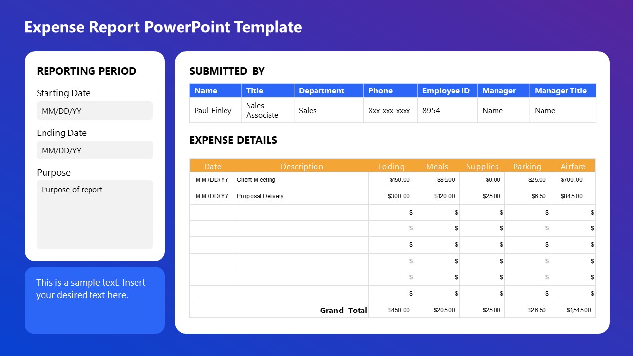
This Expense Report PowerPoint Template is perfect for detailed financial presentations. Easily document and display expenses, including lodging, meals, supplies, parking, and airfare, with clear sections for reporting periods, submission details, and expense descriptions. Ideal for corporate reporting, budget reviews, and financial audits, ensuring organized and professional presentations.
Use This Template
2. Business Progress Report Slides for PowerPoint

This Business Progress Report Template is designed to track project milestones and performance metrics. Listing a profile section for team members and a color-coded progress indicator allows for clear visualization of project status. It is ideal for team meetings, stakeholder updates, and performance reviews, ensuring a concise and effective presentation.
3. Book Report Presentation Slide Deck for PowerPoint
This Book Report PPT template is ideal for structuring narrative elements in presentations. We can outline a story’s theme, setting, and characters with visual aids to enhance understanding. This template is perfect for writers, educators, and marketers to convey story concepts effectively, ensuring a cohesive and engaging presentation.
4. Annual Report Template for PowerPoint
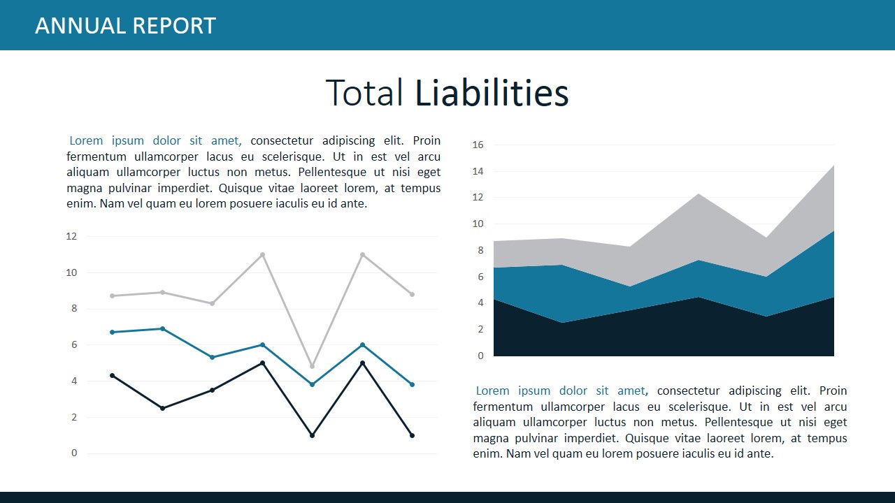
This Annual Report slide deck is designed for clear financial analysis. It features sections for detailed descriptions, bar charts, and pie charts to represent expense data visually. Perfect for financial reviews, investor presentations, and budget meetings, this template ensures a comprehensive and professional overview of total expenses, facilitating informed decision-making.
5. Business Annual Report PowerPoint Template
A slide deck designed to showcase key financial metrics and achievements. We include sections for displaying significant figures, percentages, and growth indicators, making it perfect for annual reports, investor meetings, and financial reviews. With clear and visually appealing graphics, this template ensures a concise and impactful presentation of financial performance highlights.
6. Financial Dashboard Report Template for PowerPoint
Accurately represent financial information that’s critical for your organization by implementing this PPT report template. It is a data-driven layout containing different boxes to showcase KPIs; managers and team leaders can use this template to align organizational efforts toward a strategic goal.

Like this article? Please share
Consumer Reports, Design, Executive Reports, Financial Report Filed under Business
Related Articles

Filed under Design • May 22nd, 2024
Exploring the 12 Different Types of Slides in PowerPoint
Become a better presenter by harnessing the power of the 12 different types of slides in presentation design.

Filed under PowerPoint Tutorials • May 22nd, 2024
How to Add Page Numbers in PowerPoint
If you wondered how you can speed up your slide numbering process, then stay tuned for this article on how to add page numbers in PowerPoint

Filed under Google Slides Tutorials • April 23rd, 2024
How to Align Objects in Google Slides
Optimize your layouts by learning how to align objects in Google Slides presentations. Step-by-step guide with screenshots.
Leave a Reply
NTRS - NASA Technical Reports Server
Available downloads, related records.
Press Releases
Tonix pharmaceuticals announces presentation at the 2024 bio international convention.
Presentation to highlight statistically significant Phase 3 results of Tonmya™ for the management of fibromyalgia
New Drug Application (NDA) submission to the FDA on track for the second half of 2024
CHATHAM, N.J., May 28, 2024 (GLOBE NEWSWIRE) -- Tonix Pharmaceuticals Holding Corp. (Nasdaq: TNXP) (Tonix or the Company), a fully-integrated biopharmaceutical company with marketed products and a pipeline of development candidates, today announced that Jessica Morris, Chief Operating Officer, will present at the 2024 BIO International Convention being held June 3-6, 2024 in San Diego, Calif. The presentation will take place on Tuesday, June 4, 2024 at 10:45 a.m. PT in Theater 1 at the San Diego Convention Center.
To schedule a meeting with the Company’s management at the convention, please submit a meeting request through the BIO One-on-One Partnering™ system or contact [email protected] .
Tonix Pharmaceuticals Holding Corp. *
Tonix is a fully-integrated biopharmaceutical company focused on developing, licensing and commercializing therapeutics to treat and prevent human disease and alleviate suffering. Tonix’s development portfolio is focused on central nervous system (CNS) disorders. Tonix’s priority is to submit a New Drug Application (NDA) to the FDA in the second half of 2024 for Tonmya 1 , a product candidate for which two statistically significant Phase 3 studies have been completed for the management of fibromyalgia. TNX-102 SL is also being developed to treat acute stress reaction as well as fibromyalgia-type Long COVID. Tonix’s CNS portfolio includes TNX-1300 (cocaine esterase), a biologic designed to treat cocaine intoxication that has Breakthrough Therapy designation. Tonix’s immunology development portfolio consists of biologics to address organ transplant rejection, autoimmunity and cancer, including TNX-1500, which is a humanized monoclonal antibody targeting CD40-ligand (CD40L or CD154) being developed for the prevention of allograft rejection and for the treatment of autoimmune diseases. Tonix also has product candidates in development in the areas of rare disease and infectious disease. Tonix Medicines, our commercial subsidiary, markets Zembrace ® SymTouch ® (sumatriptan injection) 3 mg and Tosymra ® (sumatriptan nasal spray) 10 mg for the treatment of acute migraine with or without aura in adults.
*Tonix’s product development candidates are investigational new drugs or biologics and have not been approved for any indication.
1 Tonmya™ is conditionally accepted by the U.S. Food and Drug Administration (FDA) as the tradename for TNX-102 SL for the management of fibromyalgia. Tonmya has not been approved for any indication.
Zembrace SymTouch and Tosymra are registered trademarks of Tonix Medicines. All other marks are property of their respective owners.
This press release and further information about Tonix can be found at www.tonixpharma.com .
Forward Looking Statements
Certain statements in this press release are forward-looking within the meaning of the Private Securities Litigation Reform Act of 1995. These statements may be identified by the use of forward-looking words such as “anticipate,” “believe,” “forecast,” “estimate,” “expect,” and “intend,” among others. These forward-looking statements are based on Tonix's current expectations and actual results could differ materially. There are a number of factors that could cause actual events to differ materially from those indicated by such forward-looking statements. These factors include, but are not limited to, risks related to the failure to obtain FDA clearances or approvals and noncompliance with FDA regulations; risks related to the failure to successfully market any of our products; risks related to the timing and progress of clinical development of our product candidates; our need for additional financing; uncertainties of patent protection and litigation; uncertainties of government or third party payor reimbursement; limited research and development efforts and dependence upon third parties; and substantial competition. As with any pharmaceutical under development, there are significant risks in the development, regulatory approval and commercialization of new products. Tonix does not undertake an obligation to update or revise any forward-looking statement. Investors should read the risk factors set forth in the Annual Report on Form 10-K for the year ended December 31, 2023, as filed with the Securities and Exchange Commission (the “SEC”) on April 1, 2024, and periodic reports filed with the SEC on or after the date thereof. All of Tonix's forward-looking statements are expressly qualified by all such risk factors and other cautionary statements. The information set forth herein speaks only as of the date thereof.
Investor Contact
Jessica Morris Tonix Pharmaceuticals [email protected] (862) 904-8182
Peter Vozzo ICR Westwicke [email protected] (443) 213-0505
Media Contact
Katie Dodge LaVoieHealthScience [email protected] (978) 360-3151
Released May 28, 2024

Benchmark Your Supply Chain Agility
2024 Survey Readout
- Registration
June 24, 2024

Join us for a webinar on the 2024 Semiconductor Supply Chain Survey results, a collaboration between SEMI and McKinsey & Company. Discover key trends, challenges, and opportunities across the value chain. Gain insights to benchmark your organization and enhance your strategic planning.
Register now for one of the sessions:
Us/eu: 8:00 am – 9:00 am pt [ register now ] , asia: 5:00 pm – 6:00 pm pt [ register now ] .
Zoom , United States
Join us for an insightful webinar as we present the findings from the 2024 Semiconductor Supply Chain Survey, a collaborative effort between the SEMI Supply Chain Management initiative and McKinsey & Company.
The annual survey aims to establish benchmarks for operational agility metrics, covering the entire value chain from material suppliers to OEMs, offering a comprehensive view of the landscape.
During this webinar, we will share results from the survey uncovering key trends, challenges, and opportunities within the semiconductor supply chain. By attending, you'll gain valuable insights to benchmark your organization against peers, identify areas for improvement, and course-correct more effectively. Please contact us if you like to learn about how your company can participate in the SCM initiative.
Choose your session:

Opening Remarks

2024 SCM Survey Briefing
About semi supply chain management initiative.

The SEMI Supply Chain Management initiative is a unique global platform that brings together top industry leaders to advance a more resilient and agile electronics supply chain. Recent geopolitical and natural events have exposed vulnerabilities but also new opportunities that require industry-wide and precompetitive collaboration. That's where SEMI comes in. The initiative’s newly formed Industry Advisory Council is committed todriving engagement, creating tools and solutions through collaboration, and ensuring alignment in global end-to-end supply chain continuity, visibility, and transparency. Through deep dives, educational forums, benchmarking, standards development, and strategic partnerships, SEMI seeks to empower our members to anticipate and respond to future disruptions proactively.
If you are interested in learning more about how your company can participate in the SCM initiative, please contact us at [email protected].

Google Limits AI Overviews for Satirical and Nonsensical Queries
Google is scaling down the presentation of AI Overviews in some search results. The decision came after the search giant made some publicized mistakes that created a public backlash on the internet.
On Thursday, Liz Reid, the Head of Google Search, admitted that the company was limiting AI-generated summaries called “AI Overviews.” The AI-powered feature was criticized when it started showing content telling people to eat rocks and glue cheese to their pizza.
Also read: Google, OpenAI, and 13 Others Pledge Not to Deploy Risky AI Models
Google began showing AI Overviews to its users in the United States two weeks ago after its annual I/O event, during which it rolled out several AI-based offerings. From Thursday onwards, users noticed fewer questions, which resulted in an AI response.
Identifying Fake AI Overviews Requires Careful Analysis
Reid wrote in a blog post that people on social media shared screenshots of AI Overviews that suggested weird solutions. She said the company’s AI made some mistakes, but many were fake and never generated by Google’s AI system.
She admitted that some odd or inaccurate AI Overviews certainly did show up. It highlighted the areas where the feature needs to be improved, but they are not commonly searched queries. Noting the fake ones, she said,
“Separately, there have been a large number of faked screenshots shared widely. Some of these faked results have been obvious and silly.”
Reid said Google did not show any AI Overviews for topics like smoking during pregnancy or leaving dogs in cars. She encouraged users who saw those screenshots on social media to search themselves and check.
Google’s AI Can Now Identify Satirical Content
Google identified that satirical content and nonsensical queries were areas that needed to be addressed for producing inaccurate AI Overviews. Google said that before the screenshots of the query “How many rocks should I eat?” went viral, no one asked the question. Reid said that Google Trends can be seen for confirmation.
Also Read: Opera Integrates Google’s Gemini Models to Enhance Aria Browser AI
Another factor is that very little content is available on a specific topic, also known as data void, which is also a reason for inaccurate AI overviews. Regarding the rocks-eating query, Reid said that the satirical nature of the content triggered the AI Overview. The content was also republished by a geological software website, which the AI Overview linked to. She clarified,
“So when someone put that question into Search, an AI Overview appeared that faithfully linked to one of the only websites that tackled the question.”
Reid did not mention the other AI Overviews making rounds on social media, and many big publishers also published reports on them. For Example, The Washington Post published a report on Google telling people that Barack Obama was Muslim. The publication also reported another instance in which Google AI Overview told a user that people should drink urine to help pass kidney stones.
Google Has an Obsession With Public Forums
Google’s head of search noted that the company tested the feature extensively before launching it to the public. She also admitted that real-world usage practices are difficult to simulate in the testing phase, but the company did robust red-teaming and sampling of typical user queries.
Also read: Google’s AI Overview Feature Faces Backlash Over Inaccurate Results
Some users and internet content analysts are noting that Google recently began showing many results from public forums like Reddit. Some question the company’s deal with Reddit, but a Google spokesperson told BBC that no such terms were part of the agreement to give Reddit more visibility in search results.
Lily Ray, the vice president of SEO strategy and research at Amsive, a marketing agency, says that now, many queries show results from Reddit. She also mocked Google in an X post (previously Twitter), saying all the world’s knowledge (Reddit content) is combined with AI.
Reid said that AI Overviews feature sarcastic content from discussion forums in some examples. She said that forums are a good source of first-hand information, but in some cases, they can trigger not-so-helpful answers, such as gluing cheese to pizza.
Google’s AI also misinterprets language, which leads to wrong information in AI Overviews, but the ratio for such answers is very low, according to the company. Reid noted that they sorted out the issues quickly through improvement or by removing responses that didn’t comply with Google’s policy.
Google Search’s VP also said strong guardrails exist for topics like health and news. The company has launched new triggering refinements for enhanced quality protections for health. Reid said that the detection system is also updated for nonsensical queries so as not to show them as AI overviews. She also hinted at the confirmation of fewer AI Overviews for satirical queries, saying, “We updated our systems to limit the use of user-generated content in responses that could offer misleading advice.”
Cryptopolitan reporting by Aamir Sheikh

COMMENTS
Typically, evaluation reports include the results of the evaluation ("What"), interpretation of results ("So What"), and recommendations for continuing and improving the educational activity ("Now What"). How evaluation findings are communicated directly influences how stakeholders understand and react to the data and ultimately ...
Written Presentation of Results. ... Poster presentation. In some symposiums and conferences, you may be asked to present at a "poster" session. Instead of presenting on a panel of 4-5 people to an audience, a poster presenter is with others in a large hall or room, and talks one-on-one with visitors who look at the visual poster display of the ...
Presentation of research results • A key component of scientific research is presenting research results to the scientific community • Research results are presented in three main formats: oral presentation; poster presentation; written paper. • LS-LAMP participants give oral presentations and turn in written papers
Present a result and then explain it, before presenting the next result then explaining it, and so on, then end with an overall synopsis. This is the preferred approach if you have multiple results of equal significance. It is more common in longer papers because it helps the reader to better understand each finding. In this model, it is ...
The results section is the core of a research paper where the study data and analyses are presented in an organized, uncluttered manner such that the reader can easily understand and interpret the findings. It is often embellished with self-explanatory tables and figures which assist in presenting data in addition to the text.
7.1 Sections of the Presentation. When preparing your slides, you need to ensure that you have a clear roadmap. You have a limited time to explain the context of your study, your results, and the main takeaways. Thus, you need to be organized and efficient when deciding what material will be included in the slides.
Presenting numbers effectively. To effectively present numbers, use a mix of text, tables, and figures where appropriate: To present three or fewer numbers, try a sentence,; To present between 4 and 20 numbers, try a table,; To present more than 20 numbers, try a figure.; Since these are general guidelines, use your own judgment and feedback from others for effective presentation of numbers.
The Results section of a research paper lays out the body of evidence collected within the context of the study to support the conclusions and generalizations that are presented in the Discussion section. To be effective in supporting conclusions, the study results and their relation to the research questions and discussion points must be clear ...
Results may be presented in a number of ways, including via graphs, tables or other visual media or through detailed written description. The nature of your research will dictate the best forum through which to present. However, presentation of results is only part of the story you need to tell. A discussion of your results is where the ...
Abstract. This chapter is intended to be a practical guide to help with the construction of tables and figures and with the general presentation of results of statistical analysis in a research paper. Constructing tables and figures well and writing a results section so that it appears to make a coherent point—and does not wander—is as ...
Here are a few best practices: Your results should always be written in the past tense. While the length of this section depends on how much data you collected and analyzed, it should be written as concisely as possible. Only include results that are directly relevant to answering your research questions.
The results chapter in a dissertation or thesis (or any formal academic research piece) is where you objectively and neutrally present the findings of your qualitative analysis (or analyses if you used multiple qualitative analysis methods ). This chapter can sometimes be combined with the discussion chapter (where you interpret the data and ...
The results chapter (also referred to as the findings or analysis chapter) is one of the most important chapters of your dissertation or thesis because it shows the reader what you've found in terms of the quantitative data you've collected. It presents the data using a clear text narrative, supported by tables, graphs and charts.
Here is a great way to synthesize and summarize your results in a way that will help your audience easily process what the results mean and then make a sound decision based on those results. How to Present Your Results and Get Recommendations Implemented. Focus on the Objective as the Burning Issue. In the first thirty seconds of your ...
Indeed, disseminating the results is an essential part of the research process. By sharing your results with others, whether in written form as scholarly paper or an applied report or in some alternative format like an oral presentation, an infographic, or a video, you ensure that your findings become part of the ongoing conversation of ...
The "results" section, the heart of any article, is the third section of the IMRAD structure. Writing the "results section" can either begin with a general overview of the experiment or with a direct presentation by referring to tables or figures.
In a quantitative dissertation or capstone you will be presenting your results. You may present your results with or without a discussion explaining what those results mean. You will want to consult your chair to make sure you are following the approach. preferred by your chair. Thus, your chapter 4 may include the following: Introduction. Results.
At Comet.ml, we help data scientists and machine learning engineers to automatically track their datasets, code, experiments and results creating efficiency, visibility and reproducibility ...
Results should answer main hypothesis or research question(s) Order of presenting results is arbitrary; May be done in Table 1 in less-complicated studies; or be set apart to emphasize its importance. Results that are "sidelights" should not receive equal weight; When presenting the results for the main hypotheses, consider: Clear, concise, simple
Unfortunately, however, the diversity of result presentation format, alongside the number of manuscripts, has resulted in confusion not only in the review and publication process but also in delivering appropriate information to the readers. Presenting results derived using similar statistical methods in a prescribed tabular format recommended ...
Introduction. Presenting the results in a clear and logical format to the client is one of the most important tasks for the person managing the survey. When presenting results, the format of the presentation should be tailored to address the aims and objectives of the survey and to satisfy the potential users of the results.
The results are in. Now it's time to make sense of them. Creating a survey results presentation is one of the best ways to analyze your results and present them to stakeholders in a format that makes them clear and understandable. It's not as simple as copying and pasting everything into a PowerPoint presentation, though.
presentation. If these figures are compared to that of subjects, who attended workshops that were presented in literal language, it seems that the majority of the latter group was content with the presentation. The results show 67,3% satisfaction with literal language and only 32,6% dissatisfaction.
Design created using the Lab Report PowerPoint Template. To build a high-quality academic report presentation, consider the following slides: Title Slide: Title, author's name, institution, and date. Introduction Slide: Background and research question. Literature Review Slide: Summary of relevant research.
The following slide deck was published by Asana, Inc. in conjunction with their 2025 Q1 earnings call. View as PDF. 128.
This presentation will focus on recent advances achieved through the project, including integration of multiple air quality datasets in a prototype data fusion system in Google Earth Engine, the quantification of uncertainties associated with our data fusion approach, and the development of user interfaces and visualization tools to convey air ...
Presenting results on both a reported basis and an adjusted basis permits readers to assess the impact of certain items on results for the periods presented, and to better assess results excluding those items that may not be reflective of ongoing business performance. As such, the presentation may facilitate readers' analysis of trends.
The presentation will take place on Tuesday, June 4, 2024 at 10:45 a.m. PT in Theater 1 at the San Diego Convention Center. To schedule a meeting with the Company's management at the convention, please submit a meeting request through the BIO One-on-One Partnering™ system or contact [email protected].
The annual survey aims to establish benchmarks for operational agility metrics, covering the entire value chain from material suppliers to OEMs, offering a comprehensive view of the landscape. During this webinar, we will share results from the survey uncovering key trends, challenges, and opportunities within the semiconductor supply chain.
Google is scaling down the presentation of AI Overviews in some search results. The decision came after the search giant made some publicized mistakes that created a public backlash on the internet.